I built it for the Business career but I'm rethinking it now. It might be more versatile than that. Certain rooms might work for Law, Journalism - any office/desk-based career, really.
Anyway, I thought you might want to take a look. As always, you can click the pictures to enlarge. Warning: massive overuse of OFB stage foundations ahead!
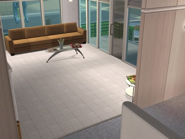 The lobby/reception area. That little round coffee table in the corner has an armchair next to it.
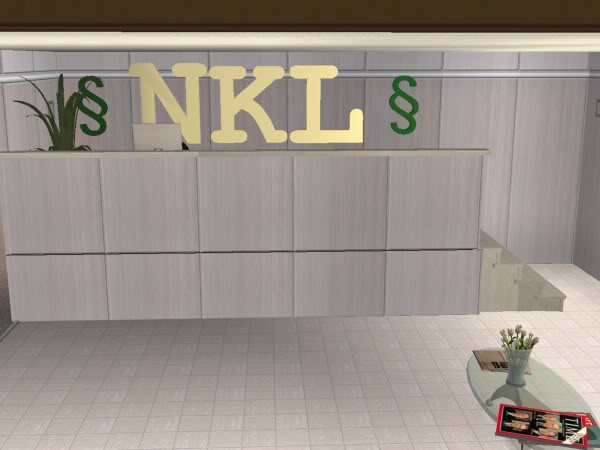
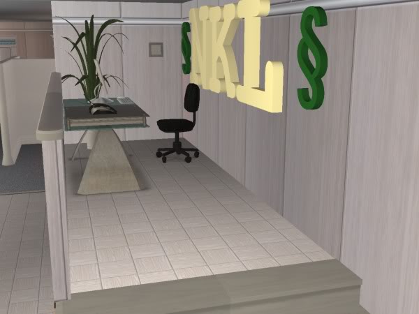 Stage foundation #1. This is the receptionist's desk. I am undecided about the sign. I might get rid of the simoleans and change the NKL colours to something less muted.
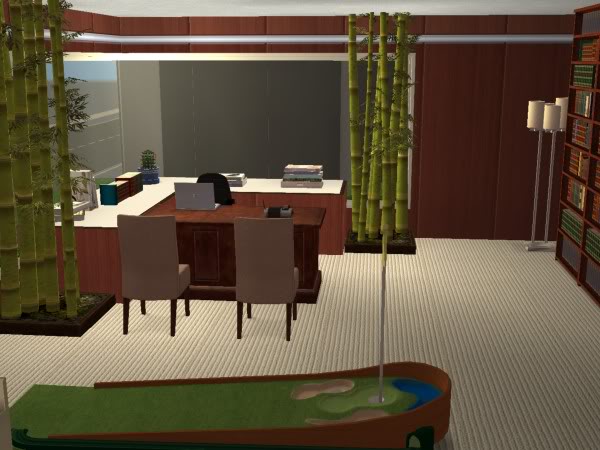 Stage foundation #2. I think I'm developing a problem. I imagine this as an office for the business higher-ups or any lawyer. I'm thinking of making my Sims go see a lawyer when they get divorced, so I would use this office. I have two more offices upstairs but they're very similar to this one, so no pics.
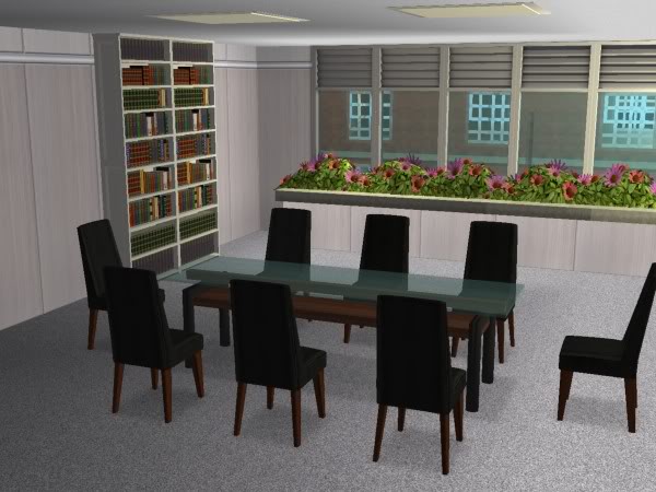 Stage foundation #3. I love this tool. Why have I hardly used it before? Anyway, having never worked in an office or been in a conference room, I have no idea if they would have a planter against the window. But my office does.
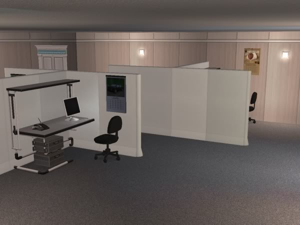 And finally, the cubicles, aka veal-fattening pens! I should have taken pictures of the upstairs ones because they're a tiny bit less boring looking. But all my knowledge about offices comes from Office Space, so I kind of like that it looks boring and soul-crushing. It fits with the stereotype I have in my head. ;)
There's also a break room, which is fairly small and plain and they have some vending machines at the end of a corridor too. I'm pretty happy with the interior but I loathe the exterior. Getting the windows the way I wanted on the inside means that the outside now looks very unbalanced, which is a shame. I'll see if I can do something about that another day.
Anyway, I don't know how often I'll use this but I have ideas that I may or may not use. I could stage firings, workplace romances or just day-to-day stuff. I think I can use the Visitor Controller to allow only people from certain career tracks onto the lot, so that might come in handy. I'll have to experiment with it.

That is awesome! I love the design.
ReplyDeleteI think the sign looks good. A real office would probably use a huge muted sign like that that looms over the lobby. XD
It looks great! And what a cool idea! I don't think I'd have the energy to do that sort of stuff but I'm really looking forward to reading how it will go.
ReplyDeleteYes, you can use the Visitor Controller to ban people from certain careers so you can make the lot available to only those careers you want to.
I think your office space looks great. I have been meaning to build some spaces...the only space I have built so far is a semi decent cemetery... Thanks for the idea, I may end up building some spaces now.
ReplyDeleteVery cool looking office! And as someone who works in an office, it's perfect the way it is. Boring muted tones, small tiny cubicles, reminds me of work!!!
ReplyDeleteI love it! I've thought before about building an office environment for my Sims in the business career, but hadn't gotten around to it yet. The colors and look are just right. Although the cubicles in the newspaper office where I work are a lot messier. But that may just be the nature of a newspaper, rushing to meet deadlines and little time to tidy up. ;)
ReplyDeletewicked cool!
ReplyDeleteGreat ideas for uses for it too! No clue on the planters in a conference room but why not? Looks great
Thanks everybody!
ReplyDeleteI'm glad the office looks relatively realistic, especially to someone who works in an office. I had my sister take a look at it (who also works in an office, though she's in social work, not business) and she liked it a lot too. She also doesn't think the outside is that bad so maybe it's not. She'd totally say it if it was.
Shana, I was tossing up between making this place for business or journalism. I'd definitely make a newspaper office a little messier though!
Oh I LOVE this office setting, Sullivan!! It looks perfect! And what a great idea!
ReplyDeleteThank you so much, I'm glad you like it!
ReplyDeleteCarla, I love your office! It is very realistic. The cubes are my favorite part. I can't wait to see it in use in your game.
ReplyDeleteThank you! The cubicles are my favourite part too.
ReplyDeleteI still haven't used it but I will eventually. I wouldn't want it to go to waste.
I hate to be grave digging, but if your're still looking for good business objects check out the donation one at http://www.simgedoehns2.de/ . Since its donation, it may be at the Booty. If not, I'll upload it there.
ReplyDeleteThis set is amazing! With wall logos, chairs, desks, etc.
LaToya, I get comments on my older entries quite a bit and I don't mind, so go right ahead if you have something to say!
ReplyDeleteThanks for the link, I'll definitely be checking that out. :)