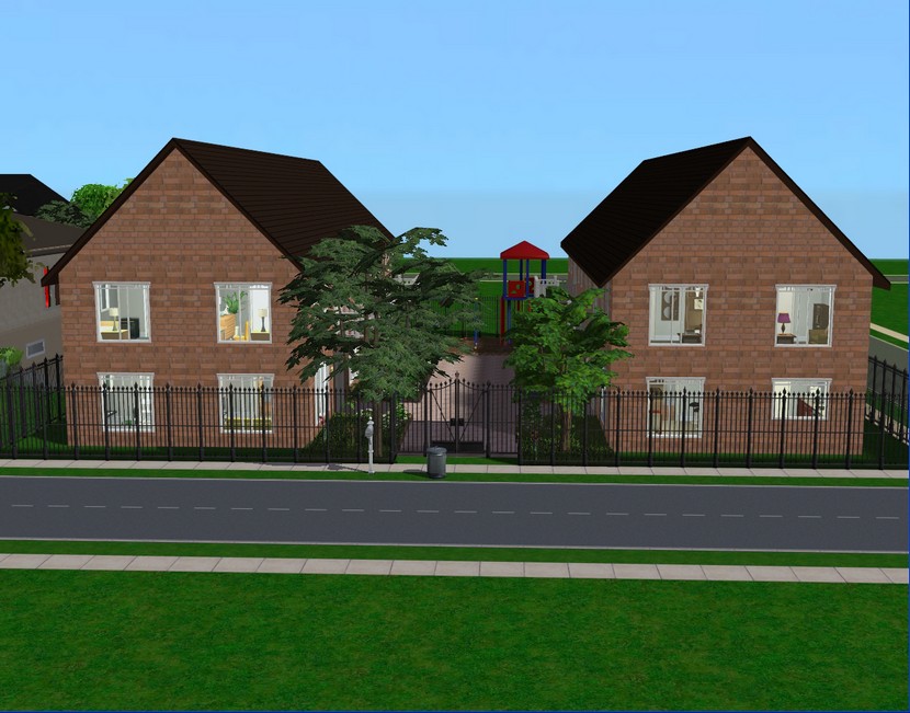
 I had the idea for the exterior for quite a while but wasn't sure if I wanted to bother building apartments. They always sound like such a hassle! As it turns out, it was a bit of a hassle! The apartment doors you'll see in these pictures are custom and supposedly functional - except they're not. So I had to replace them with the EA doors. Ditto for the custom arches I used in the foyer. Still no idea why they didn't work but whatever. Apartments are a pain and I probably will not be building one again!
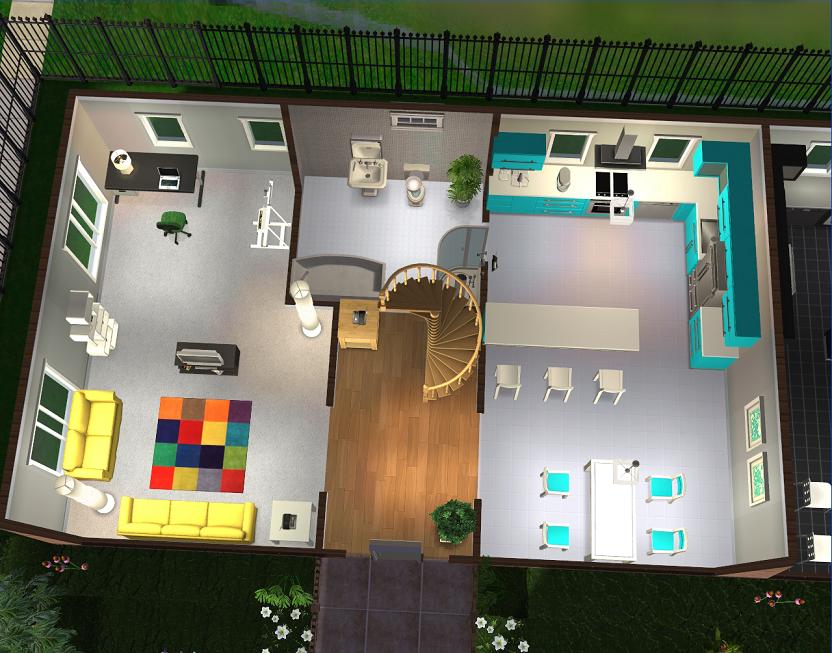 All four apartments are identical in layout. This is the bottom floor of apartment 1.
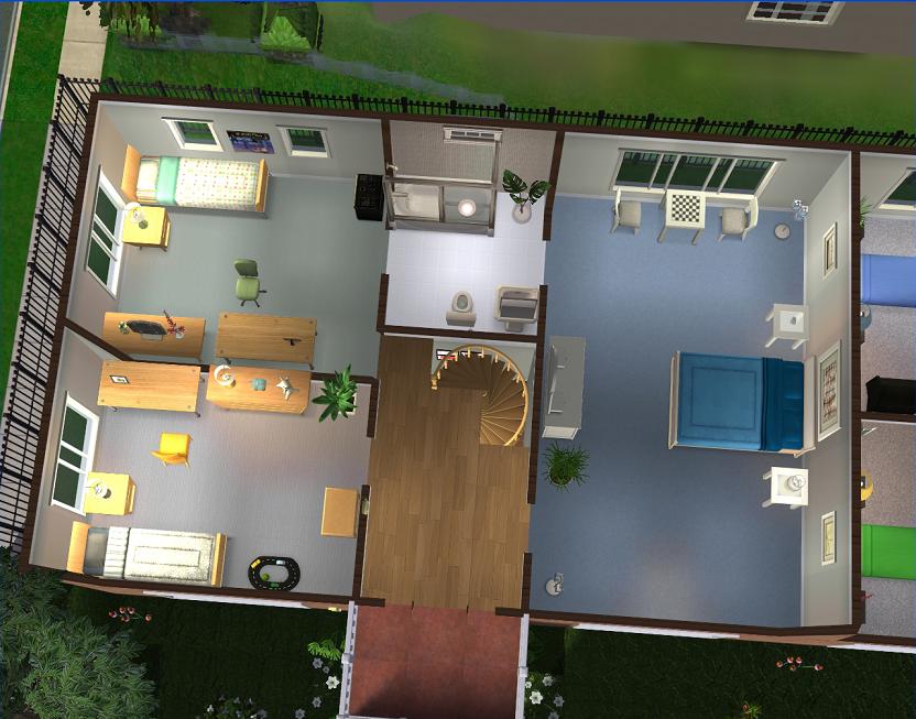 And the top floor.
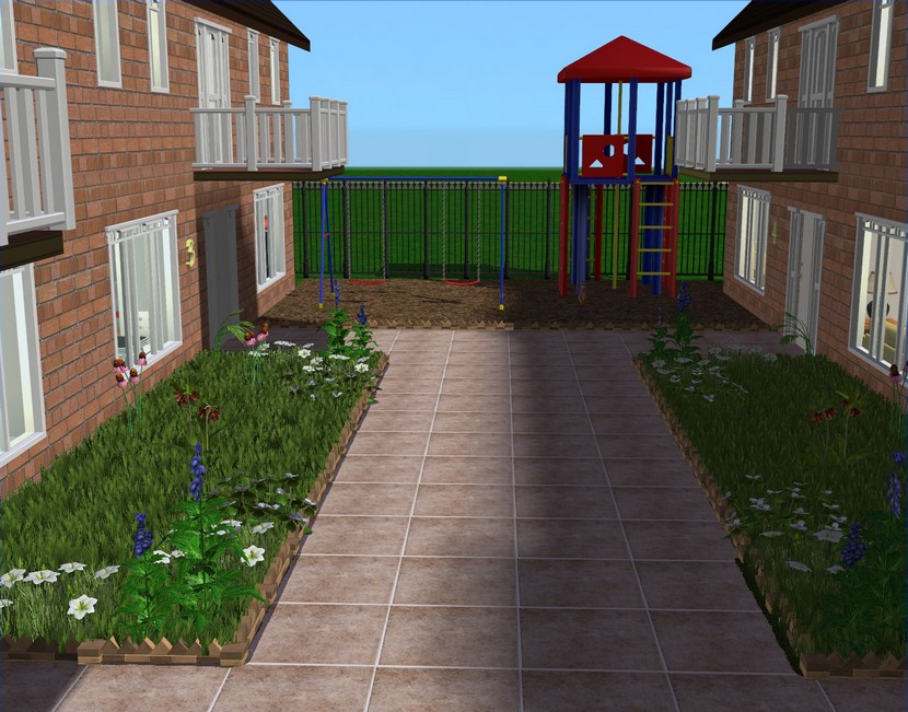 When I started building this, I was thinking of aiming it at recent college graduates but rent and security deposits at this place are much too expensive for that! So I decided to build it for small families instead, hence the playground equipment.
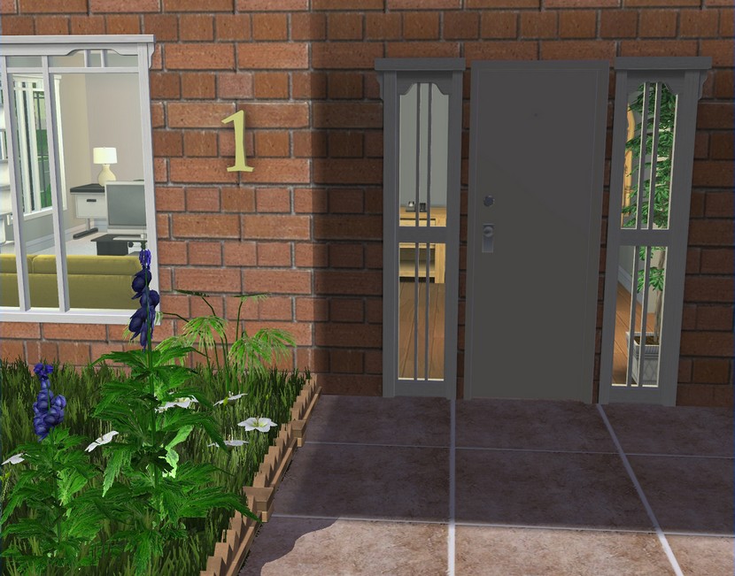 Apartment #1 is reserved for Charlie and Camilla; the others are up for grabs!
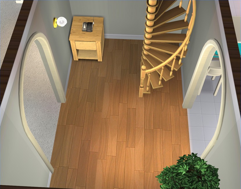 All the entrances are pretty much identical, so this is the only one I'll show you.
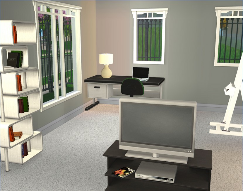
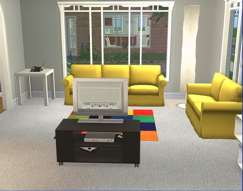 So this will be the living space for Charlie, Camilla, Grace and Everett. Next time you see them, they should be all moved in.
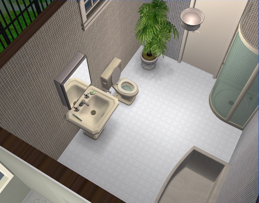 The bathrooms are also identical. I hate decorating bathrooms!
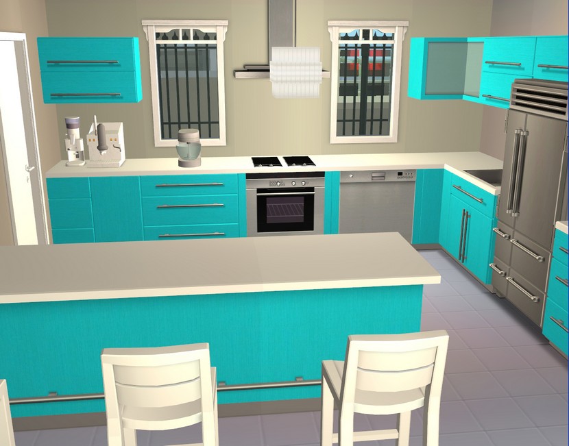
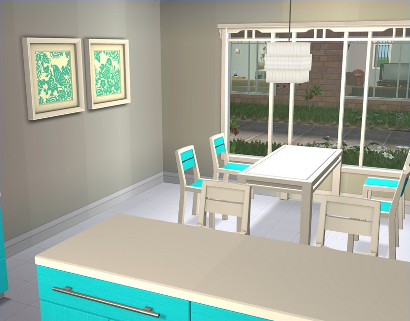 I do love a kitchen though! I've been waiting for an excuse to use these bright cabinets and Charlie really likes bright colours, so they were perfect for him (all the grey and white is for Camilla!).
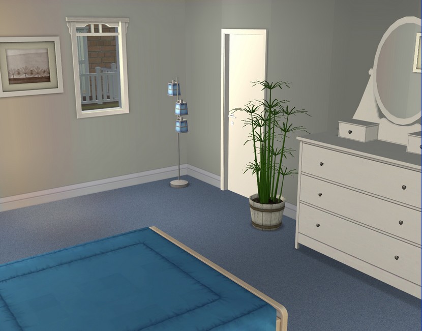
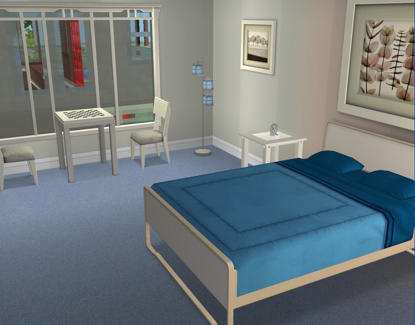 The master bedrooms are a bit too big in all of the apartments but I think I'll probably be grateful for the space eventually. There's usually something else I need to buy, when I move Sims into pre-decorated homes. For Camilla and Charlie, that's probably going to end up being a dog bed, seeing the kids want a pet.
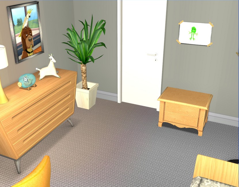
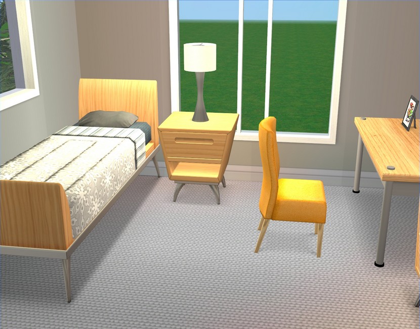 This will be Everett's room.
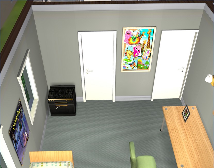
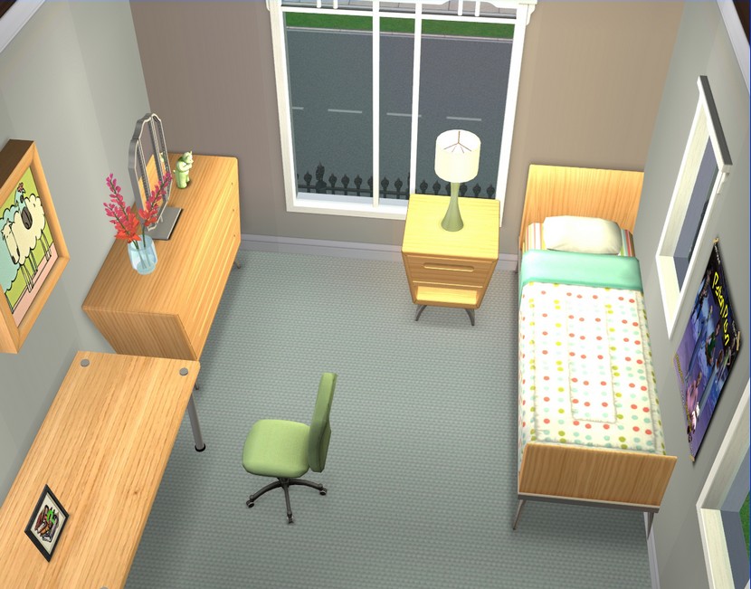 And this room is for Grace.
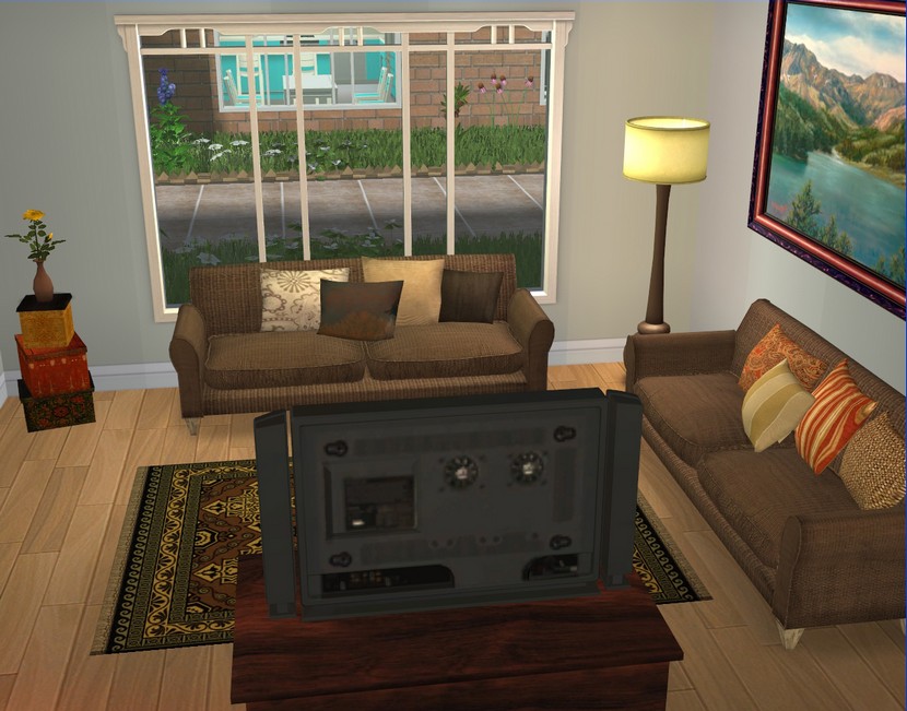
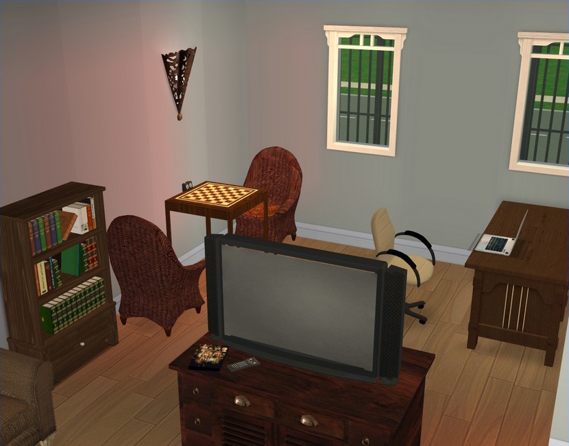 This is the living area in apartment #2.
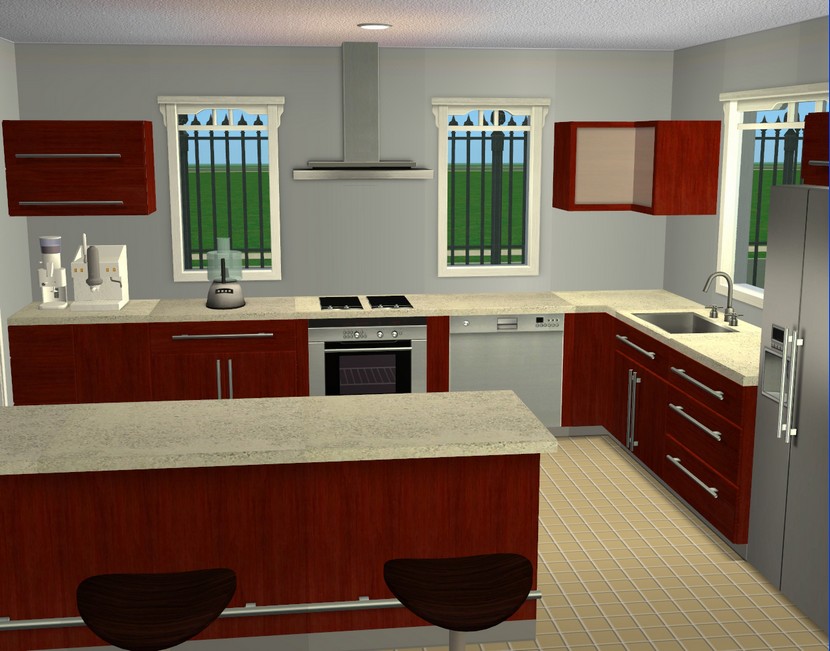
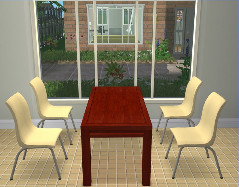 Kitchen/dining.
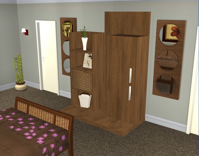
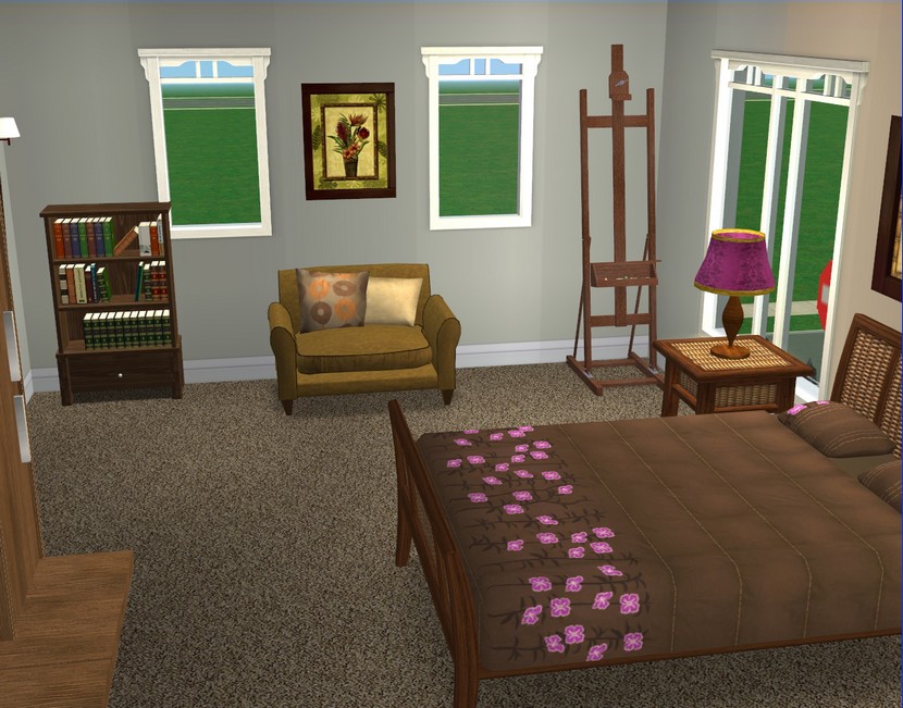 Master bedroom (this one is probably my favourite bedroom).
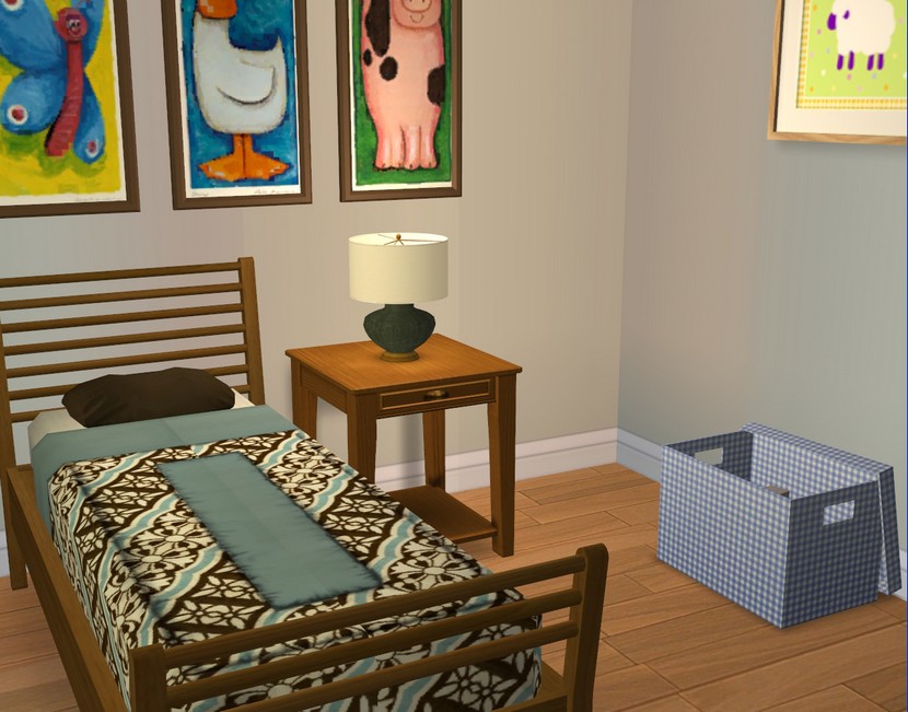
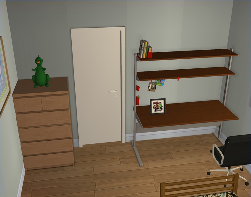 Kid's bedroom.
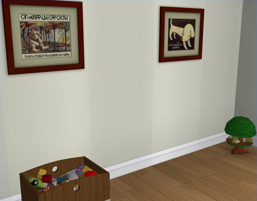
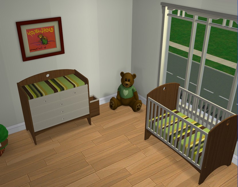 Nursery.
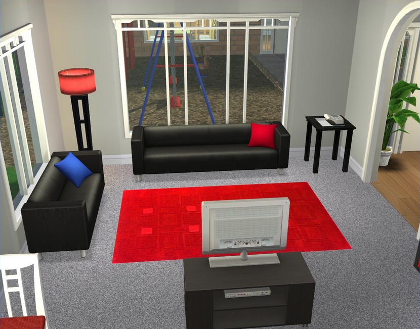
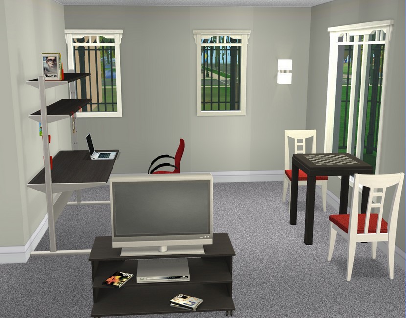 Apartment #3's living room.
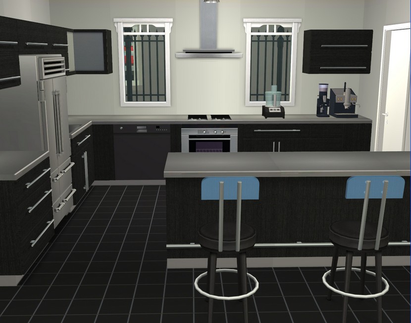
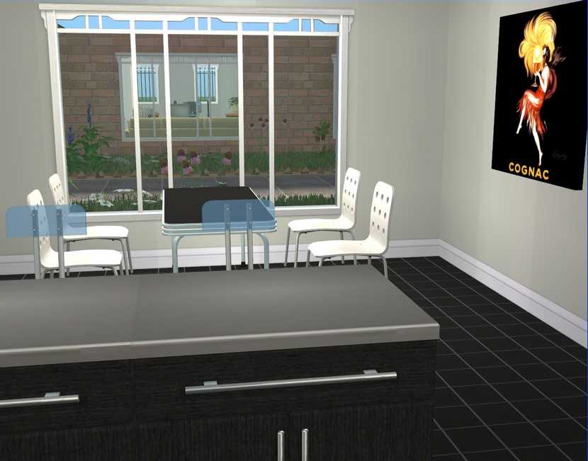 My favourite of the kitchens.
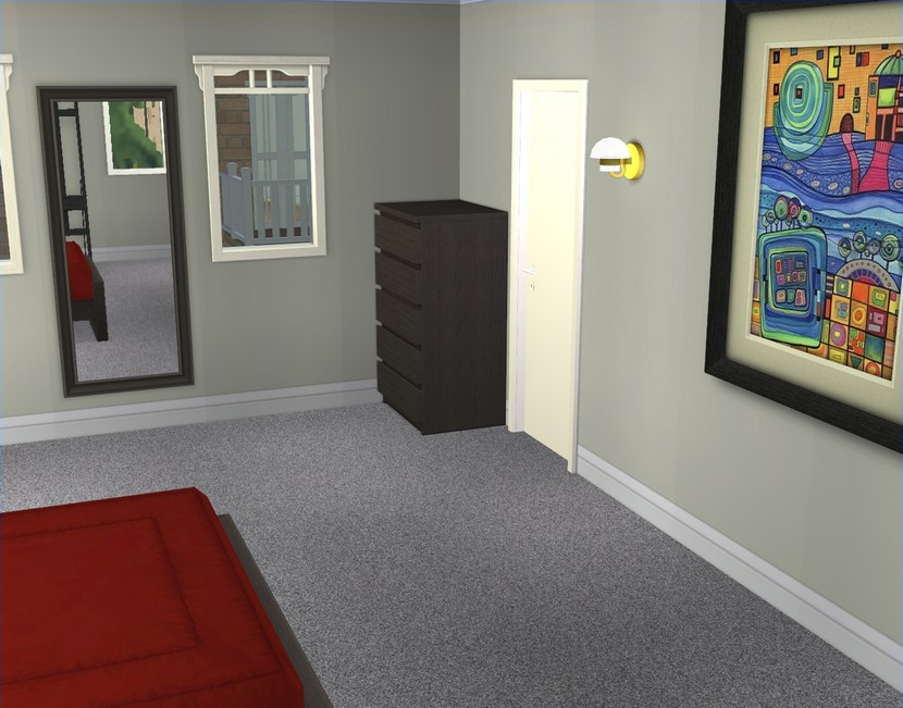
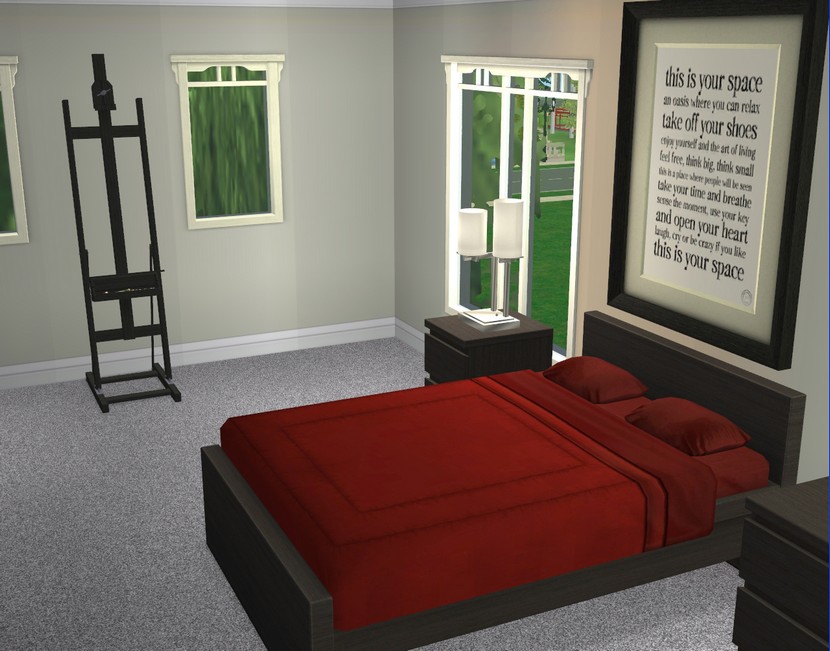 The master bedroom.
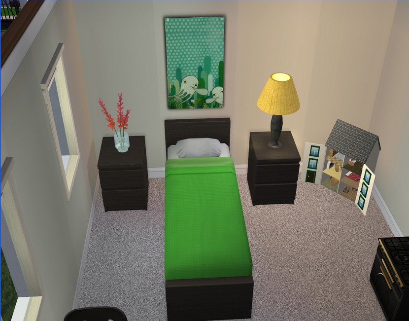
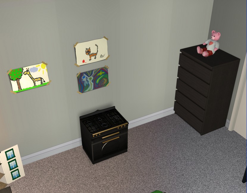 Kid's bedroom #1.
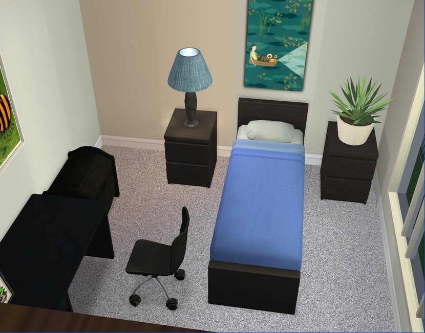
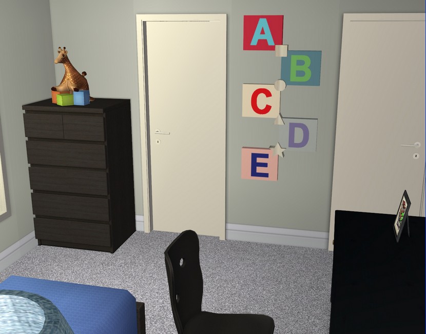 Kid's bedroom #2.
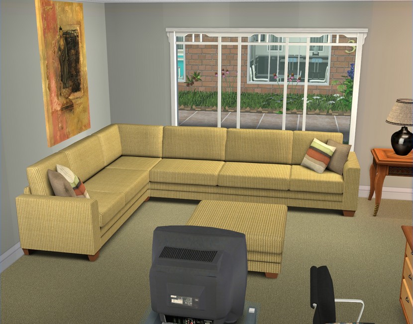
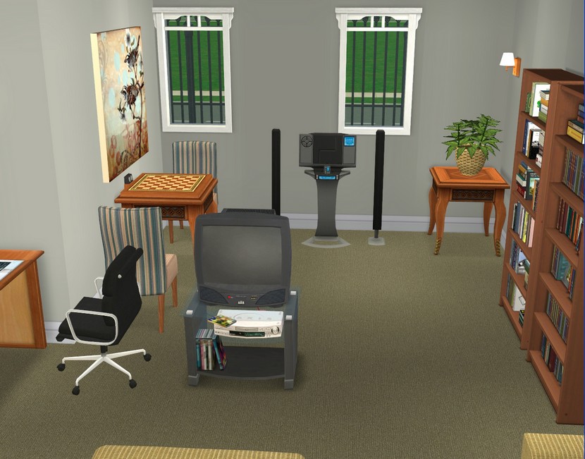 And finally, we enter apartment #4.
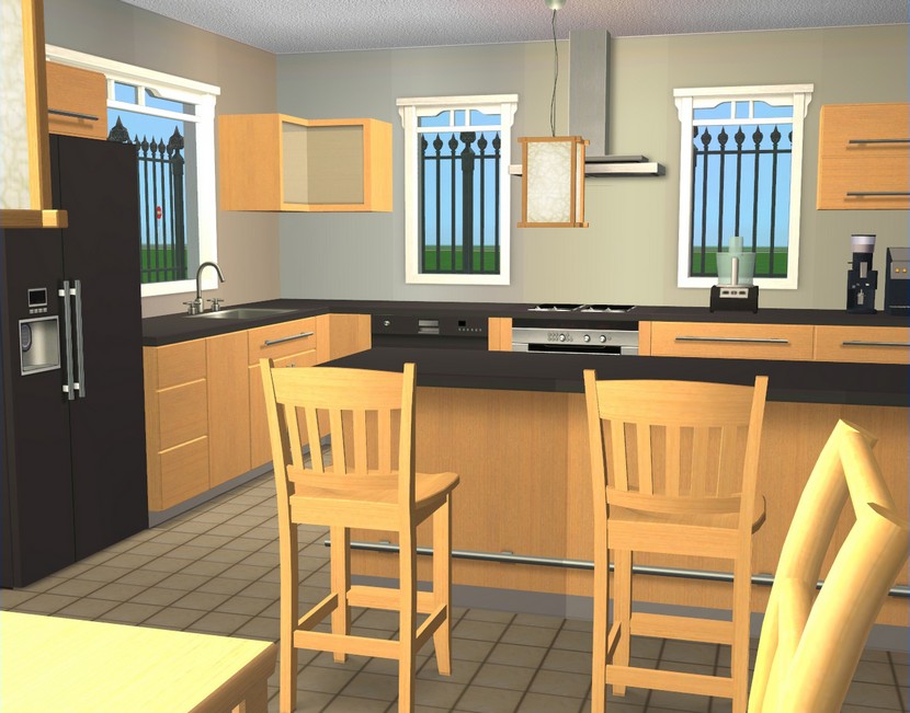
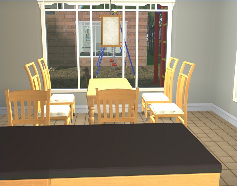 Kitchen/dining. I used the same Buggybooz cabinets/counters in every apartment, just with different textures. They are awesome because they're cheap and I have a ton of recolours for them.
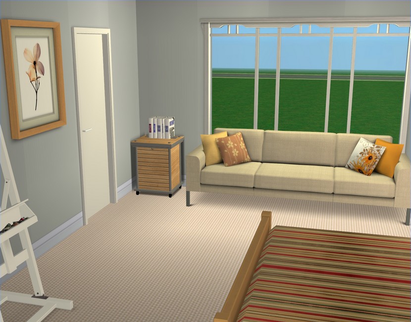
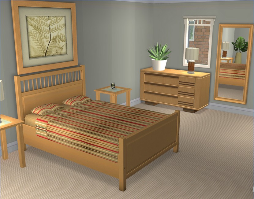 Master bedroom.
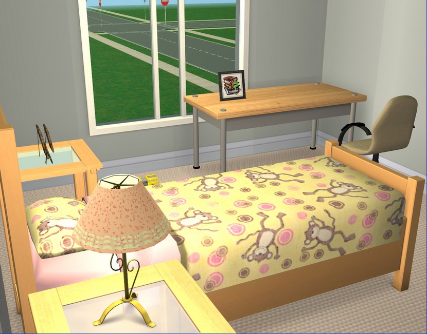
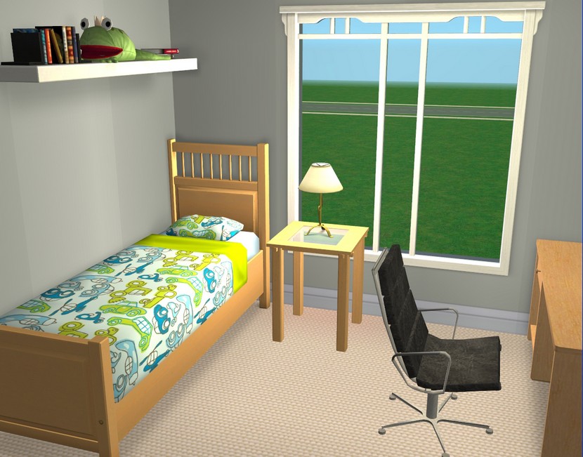 And the kids' rooms!
I cannot tell you how relieved I was to finally finish this lot! It felt like it took forever!

This is gorgeous! Simplistic yet homey. :)
ReplyDeleteAdorable! I wondered where you would end up putting Charlie and Camilla and the kids. I think it will be the perfect place for them.
ReplyDeleteYour decorating skills always make me want to go and decorate something!
Very nice, you shouldn't give up building apartments, you do such a great job. I try not to pour over your photos since I usually get tempted to download to no end, your CC is amazing and you use such great combinations. I have a WCIF for you: that large photo over the medium wood ikea bed, it looks like a BV add-on, but much larger. Is it?
ReplyDeletemmmcheezy225, thanks, I'm glad you like it!
ReplyDeleteLunar, I wasn't sure either and it's actually something I've been thinking about since the twins were born. This will be a good place for the family, I think!
Thanks for looking!
Apple Valley, well, if I ever think of another good idea for an apartment lot, I won't let this experience stop me from trying it out. But it's definitely not something I'm planning to do on a regular basis!
Yes, the painting over the bed is an BV add-on. The picture part is slaved to the BV poster and the frame part is slaved to Buggybooz's KitchenBasic counter. You can get the paintings here:
http://buggybooz.blogspot.com/2010/03/feast-of-frames.html
The KitchenBasic set is at MTS, if you don't already have it.
Thanks for looking!
I said it at N99 and I'll say it again: I love it! It'll be the perfect for Charlie and Camilla.
ReplyDeleteI know you're not going to put this up for download so I was wondering do you mind if I copy the floor plan for my hood? I'm looking to replace the apartments that Erin & Toby and Tina & Kurt live in and this would be perfect. I haven't found anything even remotely suitable so far.
I have to agree with apartment building. It takes long and there are times when I have no patience in decorating. I find making each apartment unique. Lately I have made apartments that are identical and with just the basics.
ReplyDeleteLOVE it! Can't wait to see Charlie and Camilla moved in! But hmmmm where is the download link.. *nudge nudge*
ReplyDeleteIt looks really good, nice work Carla! I especially like the blue kitchen!
ReplyDeleteThis is very cool. I just love all the apartments but my favorite is the one you built for Charlie and Camilla (I was totally going to write Charles).
ReplyDeleteSari, no, go right ahead! Imitation is the sincerest form of flattery. ;)
ReplyDeleteThanks for looking!
Bernz, yes, it's a real pain! Identical is tempting but I get rather carried away with decorating. Even if I want to just do a quick job and put the basics in, I never can. I can't help myself.
Thanks for looking!
Maisie, glad you like it! No download link, unfortunately. It is packed with custom content, so the file size would be huge. And because the lot is so big, it would be a pain for me to go through and replace everything with Maxis content. Sorry!
Thanks for looking!
Charleston Sims, I'm fond of the blue kitchen too, if only because I didn't think I'd ever get to use those counters! Now to find an excuse to use the similarly bright pink and green recolours of same!
Thanks for looking!
Rosa, in game, Charlie's name is Charles. I never fail to giggle. But anyway, Charlie and Camilla's apartment is my favourite overall because it's very "them".
Thanks for looking!
Thanks Carla, you're the best :)
ReplyDeleteYou're very welcome! I'll be interested to see what you do with the layout. :)
ReplyDeleteCarla, if you package the file, then open it with clean installer-unclick all the CC and then save, it saves a clean version. Then it replaces most of the items with maxis items for your downloaders. Also, thanks for the link to the paintings. I'm still debating actually downloading them :P the frames are linked to the kitchen and I have a ton of add-on frame recolors for the BV poster that I'd love for the big ones to use/call so that's the debate.
ReplyDeleteApple Valley, I did forget about that trick, so thanks for the reminder. I'm still not sure I'll share this one though. :)
ReplyDeleteThese apartments are gorgeous! I love how each one is so individual and reflects the different people living there.
ReplyDeleteDriftwood Valley, glad you like them!
ReplyDeleteThanks for looking!
The apartments are wonderful! You have such a knack for decorating, I swear.
ReplyDeleteRachel, it's still a bit odd to hear people say they like my decorating, as it was extremely lacklustre just a couple of years ago, so thank you!
ReplyDeleteThanks for looking!
I can't believe how much I have to catch up! *lol* Darn, I hate July, and I won't be able to read more than two entries for today, I'm afraid. I know there's one with Connor I'm impatient to read about! :)))
ReplyDeleteThose apartments are lovely! I love how you personalize them, but keep them simple as well, without being too heavy on clutter. They look big enough without being too spacious. Well, they're perfect, in one word! I love also the outdoors with the playground for kids. That's cute!
Thanks for the tour!
Sandy, I've noticed that July seems to be a busy month for a lot of people! I've been a bit bored some days, because I've had two weeks off work, lol!
ReplyDeleteI can always add clutter when I move people in, if I think they're the type of Sims who would have clutter! I wanted to keep these relatively affordable, so there's a lot of IKEA furniture and minimal decor. I'm glad you like them!
Thanks for looking!