I was going to save this lot tour until I was completely finished with the high school but have
decided instead to post it in three (possibly four) parts. I took 25 pictures of the first storey alone, so if I do it all as one tour, I might end up with over 100 pics in the one post. So watch out for more of the school, hopefully soon!
decided instead to post it in three (possibly four) parts. I took 25 pictures of the first storey alone, so if I do it all as one tour, I might end up with over 100 pics in the one post. So watch out for more of the school, hopefully soon!
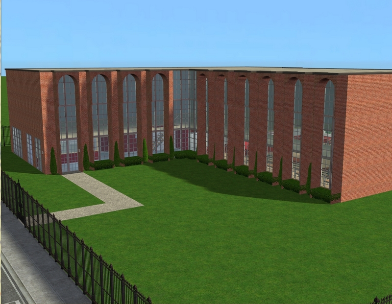
I haven't really done landscaping yet but this should show you the basic shell of the school.
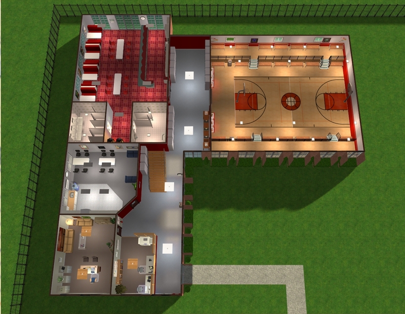
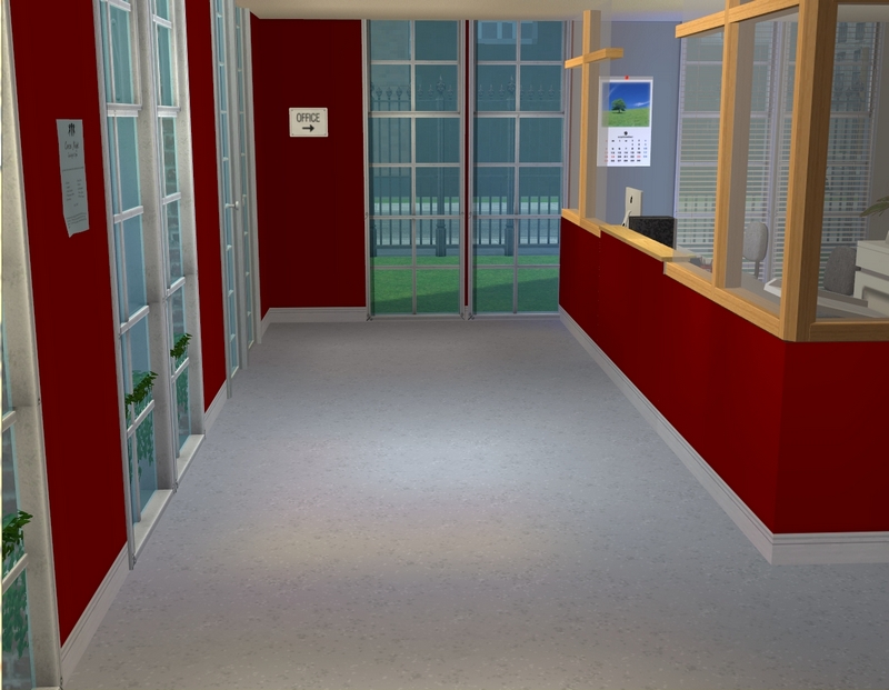
As you enter, the first thing you'll see is the admin area, where the school secretaries work.
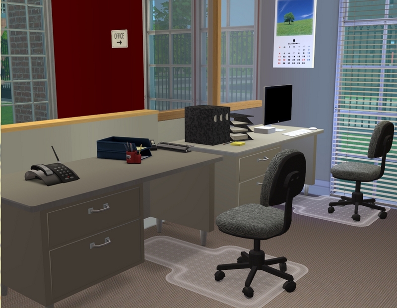
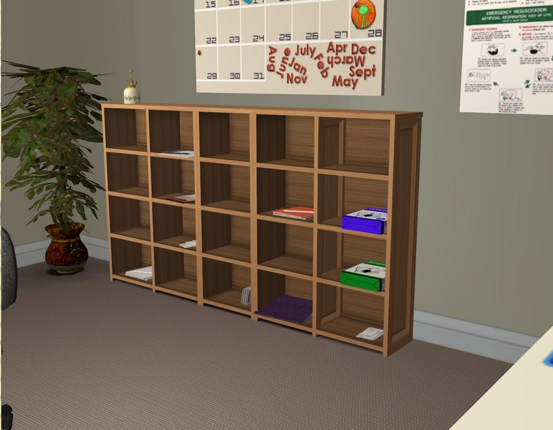
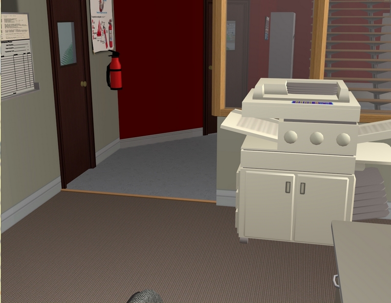
It's based loosely on the admin area of the school I work at.
That door leads right into the principal's office.
That door leads right into the principal's office.
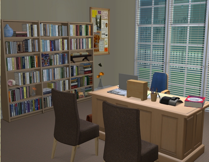
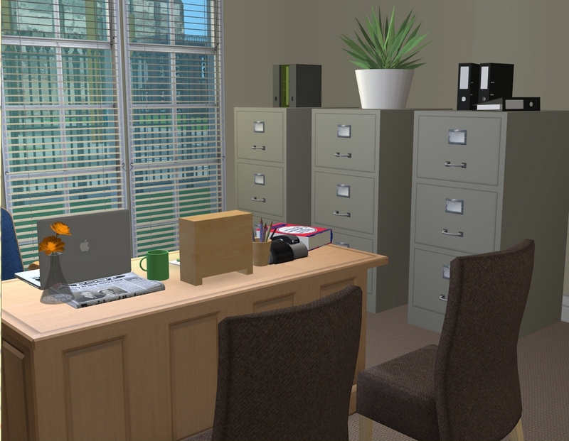
This is where Kendal will work. Sidenote but I just realised I still have not fixed that bloody floating vase!
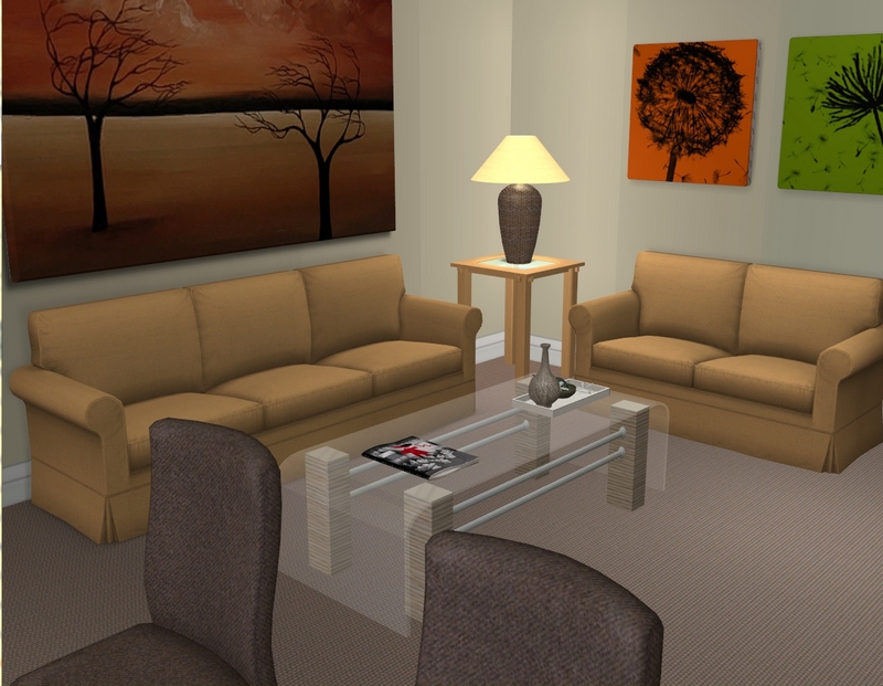
Kendal has the option of holding meetings and conferences on the comfy couches, as well as from behind her desk.
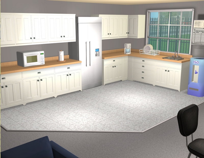
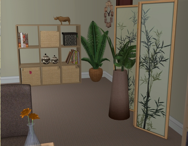
Next door to Kendal's office is the faculty lounge/staff room, where she can catch up with
the rest of the teachers.
the rest of the teachers.
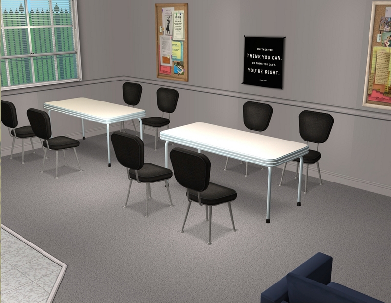
Assuming they're not on duty in the cafeteria, the teachers will eat their lunches here.
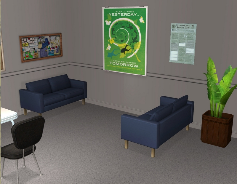
If they just want to chat or have a cup of coffee, they can sit on the couches rather than at the
tables.
tables.
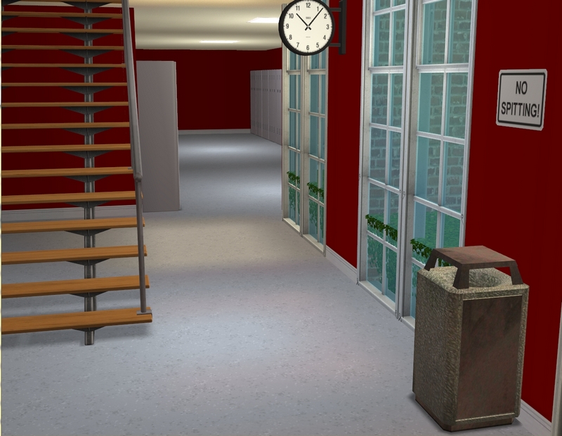
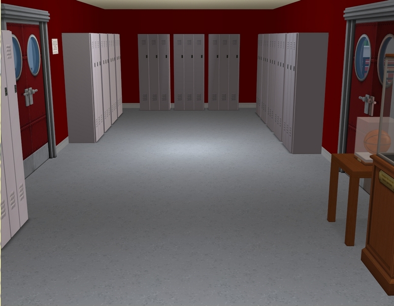
This hallway is just past the admin area and leads to the cafeteria and gym.
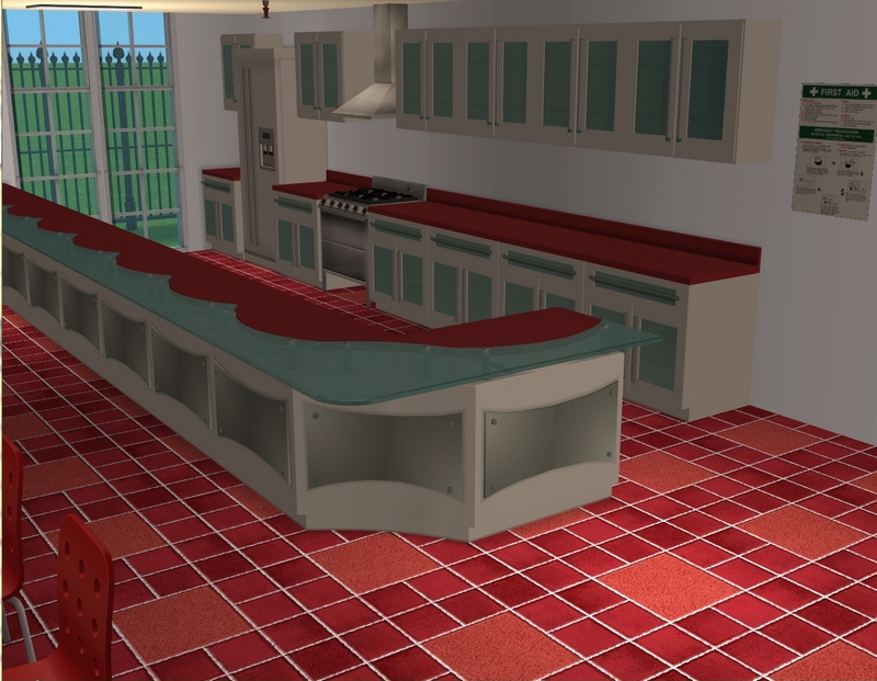
The kids need a place to eat too, of course, and they'll be in the cafeteria.
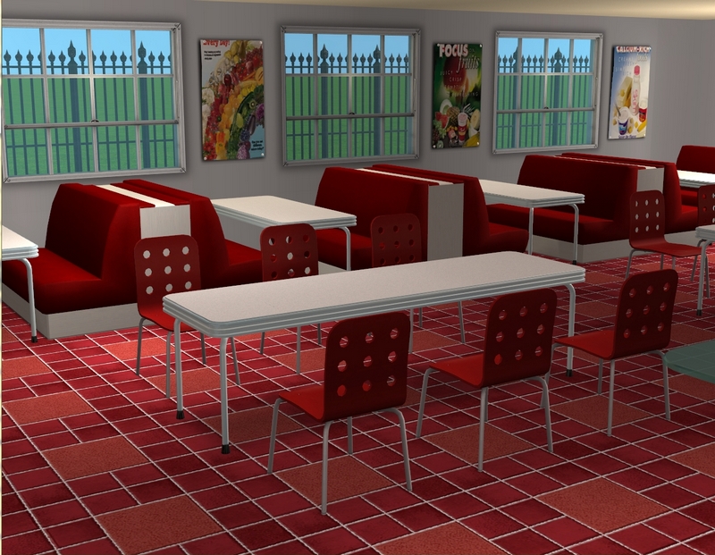
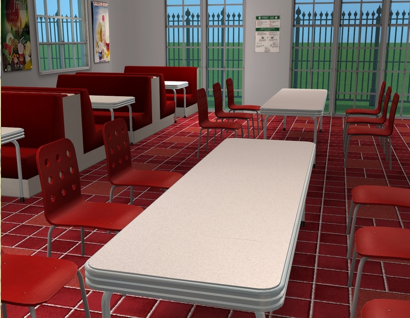
I'm still not sure about these tiles. I may change them.
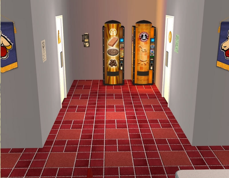
There are plenty of filling meals available for lunch but if students would rather eat junk, they
have that option too!
have that option too!
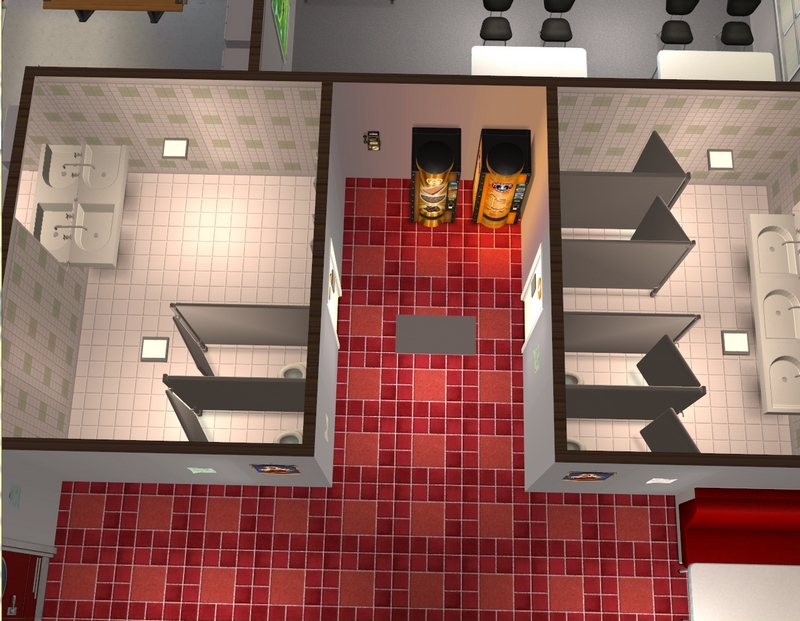
The toilets are also located in the cafeteria, though I will probably add another couple
somewhere else in the school too.
somewhere else in the school too.
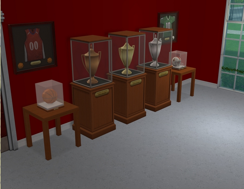
Back out to the hallway and outside the gym, there is a display of some of the sporting awards won
by Sullivan students.
by Sullivan students.
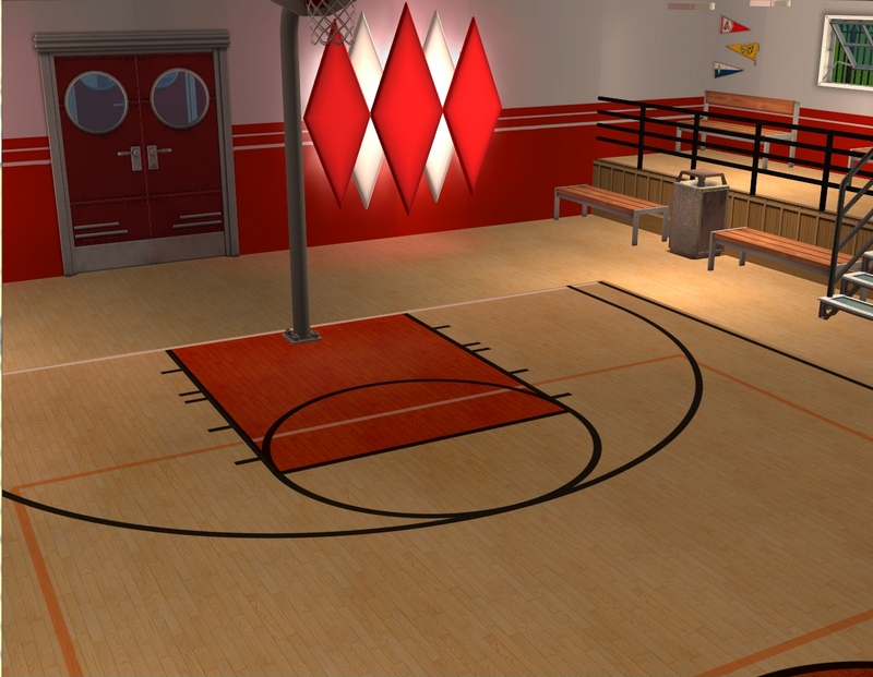
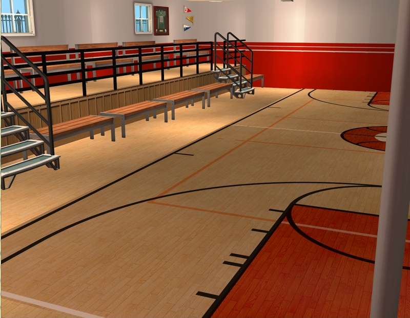
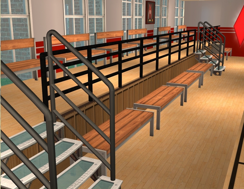
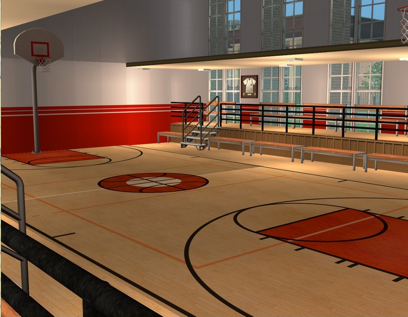
And then we have the actual gym! Don't mind the unpainted walls upstairs in the last picture. I
haven't done anything at all for the second storey but those will all be fixed up by the time I start using this lot.
Hope you enjoyed the tour!
haven't done anything at all for the second storey but those will all be fixed up by the time I start using this lot.
Hope you enjoyed the tour!
Notes:
- I'm still doing battle with Blogger's new editor. This looked fine in KompoZer and fine in the editor but the text is out of alignment in some places in the preview. Hopefully it will be fine in the published version but probably not.
- These pictures are not clickable, unfortunately. Normally, you can click my pics to get to the full-size versions but I'm still trying to figure out how to have that feature and have pictures at a custom size with this new editor. S

It looks great, love the spacious gym
ReplyDeleteI think the gym is going to be one of my favourite parts of the school. I'm really happy with how it turned out. :)
DeleteThanks for looking!
I don't know if you fixed it already or not, but clicking on the pictures does bring up a full size photo. Anyway, it looks great! I love how you worked around the absence of bleachers; and the bench seating in the cafeteria was a great idea instead of just having tables and chairs.
ReplyDeleteI changed something this morning but I hadn't checked to see if it actually worked! Glad to know it did!
DeleteI'm glad you like the school so far. I shamelessly stole the bleachers idea from Dani at Crystal Creek. ;) I will also take any excuse to use bench seating, lol. I have it in the current high school too. :)
Thanks for looking!
Yes, just wanted to say that the pics are clickable, but then saw that Caitria has already said it :-)
ReplyDeleteLove the admin area, the principal's office and the gym; the cafeteria is a bit too "red" for my taste (isn't red supposed to animate people up to the point of passion and aggression? The children won't ever calm down in there to eat their lunch, he he) ;-)
Where are the locker rooms and showers for the gym going to go?
Eh, to be honest, I rarely think about "mood" when I'm planning colours for rooms. I use green all the time for nurseries, which I've heard you're not supposed to do. I just use what I like and I think I've decided I like the red in the cafeteria.
DeleteThere won't be locker rooms for the gym. It's a huge lot already and something had to give. Seeing I wouldn't really use locker rooms, I didn't bother with them.
Thanks for looking!
I always like your lots!
ReplyDeleteI've made a high school myself, but it doesn't look as nice. But I hope practice will make perfect. (:
Can I ask where you got the file cabinets in the office? I only have one ugly file cabinet that I can't really use because it's so ugly. :/
I'm glad you like it. I've been heavily inspired by the awesome schools of some other simmers. Seeing their schools made me want to do a new one for myself.
DeleteThe filing cabinets in Kendal's office are from here. The desks I used in the admin area actually match the filing cabinets. If you poke around a bit at that blog, you should find those too. :)
Thanks for looking!
Thanks for the link, I'll be sure to check it out (:
DeleteAnd then just one last little question! My schools are residential lots because I just find it easier. When I make a community lot I've noticed that Sims from *everywhere*, even my subhoods(!), visit.. How do you avoid unwelcome guests at your school when it's a community lot?
Ah, that's really easy. I just have my principals own the school lots. That way I can keep the school closed, preventing any walk-by traffic. :)
DeleteWow, Carla, this looks really great!I love the high arched windows in the front and can't wait to see the rest of the landscaping.I like the layout and how playable your lots are---students definitely won't have trouble going from one room to the next without any twists and turns.The decorating is awesome, as always.
ReplyDeleteI have quite a bit of red in my high school as well; in fact, I have those same gym walls. I like the boldness red adds to the school, and it definitely looks great in your school.
The staff room and the administration areas add realism---I can visualize Kendall and the rest of the staff relaxing and chatting it up during their breaks.I like your school so far and can't wait to see the rest.
Ever since Buggybooz released those nooks and niches, I've been dying to use them somewhere. The arches around the windows were my first opportunity. :)
DeleteI'm hoping the school turns out to be playable! The first level should be but I haven't plotted out the other two levels, so I'm a bit worried about fitting everything in! Fingers crossed.
Yeah, I've decided I'm happy with all the red. The school colours are red and white and I wanted something a bit different in the cafeteria. I used white flooring in the primary cafeteria, so I mixed it up a bit. So glad you like the school so far!
Thanks for looking!
The lot looks great so far! I'm in the process of rebuilding my high school as well. It's a sloooow process since I'm busy with other things, but I'm hoping to have it done soon. Not sure when I'll have a post to share or not. But at least I'm keeping busy. LOL
ReplyDeleteEven if you're not busy with other things, doing a lot like this is such a long process! You've got to have the time, as well as the inclination to work on it.
DeleteBut I'm glad you like it so far. Looking forward to seeing your lot too, when you get it done!
Thanks for looking!
I keep thinking I should stop reading Sullivan you have way too many great ideas that I want in my game as well! I'm already thinking about redoing my high school, which really suits its purpose just fine at the moment - and it's all because of you - lol!
ReplyDeleteI do love Sullivan too much though to ever consider stop reading it!
It looks great Carla! I can't wait to see more of it, and to see your students attending here!
It's all just perfect both the exterior and the interior! And I can't wait to see the classrooms!
I never thought about adding a staff room but it makes perfect sense, it's all so real!
Great job, Carla, as always!!
Ha, I know exactly what you mean, because it was looking at other people's awesome schools that made me want to redo mine in the first place! The current one still fits all my students with no issues but there are features other schools have that I was getting a little jealous of. ;)
DeleteI'm glad you like it! I'm quite keen to get it finished and see how it looks with all the students and teachers on the lot. :)
Thanks for reading and commenting!
Wow! This looks amazing, Carla! I love all the red. Is it just me, or do schools primarily use red or yellows? Any school I've ever attended has been one or the other. I wonder why.
ReplyDeleteI can't wait to see this in action!
So glad you like it all! I'm pretty keen to get it all going and watch my sims use it too. :)
DeleteAs for school colours, I don't know. The big school colour seems to be blue here, actually (the school I teach at uses maroon and blue)! All the schools I attended used blue in some capacity and almost every single primary school has the same blue shirt/grey pants or shorts uniform for boys, no matter what colours the girls are in. But I've obviously got something in my mind telling me "red = school", so I must have picked it up from movies or TV!
Thanks for reading and commenting!
Looks amazing! I really like all the teacher areas! I want to add some to my Grammar School (and eventually High School) now that I have a lot more of my sims working at these schools. Love what you have done with this! It all looks great, and I can't wait to see the rest of it, and Kendal's office is awesome!! Looking forward to seeing it in action!
ReplyDeleteGlad you like it! Your high school was one of the ones that inspired me. :)
DeleteI don't know how much I'll use the teacher areas but I'm happy I've got them there, if I do decide to use them. The principal's office will get a work-out, I'm sure. I mean, Ruby is a student at Sullivan High now. ;)
Thanks for reading and commenting!
Thank you, it is really azaming for getting new ideas interms of school decoration.
ReplyDeleteGlad you enjoyed the tour. Unfortunately, I never got to finish this lot as my game started crashing pretty badly while I was building it and I started my hood over. I'll have to copy it in my new game some day.
DeleteThanks for reading and commenting!