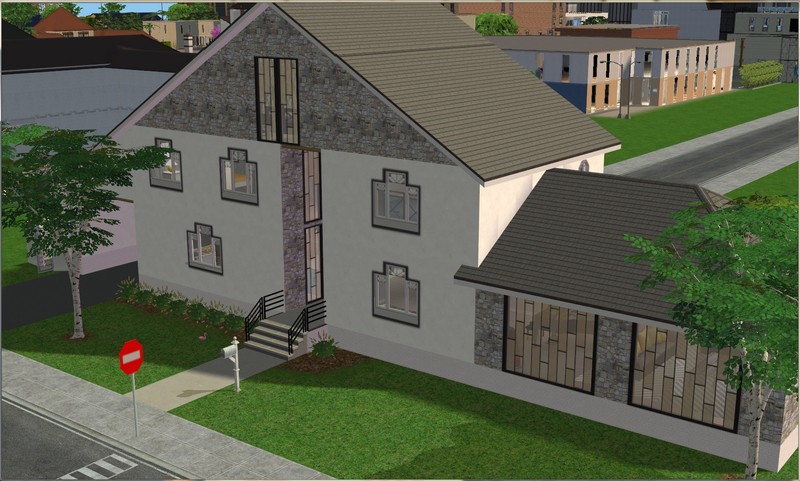
This is a TS2 rebuild of a TS3 house from (I think?) Sunset Valley by Danie. I'm still not totally pleased with the window placement at the front but it's okay inside, so I'm living with it!
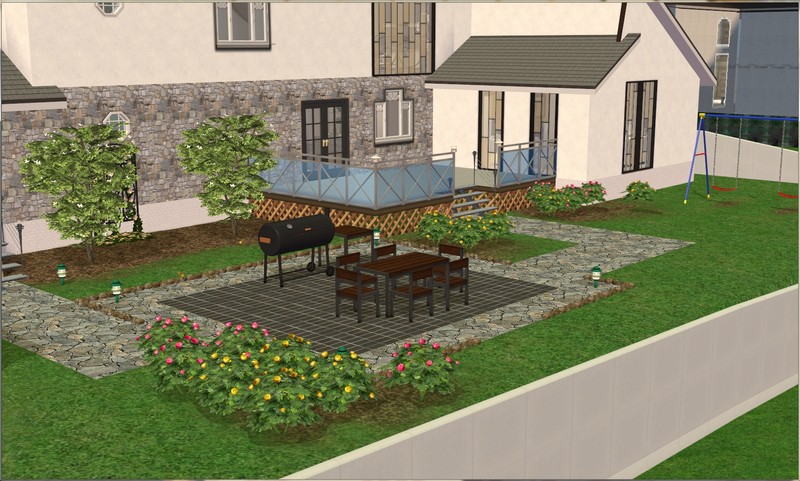
Not a ton changed in the backyard. Just the fences, flooring and outdoor dining set, I think.
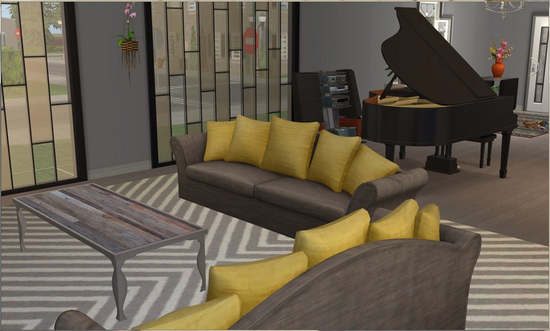
I decided to haul the grand piano over from the old house. It was white there, so let's say that it's been repainted.
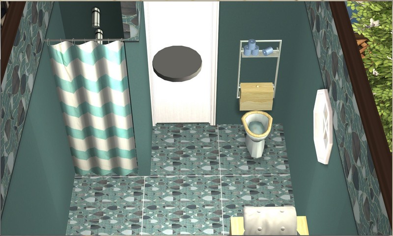
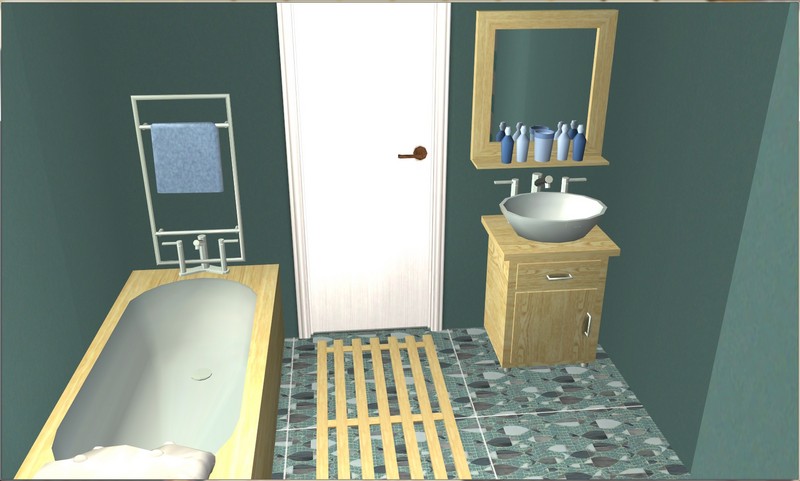
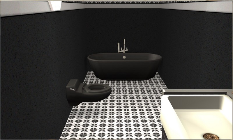
This is one of three bathrooms that is basically identical.

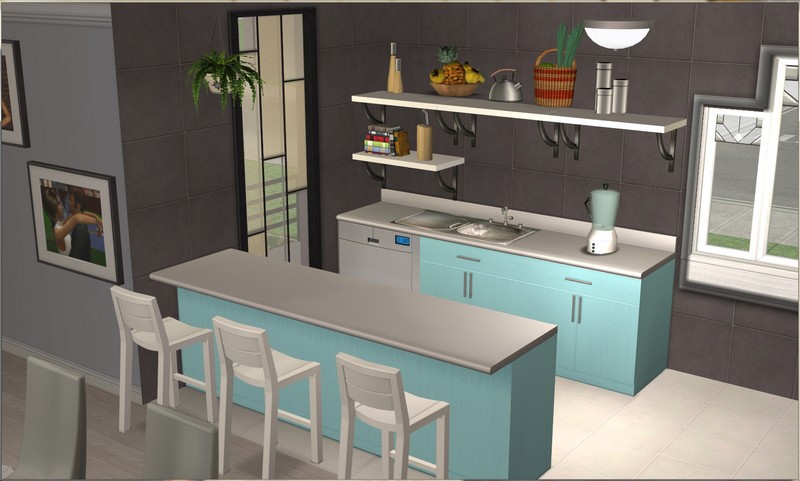
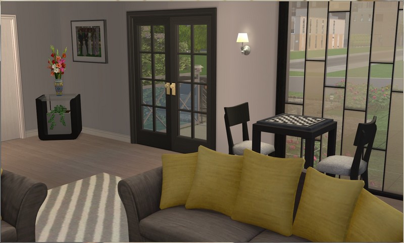
The dining/kitchen area.
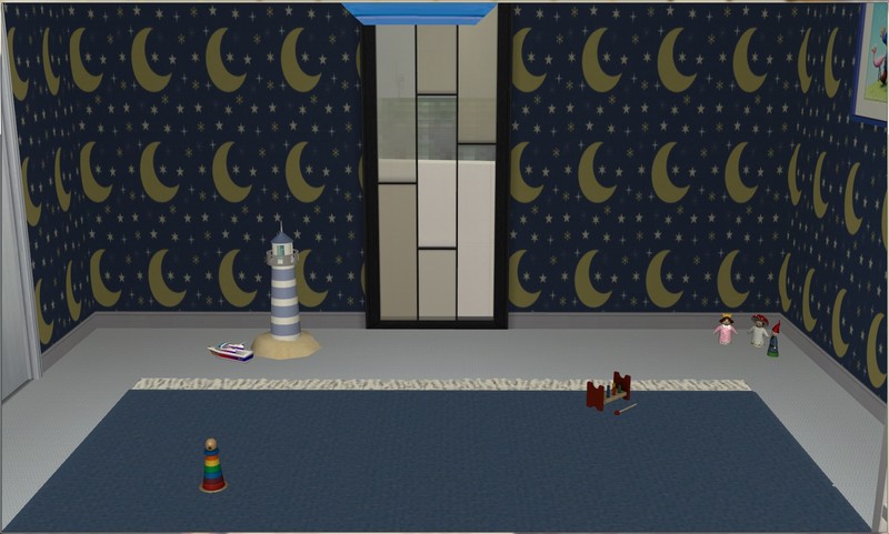
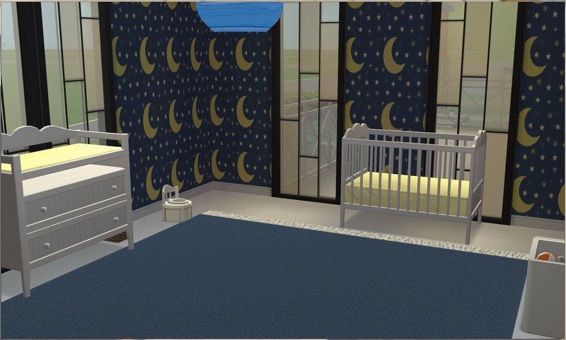
Nursery for the new baby. I'm not entirely sure the stuff against one of the walls will be functional (I was getting "ceiling is too low" pop-ups), so I didn't put anything important there!
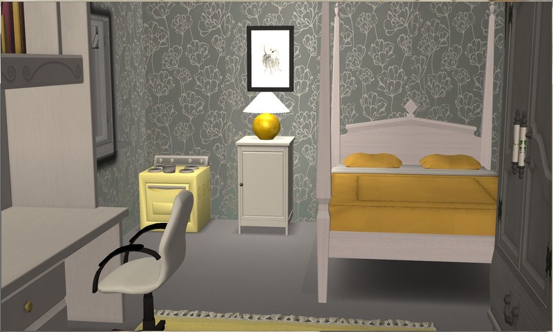
Phoebe's new bedroom. She's so close to teen (11 next game year), so it's a bit more mature than what I'd otherwise design for a little girl.

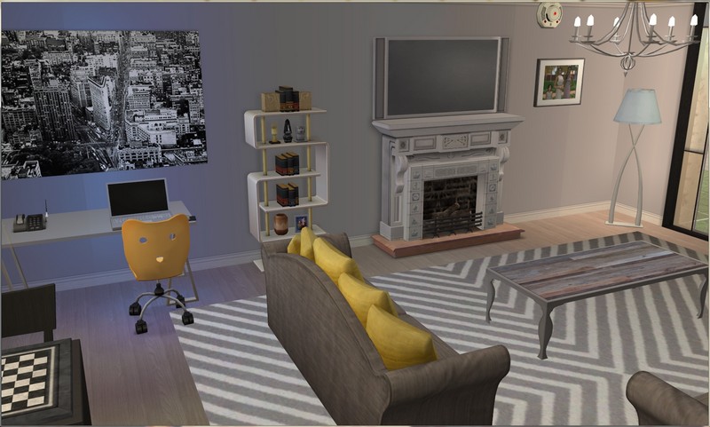
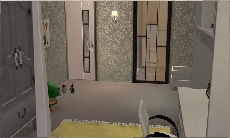
Miles gets his study back! It was more of a nook in the old house.
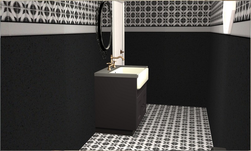
Miles and Matilda's ensuite.
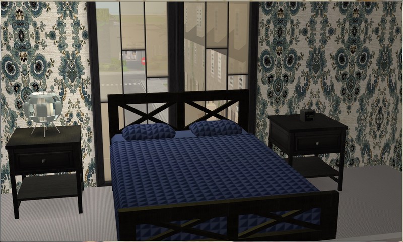
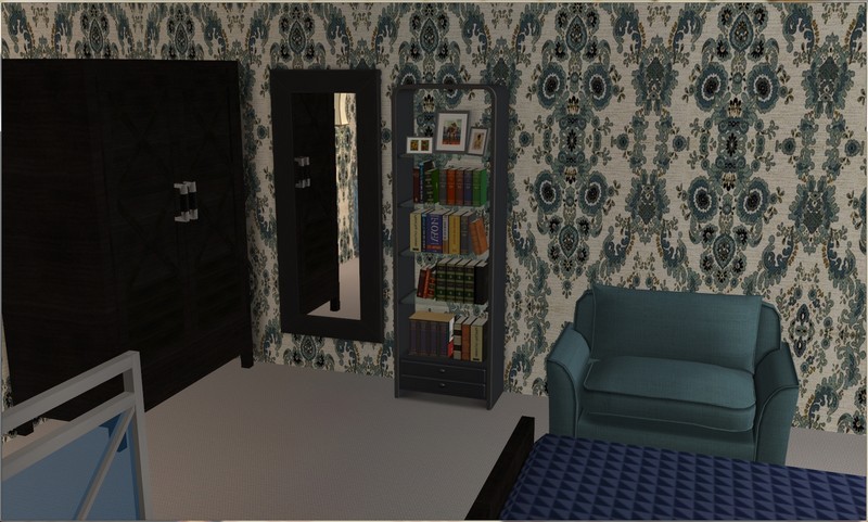
And finally, Miles and Matilda's bedroom!
I had lots of fun decorating this place. I got into such a groove with it and finished it much more quickly that I thought I was going to. Hope you all enjoyed looking!
Yellow and grey are my favourite colour combination - therefore, you can imagine I love this place! Also, light blue/turquoise/aquamarine/teal shades feature high up on my list of favourites. The look is both modern and cosy at the same time, stylish and homely.
ReplyDeleteIt's a favourite colour combination of mine too. :) I'm glad you like the house and the colour choices.
DeleteThanks for looking and commenting!
Looks awesome, so modern! Love the entry, lounge and dinning rooms!
ReplyDeleteI really like the two types of windows you have used, they match nicely together and with the decor theme of the house. Just an idea have you tried placing a couple of the taller/thinner windows at the front of the house either on the first or second floor. I think they would look quite nice. :)
Glad you like it! Modern seems to suit this family.
DeleteDo you mean the area on the left, specifically? I ask because I actually played around with the windows a LOT with this house and never got a look I was 100% happy with in that area. It just always looked weird! I don't think I tried the longer windows there, because the lower floor is the kitchen and the counters are against that wall. Above is potentially a good idea though, so I may play around with that!
Thanks for looking and commenting!
Yep the area on the left! Sorry I wasn't very specific. Totally understand about the longer windows not working due to the kitchen counters being on that wall. So annoying when that happens! Hope you find something that works and that you're happy with. :)
DeleteMe too! Thanks for the suggestion!
DeleteThis is so pretty. The black and taupe/gray and white and that punch of yellow are wonderful. The ensuite is really striking (those tiles in the bath!), and I like your choice of aqua (is that aqua?) for the kitchen. How totally unexpected. It's larger on the inside than it looks like it would be on the outside. The exterior is different - the different roof slopes and the somewhat severe shape - but the windows are really perfect and pull it all together. Great place!
ReplyDeleteYou're totally right about the size. I was really surprised when I loaded the lot, because the last five or six I'd looked at didn't seem large enough for what I think this family would have. And I'm always looking for an opportunity to inject some colour into a kitchen, a room that is usually more neutral. :)
DeleteThanks for looking and commenting!
Love their house! It is spacious for them, and Miles having his own space/office, is so nice when you're about to have a baby. All of the bedrooms and nursery are very nice too. I'm excited for this new baby, I never thought they'd have more. The living and kitchen areas are my absolute favorite. Add me to the grey and yellow group, it's my dining room theme since forever. Everything looks great for them, I'm glad to hear you've got your power back on, I can't believe how long it took. The bush fires are horrible, they've been all over our news, and I can't imagine how it'd feel to live near to it, and see so much country consumed. I hope they are contained soon and the fires start dwindling.
ReplyDeleteI'm happy with the amount of space, because the last house was surprisingly unspacious, considering the actual size of the lot was not that small.
DeleteMatilda's really borderline for sims being able to conceive easily, so I'm glad she was able to get pregnant with this new one! I promised myself I wouldn't let them use fertility treatments or "cheat" in any way and as it turned out, I didn't have to.
Today was supposed to be a bad day for the fires but in Sydney, it's been fine. No new fires that I know of (some may have popped up and been extinguished before I saw them) and the ones that are still burning are under control or on the way there. The really terrible fires are much further south than Sydney. We are safe but we get a lot of smoke blowing up and the air quality has been awful on many days since the beginning of summer. What we all need is a really good dumping of rain. That's the only thing that is going to put some of these fires out.
Thanks for looking and commenting!