I can hardly believe it but I'm finished my hospital! I wish I knew how long I'd been working on it but I didn't think to note it down. For my next project, I think I'll add my start date to the lot description, so I can keep track. :)
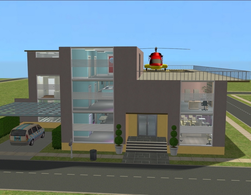
Anyway, here is the exterior! There are still some changes I might make, like painting that big blank grey spot in the middle yellow and maybe adding some edging around the roof but for now, I'm calling it done.
I didn't do layout shots, because they're really not that interesting. On the first and second storeys, there's a long hallway with square/rectangular rooms on either side and that's it. At the top, it's really just one big room.
Part of the hallway on the first floor. I like that one of my tester sims decided to use the elevator at that exact time. I don't know why but I just thought it was cool to see one of the elevators open!
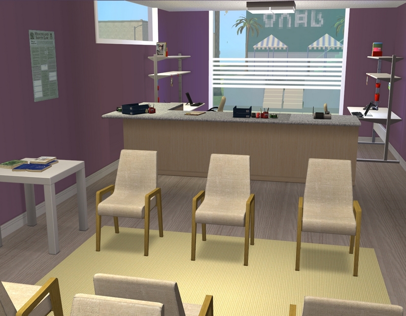
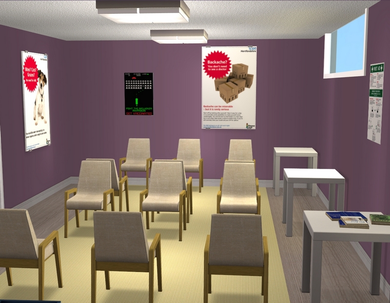
If you follow me on Tumblr or hang out at N99, you may have seen the first version of my reception area. Since then though, I've made some changes. The first was that I thought the whole hospital was way too big (it still is but it's an improvement) so I shrunk the whole thing by one tile width all the way around the perimeter. The second is that I found some more hospital posters, so I've added them. The posters you see in this hospital are a mix of my own and various ones I've downloaded.
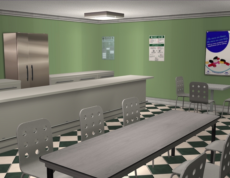
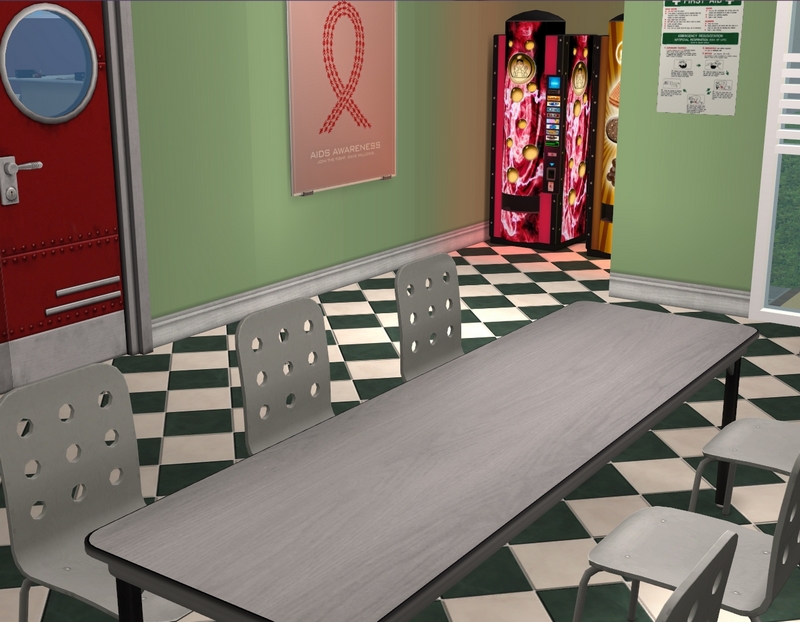
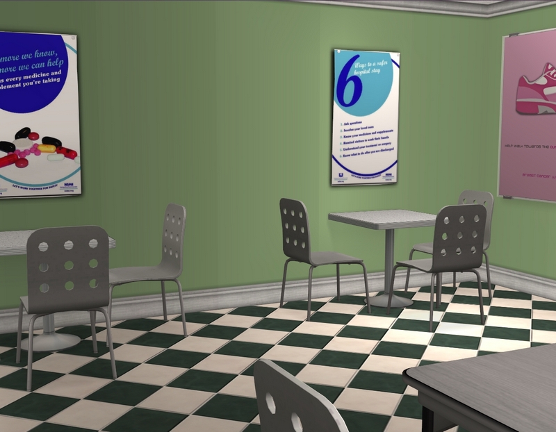
The cafeteria. Not pictured: the chip bags my tester sims are leaving all over the place!
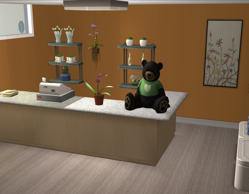
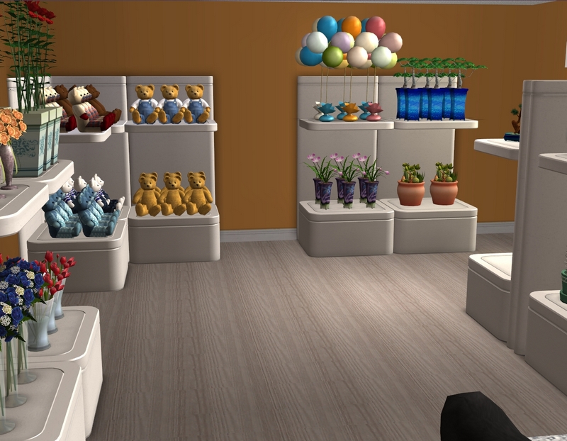
The gift shop. I still need to add the postcard and greeting card racks.
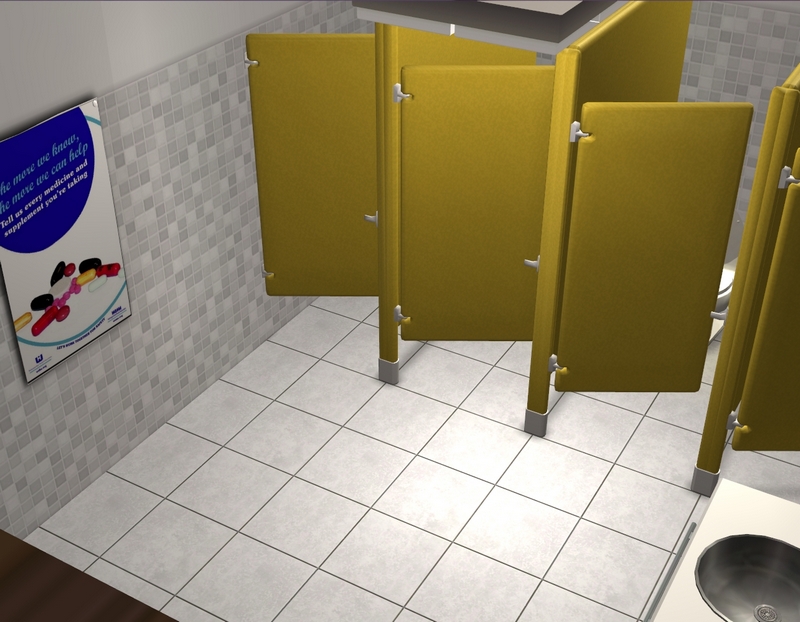
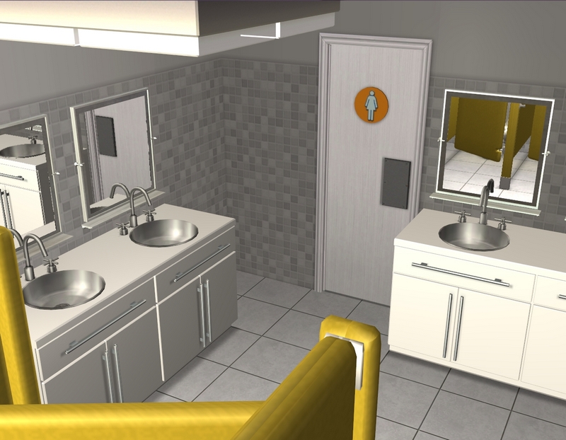
One of the public bathrooms.
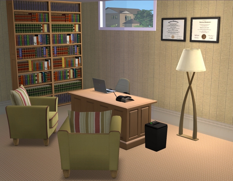
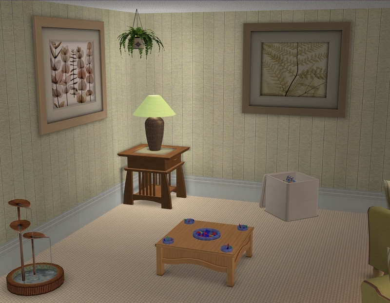
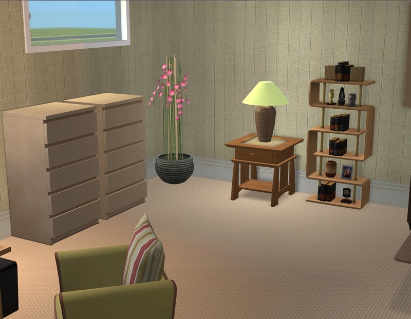
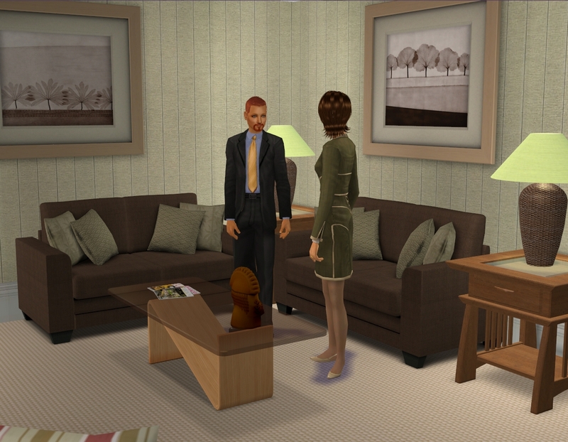
The counsellor's office, which looks very similar to my last one. That was my favourite room in the hospital, so I was heavily inspired by myself here, lol! Excuse my tester sims. ;)
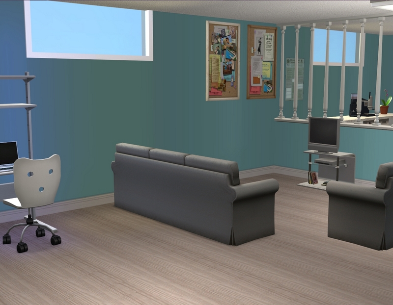
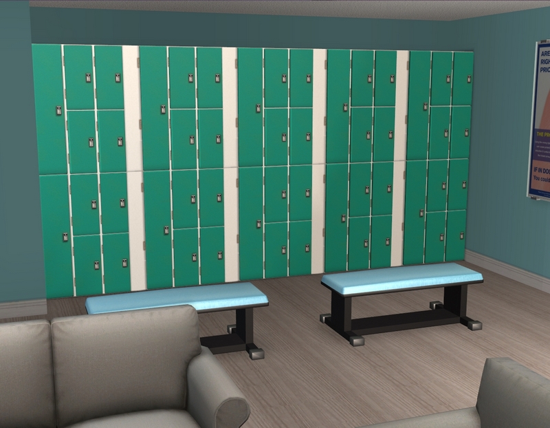
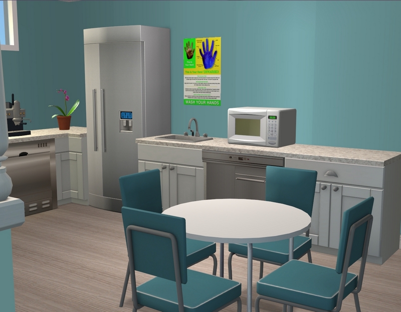
Staff breakroom, which I've just decided needs a couple more posters.
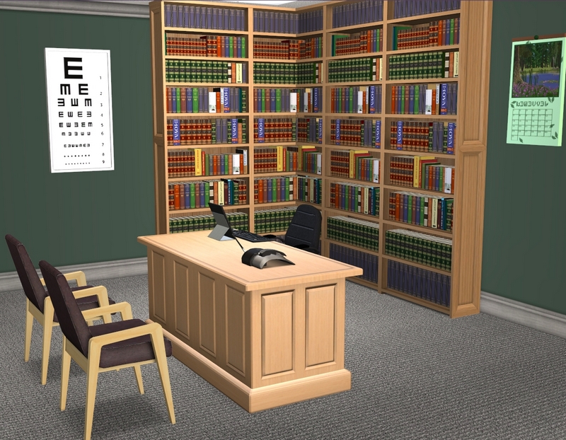
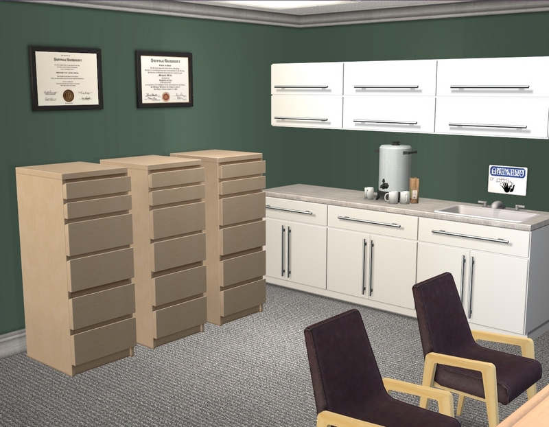
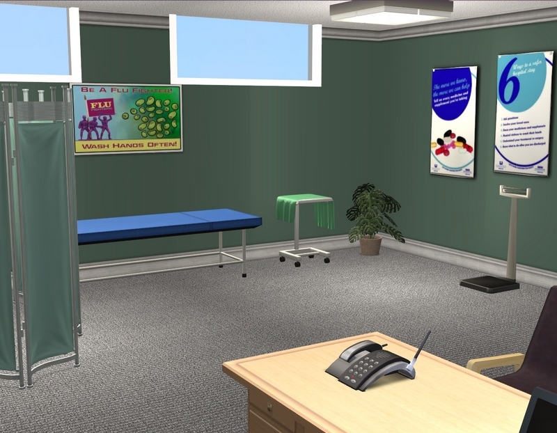
The GP's office. Josie Clarke is my GP, so this is where she'll work most of the time.
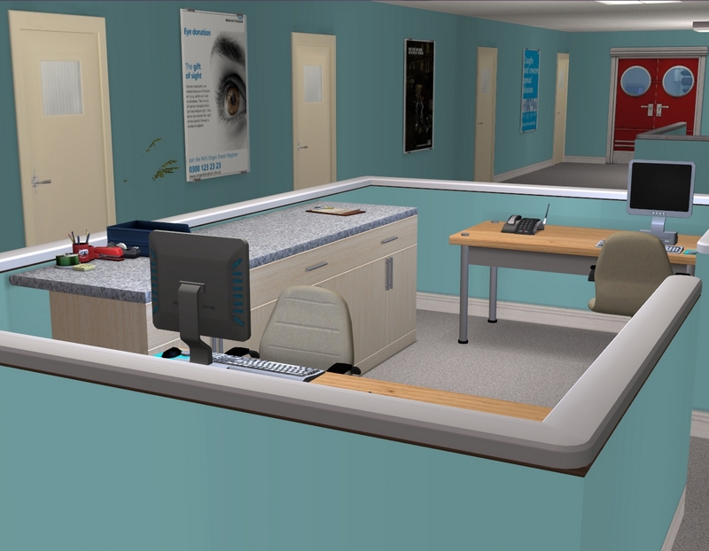
Mini reception area/nurse's station on the second floor.
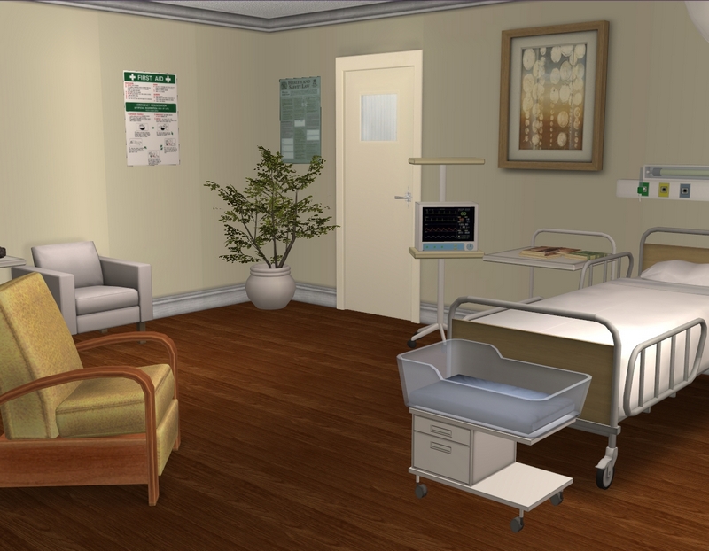
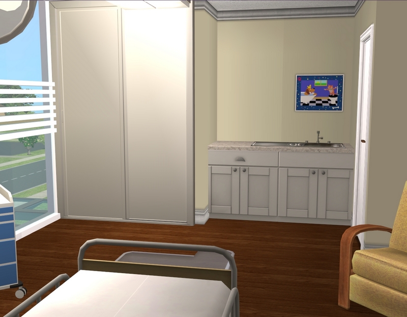
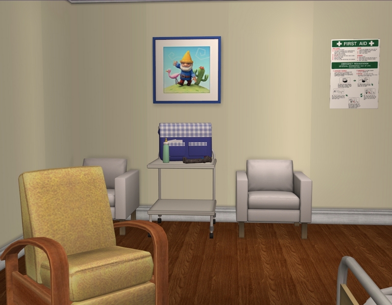
Birthing suite, which is one of my favourite rooms.
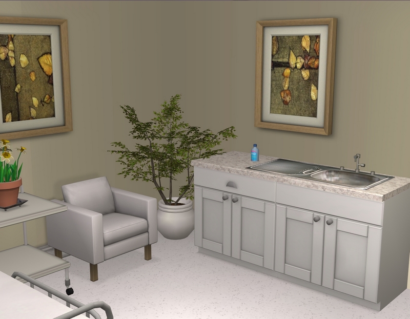
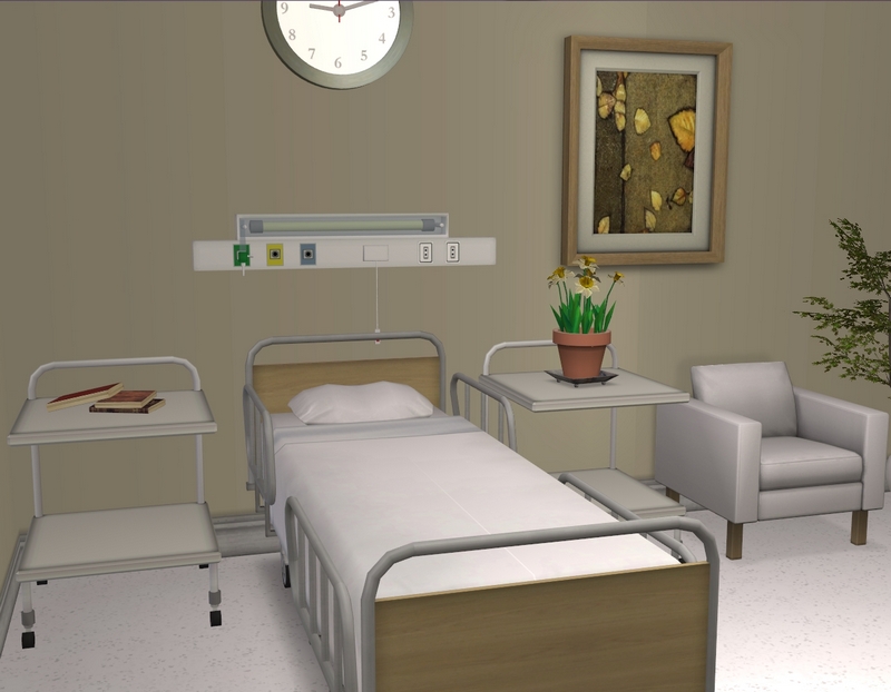
Standard patient room. I had two in my last hospital and it was completely pointless.
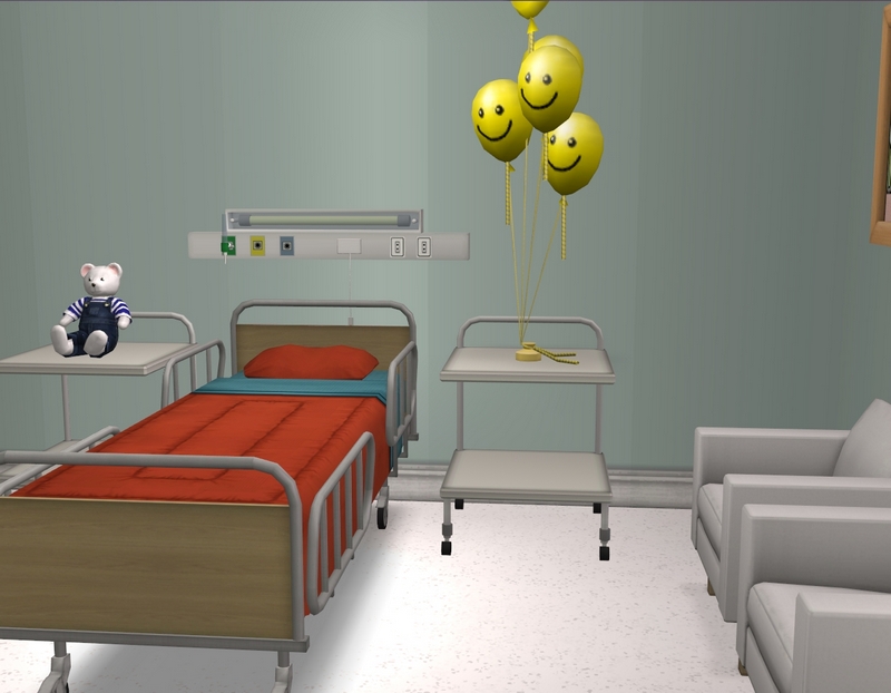
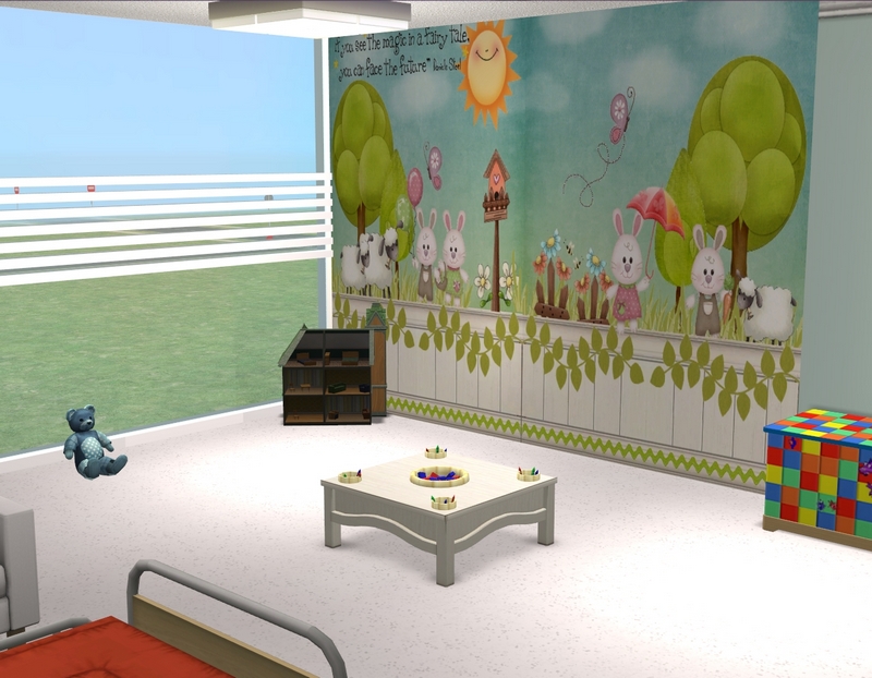
Instead, this time I have a standard patient room and a child patient room. :) I'll probably add some kind of rug in the play area.
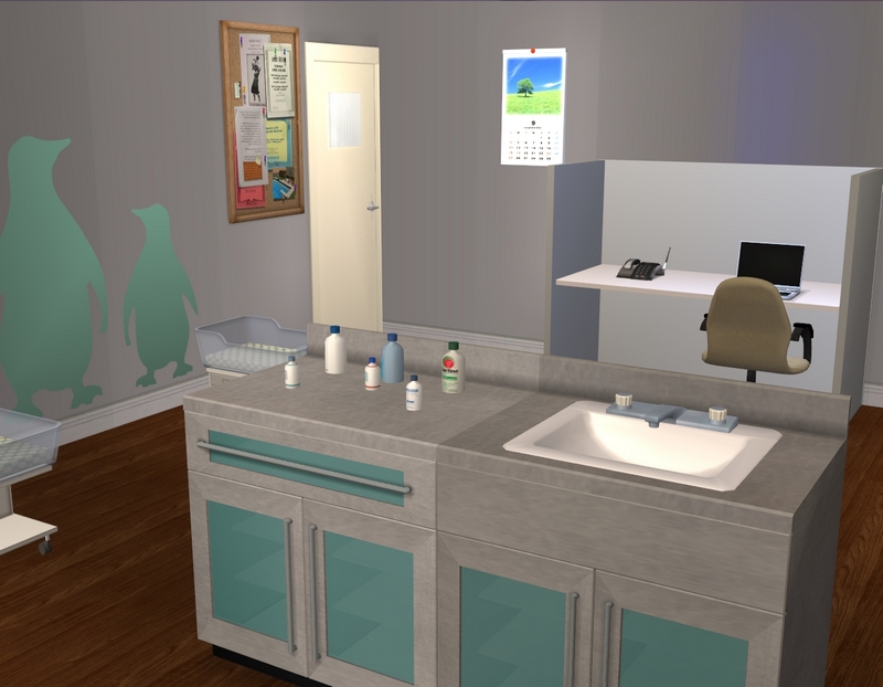
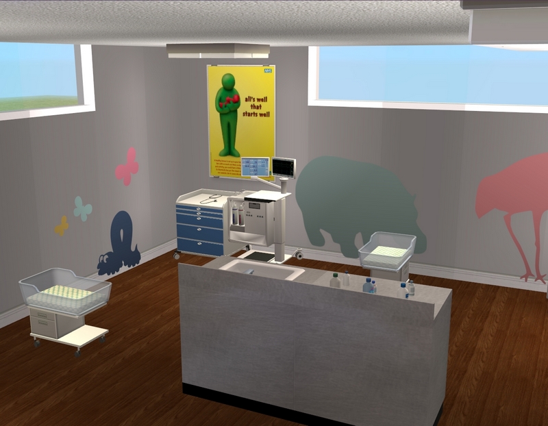
The nursery. I'm considering swapping those cribs out for some that sit slightly higher but I haven't made up my mind yet.
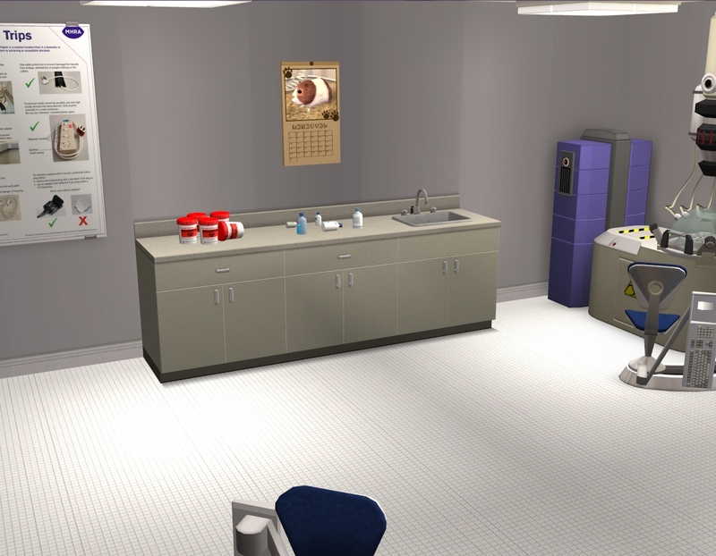
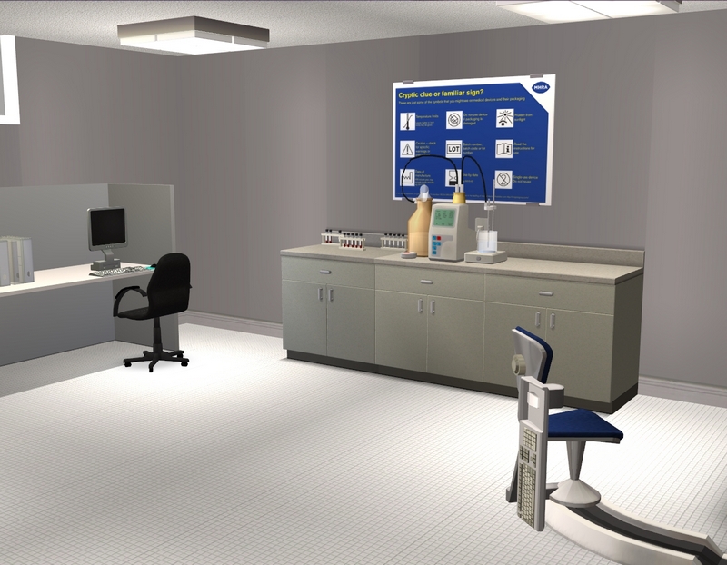
Laboratory.
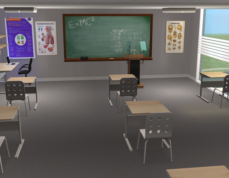
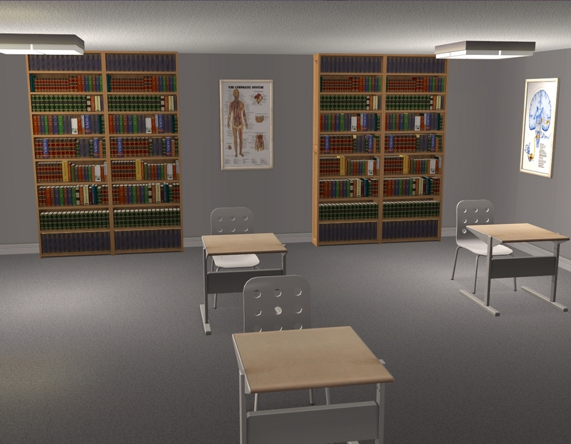
Classroom for my med students, which is basically identical to my last classroom, I think!
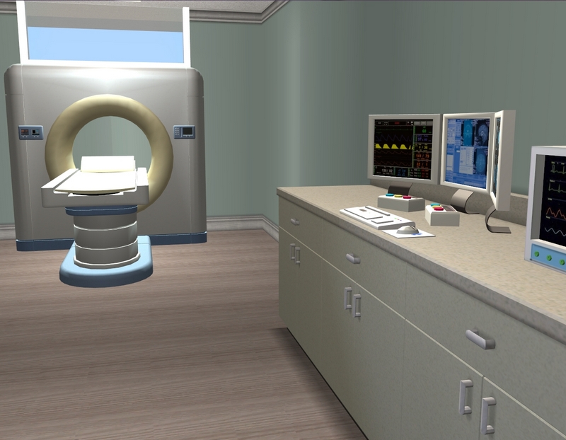
MRI room, which I decided was way too big and split in half.
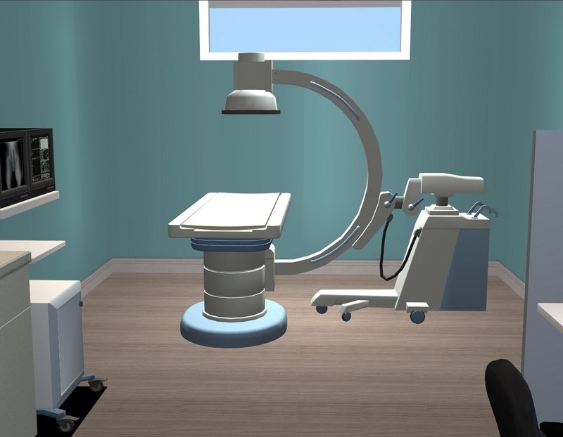
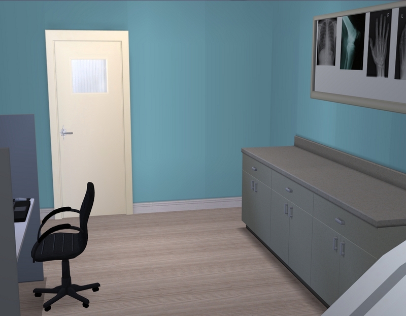
The other half is now the X-ray room.
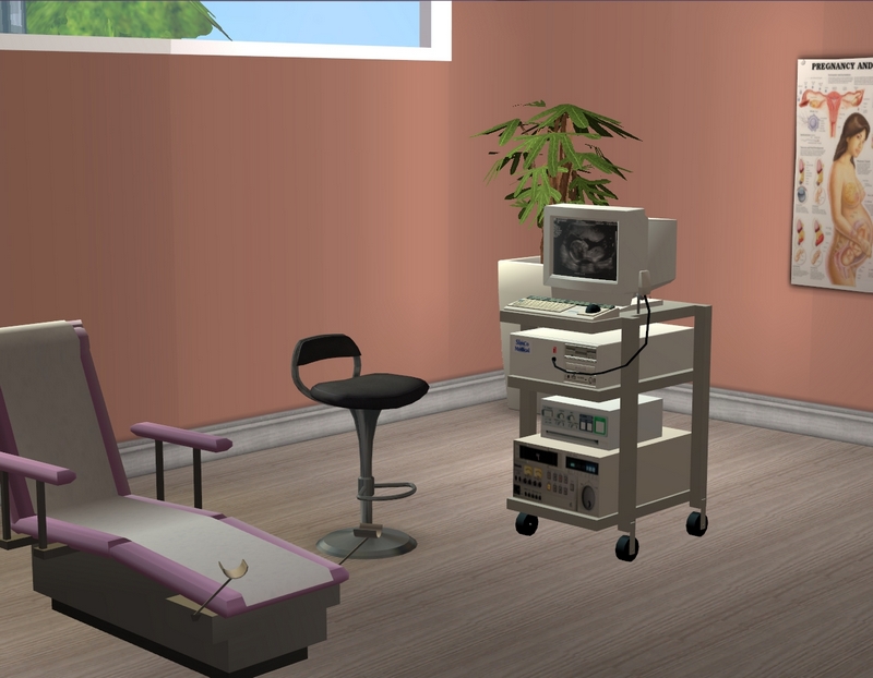
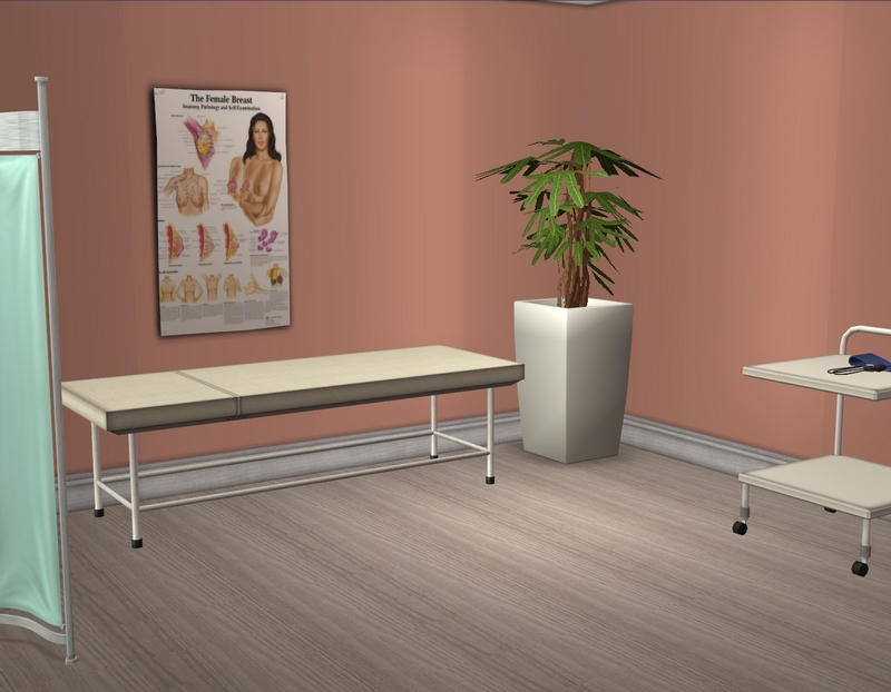
Ultrasounds, which Cara Moretti will probably see a lot of.
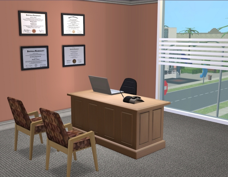
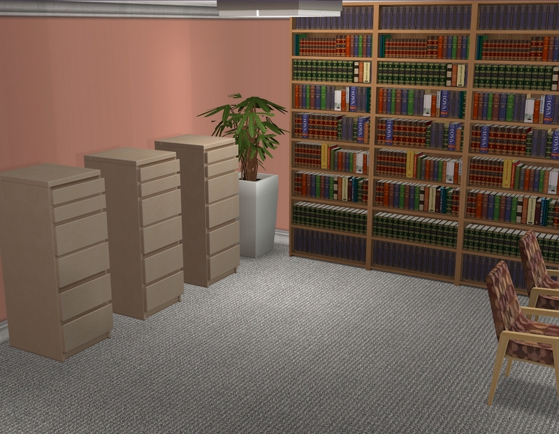
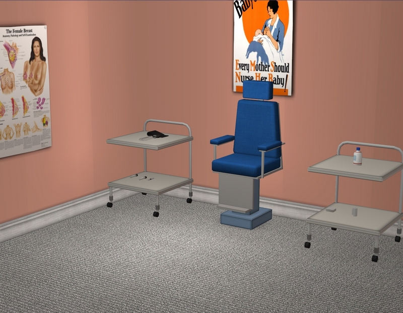
As the OB-GYN, this is Cara's office. Forgot to swap that chair out for the one with the stirrups! Even though I've never seen one of those chairs in real life, it seems wrong not to have it in game, somehow.
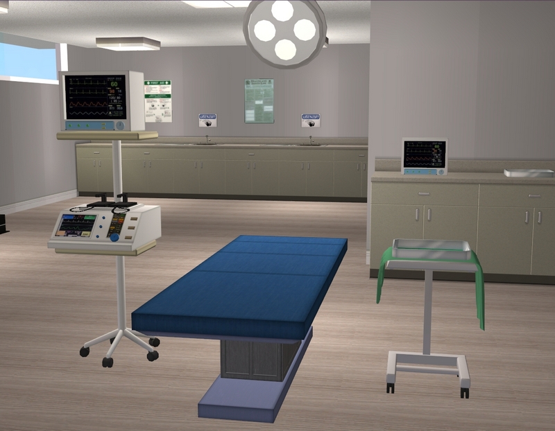
Upstairs on the third floor is the operating theatre. I'm not sure how often I'll use it but what kind of hospital doesn't have an operating theatre? I had to have one!
Hope you enjoyed the tour! I'm hoping to play my college girls on either Friday or Sunday and then get an update out for you soon after. :)

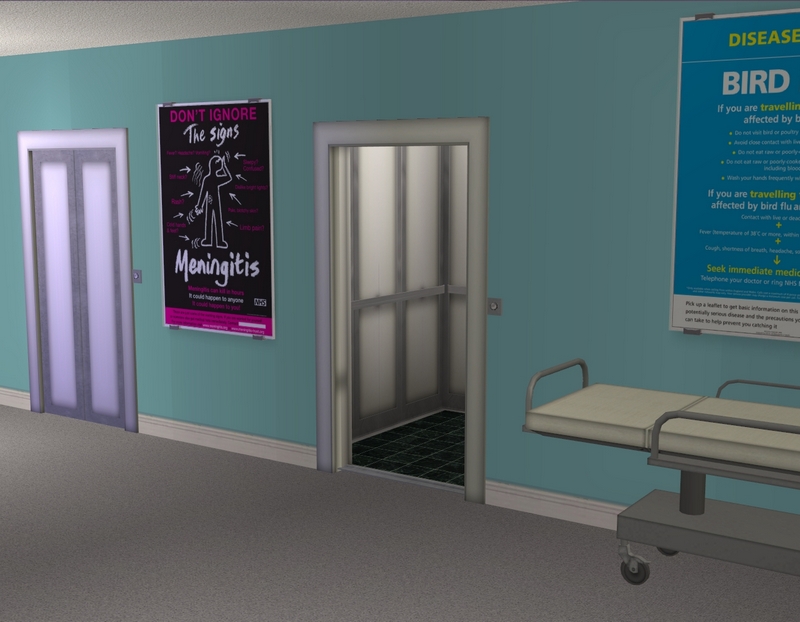
Carla, this is such a great back drop for all your stories to play out. It looks great! The open elevator looks just like when you are in a real hospital, but you don’t usually catch it open in Sims 2 unless you have a tester or other sim about. You mentioned cutting down the size by a tile; I find that I tend to make my community lots too big to begin with many times. The cafeteria looks very institutional and hospital-like. I also loved your counselor’s office in the other Sullivan, so I’m so glad to see it look similar. The staff breakroom looks great; that’s not an area I thought about when building my Sims 2 hospital, but one where a lot might take place for sims that work there so I’m going to keep that in mind for future hospitals! The GP’s office looks great and I can just picture Josie Clarke there! Having one child room and one general room is a great idea; I think I had to keep redecorating my hospital room that wasn’t a birthing suite depending on what was going on.
ReplyDeleteGlad you like it! I've had the birthing suite done for a while now and have used reception and the GP's office on the blog before but I'm excited to start doing some other kinds of scenes in here now. I've had a bit of drama between my doctors in the past (specifically Josie and Cara) and it's far more professional to confine that stuff to the break room. ;)
DeleteSo glad I'm not the only one with size issues with community lots! Mine are always way too big. Really just happy this lot is finally done!
Thanks for looking and commenting!
Ha, more professional to have drama in the break room!
DeleteI guess no drama at all would be the most professional but some of my sims can't help themselves! ;)
DeleteThis is awesome! So much detail and so many cool pieces of cc to make it look realistic! I love the posters, they really add that extra bit of hospital-ness. lol ;) Great job, oh and I love the chopper on the rood too!
ReplyDeleteI have to give so much credit to all the awesome CC makers. I think a lot of what makes this hospital what it is is the stuff I used, rather than any particular design talent of mine! I'm really happy with it.
DeleteGlad you like the chopper! I can't remember if I have a helipad under it, now that I'm thinking about it. My last hospital had a helipad and no helicopter, lol!
Thanks for looking and commenting!
It's great!! If I were you, I wouldn't put a rug down in the children's play area. I just can't imagine a real hospital sporting rugs anywhere - they are too unhgyienic and need too much care and cleaning.
ReplyDeleteI like the gift shop! Are you going to put a magazine rack there, too? So far, in every hospital I've ever been to, magazines were one of the most bought articles.
You definitely have a point about the rugs! I think you're right. I've been thinking about it and I will probably experiment with some coloured tiles instead, just to brighten things up a little bit. A magazine rack would be a great addition too. The gift shop is quite small though, so I'll have to see if I can fit one in!
DeleteThanks for looking and commenting!
It's really nice, love your addition of a children's patient room
ReplyDeleteGlad you like it! I've never found a need for a children's hospital room before but I figure if I ever do, I'll be glad I have one. :)
DeleteThanks for looking and commenting!
It looks awesome! I really like the child patient room. And now I want to re-build my hospital OMG ;).
ReplyDeleteBefore I gave up on Sullivan 1.0, I was seriously reconsidering rebuilding that hospital, because I'd seen so many more awesome ones since I built it, lol. Looking at lot tours can be so dangerous! So glad you like mine. :)
DeleteThanks for looking and commenting!
This looks great! Glad you got it finished, I'm sure that feels like a huge accomplishment! Looking forward to your medical staff breaking in the hospital. So much awesome!!
ReplyDeleteI am so, so happy I have it finished! Definitely my biggest accomplishment with Sullivan 2.0 so far. Now to start on my next project. ;)
DeleteThanks for looking and commenting!
At my real-life Ob/Gyn's office the exam chairs look normal but have stirrups that can sort of pull/flip out from the bottom part. So you can totally leave your regular chair if you want. :)
ReplyDelete(When you think about it, perma-stirrups would be kind of in the way. When I was pregnant 90% of the time I spent in the exam chair just involved listening to the baby's heartbeat, feeling for his position, measuring my belly, that sort of thing. No stirrups involved.)
Yeah, it would make sense for the stirrups to be more of a flip-out sort of set-up. Still, I don't love that chair (the colour, mainly), so I may still look around for something else. :)
DeleteThanks for looking and commenting!
I just came across this post when I was looking for a hospital, I don't think I've ever been so smitten than by this one! I was wondering if it's up for download? Or if you have a Floorplan & links to the cc content so I could take some inspiration if you don't mind? I'm absolutely In looove 🤩
ReplyDeleteHi! Glad you like my hospital. :)
DeleteThis is not up for download. It's a huge amount of work to safely and conveniently offer a lot for download and it's not something I often feel like bothering with! And now that this is a residential lot with sims living in it, it's *definitely* not safe to share as is!
I don't have floorplan pics but I do have a fairly extensive Pinterest where I've catalogued my downloads. I also have a finds blog, though the Pinterest would have more of the hospital stuff at the moment (I have a board specifically for medical CC).
https://www.pinterest.com.au/sullivansims/_saved/
https://sullivanfinds.blogspot.com/
Thanks for looking and commenting!