I have once again been sick. It's just that time of year here in Australia but I seem to have been hit especially hard this time! I was really only well for as long as it took me to do the last update before getting sick again. But I have been decorating, at least, so I'm bringing you another lot tour.
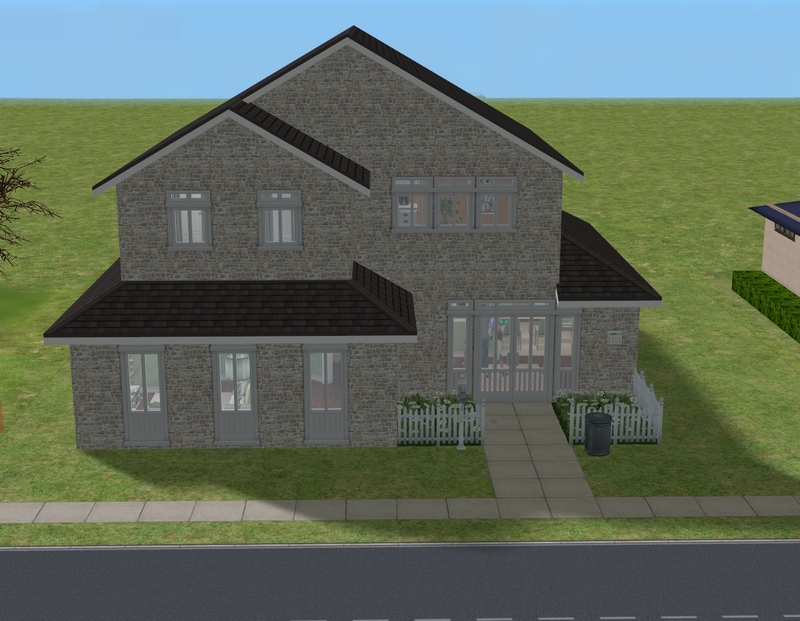
Here is Ethan and Maia's new house, which is one of the December Lane lots - #4, to be exact. I haven't included layout pics, as there are layout pics at the link.
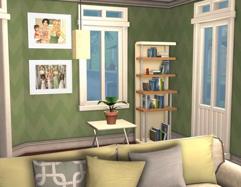
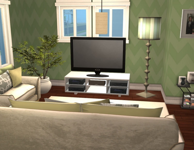
The living room, which is a little larger than it looks here.
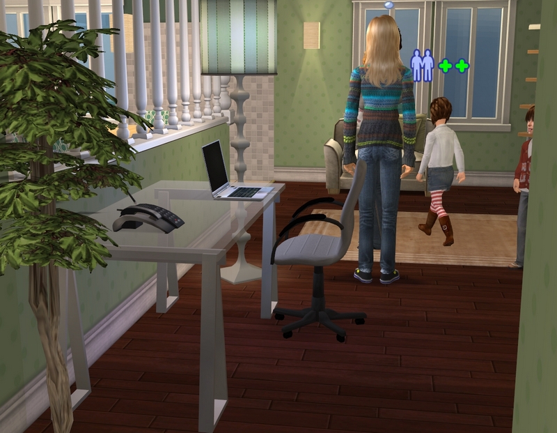
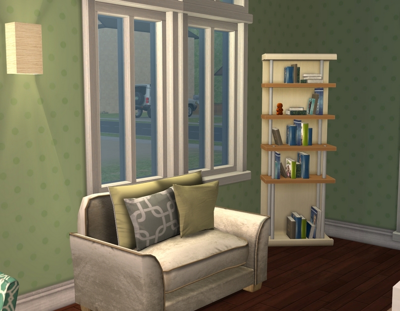
The study that's not really a study. It's really the entrance to the house but it's too big to just use as an entrance and too small for a living room!
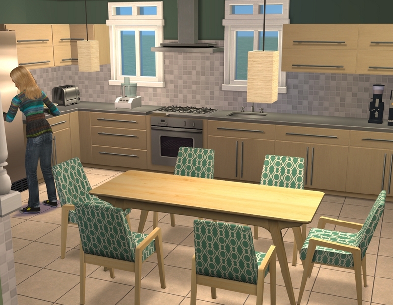
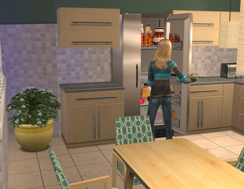
The kitchen, which I really love.
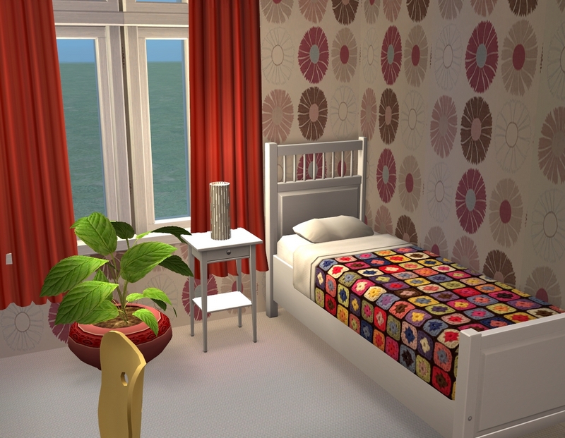
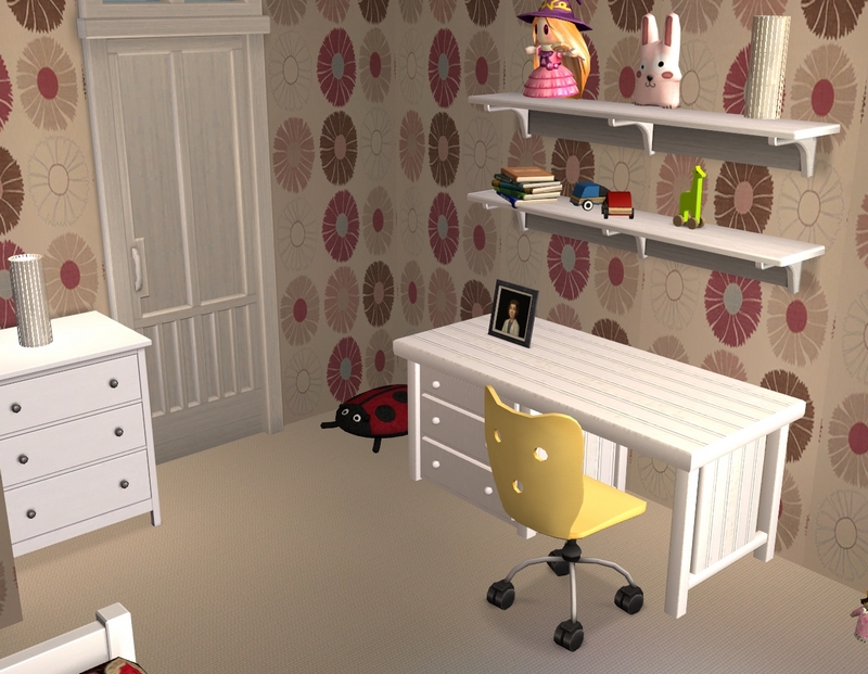
Willow's bedroom, which is another favourite room of mine in this house.
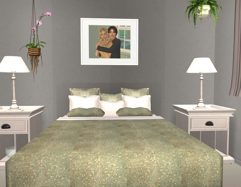
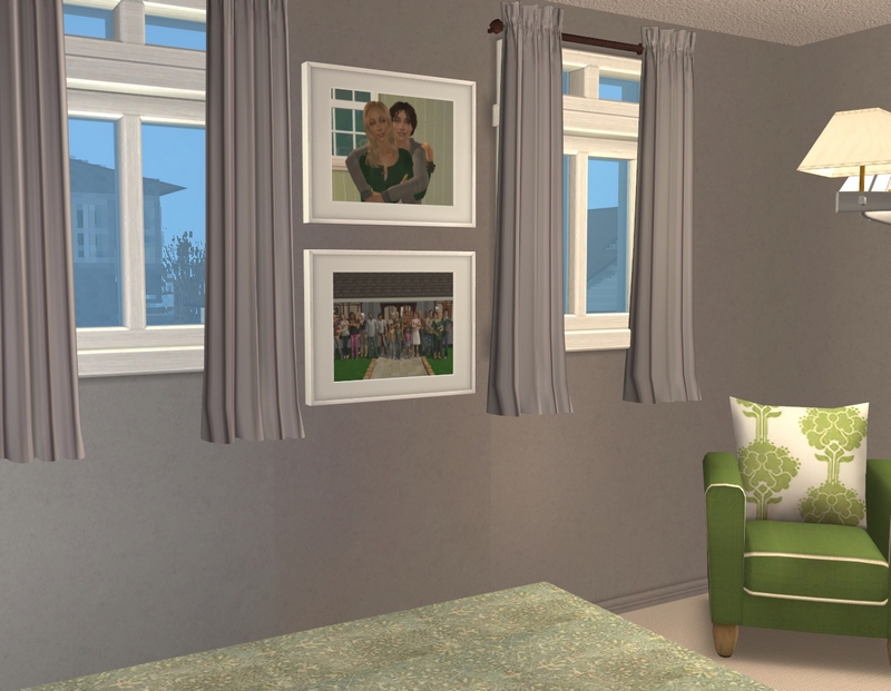
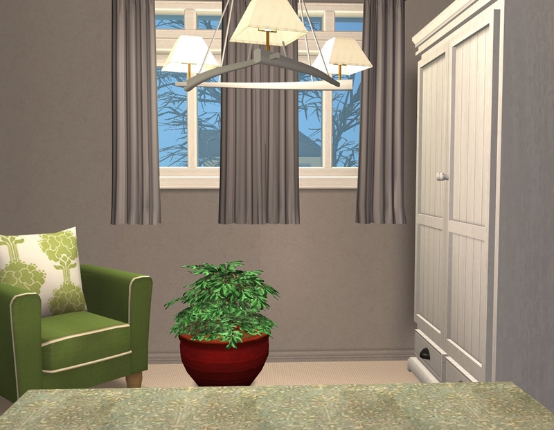
The master bedroom.
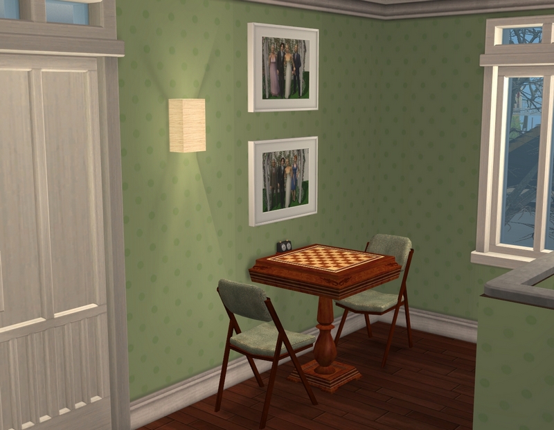
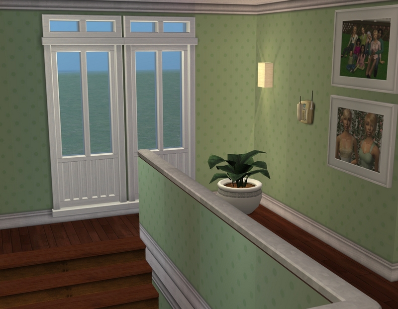
The upstairs hallway. Yes, you're getting hallway pics and no bathroom pics. They are the most boring bathrooms ever and I promise no one would be impressed or get any decorating ideas from them!
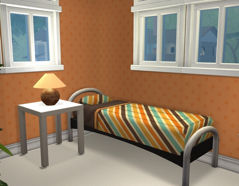
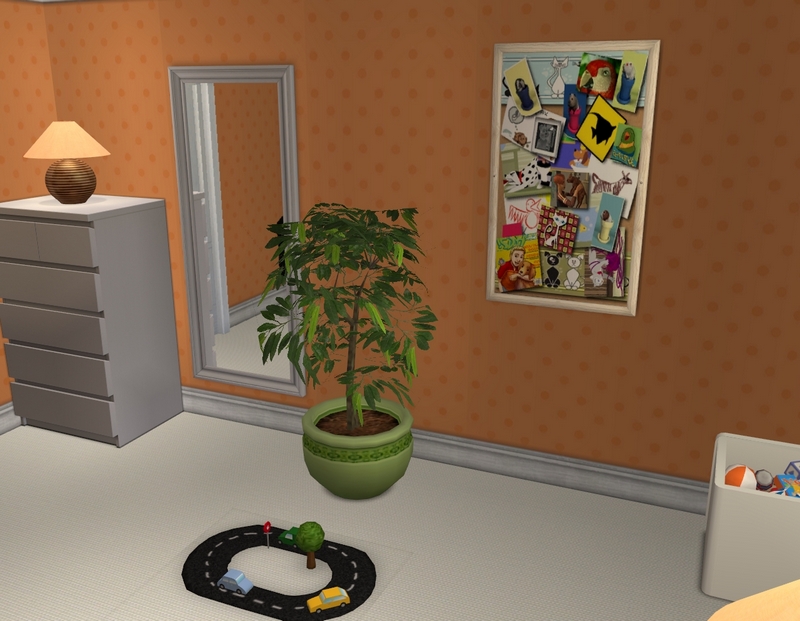
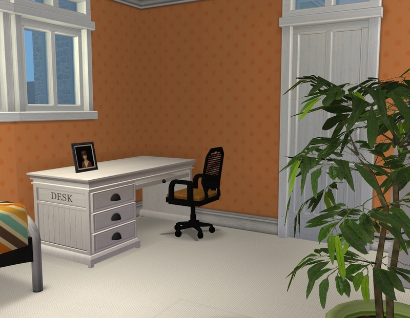
River's room. Love that stripey bedspread.
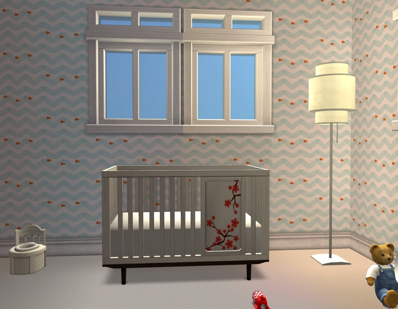
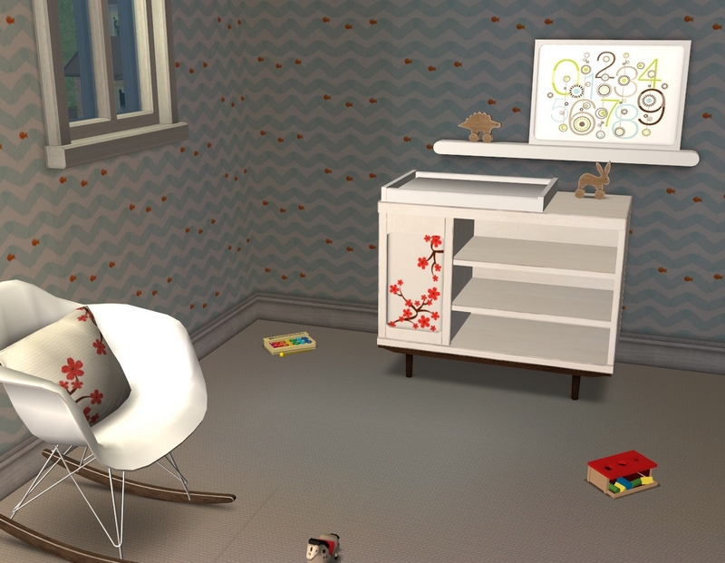
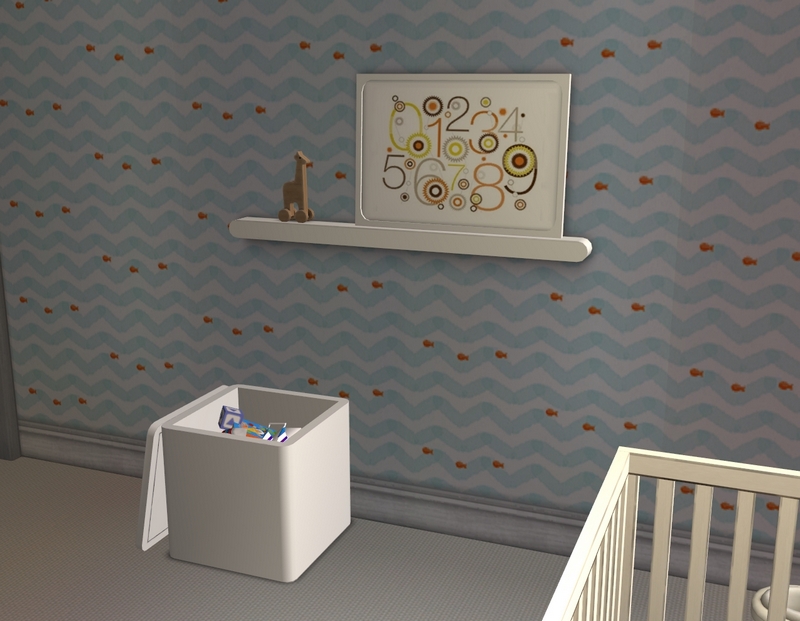
And finally, Wren's nursery, which you would have seen a very small part of in her birthday update. This room has been decorated since then but I only did the rest of the house this week.
Hope you enjoyed the tour! I hope to get Ethan and Maia's story update up for you next weekend.

The house looks great!
ReplyDeleteI love the green through out the house. I can see why you love the kitchen so much, it looks fantastic! I love the tiles you've used on the wall. I love the livingroom as well!
The bedrooms are nice as well!
I can't wait to see the family living here :)
Maia's favourite colour is green and seeing 4/5 in this family are nature lovers, it always seems like a good choice for me. Their last house had a lot of green as well.
DeleteI've decided I'm going to play the Novaks today, so there'll be an update soon, I'm hoping. :) I wasn't expecting to feel like playing but I really miss it!
Thanks for looking and commenting!
It's beautiful! I love the soft colours, it gives the house such a cozy and homely feel while at the same time it is very modern, but not "cold-modern", if you know what I mean.
ReplyDeleteI'm glad you like it! I do know what you mean by cold-modern. It's not a look I aim for too often, as it doesn't seem very welcoming to me. :)
DeleteThanks for looking and commenting!
Gorgeous house! I really like the how serene the entire place is, very calming and earth friendly in appearance, totally fits Maia. I'm excited to see their update when it comes up and see what they are up to. Their kids are getting so big! What windows are those? I've been admiring in the last few tours.
ReplyDeleteThe whole family (bar Wren) are nature lovers, so it's just the kind of home I picture them having. :) I'm in the middle of playing this family right now and am really enjoying getting back to my sims and already looking forward to the next family as well.
DeleteThose doors and windows are a completer set for a door that came with AL, which I never noticed much because EA gave us NOTHING that actually matches it. I use it all the time now that I have this set. There are a lot of different pieces to it, so it's a very useful set to have.
Thanks for looking and commenting!
I really like the colour scheme going on through the main part of the house, the green is nice! And yes that kitchen is lovely! I love that bedspread on Willow's bed, reminds me of grandma's. lol
ReplyDeleteAlso, hallway pics are good especially if they've got photo's in them but it's nice to be able to see the whole layout of a house sometimes without looking at the floor plan, if you know what I mean. Kind of allows the viewer to imagine the layout of the house in their own way. :)
Green has just always seemed perfect for this family to me. :) It's quite a calming colour. The quilt on Willow's bed actually reminds me of a blanket my grandmother made for me, many years ago! Maybe Magdalena made it. It seems like it might be her kind of thing. :)
DeleteLOL, don't know if these particular hallway pics helped see the layout at all but I'm glad you liked seeing the family photos. :) I'm not one who ever really cares much about layout pics in other people's lot tours but I've been really grateful that I took them anyway while I've been doing this whole rebuild thing! It's helped me redo a few of my lots to my satisfaction. :)
Thanks for looking and commenting!