One of the lots I was able to find again was Apple Plaza, originally made by Babbelsim. I used it in Sullivan 1.0 and made it over but I was never completely happy with the layout. Having the boys' bathroom on one floor and the girls' on the other was more annoying than I thought it would be, the hallways were too big and it was all just not quite right to me. So I decided to have another go at it, this time learning from my mistakes with the first one.
My original makeover is here. I forgot to do an exterior shot this time but it's not too different from my first makeover anyway. Remember I'm still fairly low on CC. I will likely end up adding some things to this lot when I have more but I am mostly happy with it as is.
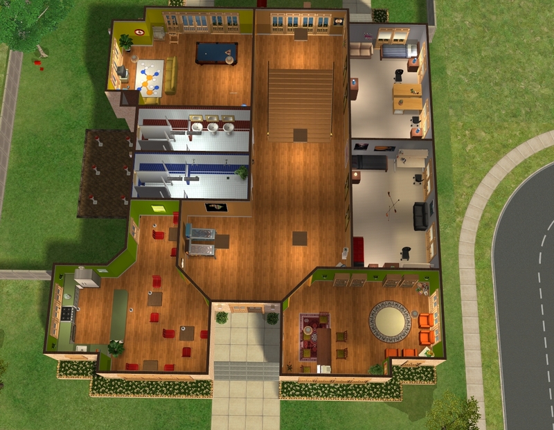
First floor layout. The original lot has rooms that are completely internal, as in none of the walls touch an outside wall. Those kinds of rooms drive me a bit nuts, so I got rid of them.
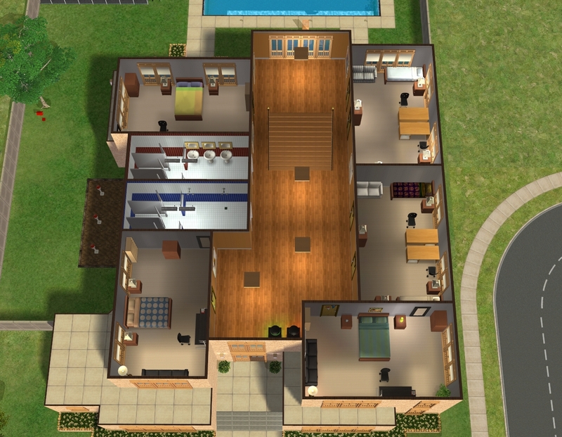
Second floor layout. You may remember that Novak Hall was the dorm where I tested out the two dorm door thing and I've done that again here. I have 7 dorm rooms now, rather than 8. Seeing half the rooms house two sims, I'm just never going to need 8 rooms anyway and I like the layout better like this.
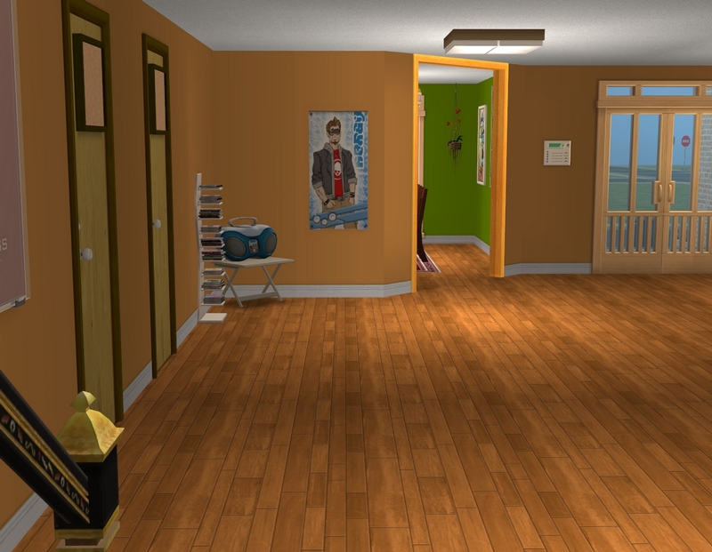
The downstairs hallway. These are the very first custom walls I've put into the game in Sullivan 2.0. I was SO excited to add them!

Other side of the hallway, I might add a couple of those lockers here, because those were handy in my first makeover of this lot.
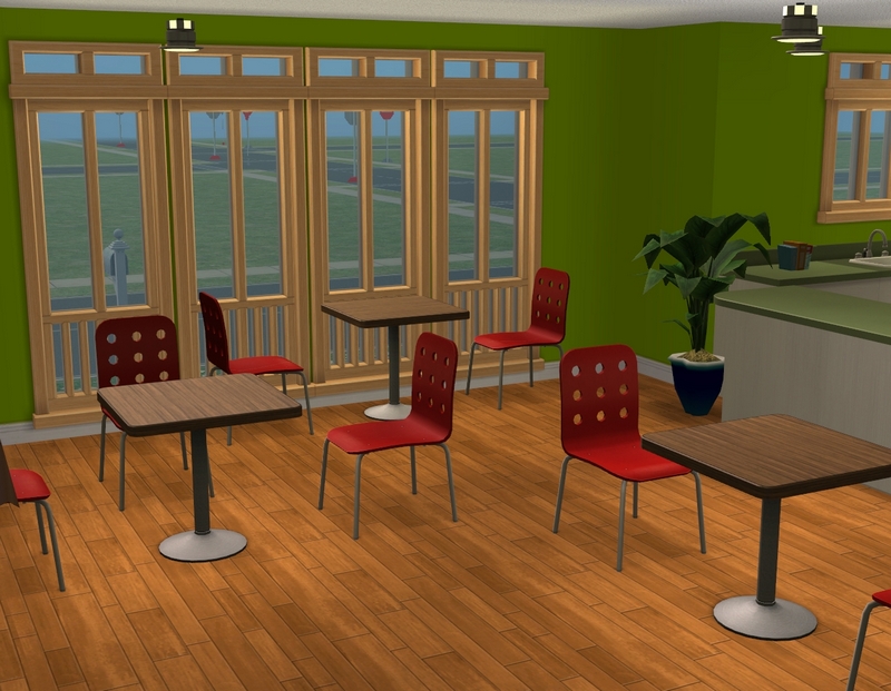
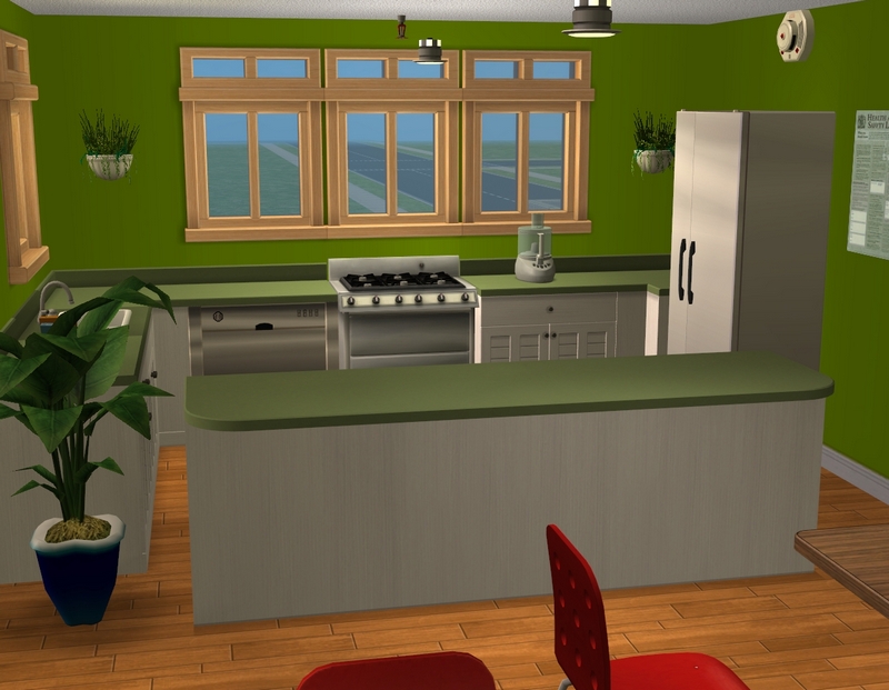
The cafeteria. You can't really see it but I put my hospital posters back in the game, so the Heimlich maneuver poster is in here.
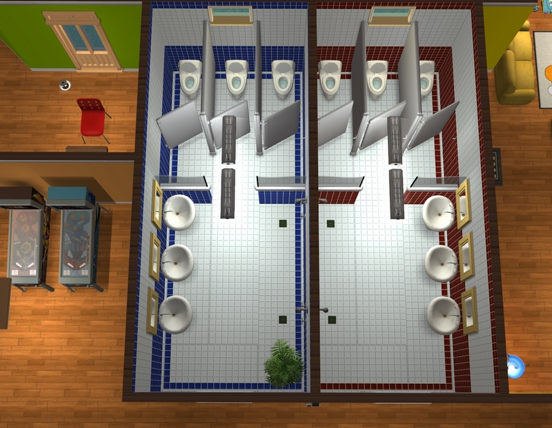
Too boring and awkward to take a proper picture of the bathrooms but..here are the bathrooms. The ones upstairs are identical.

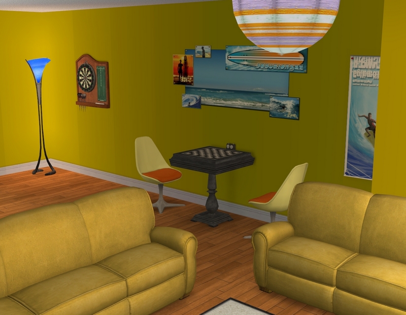
Common room. I meant to replace that TV with the more modern looking one from Teen Style Stuff. It's not until I see things like CRT TVs in this game that I realise just how long ago 2004 was!
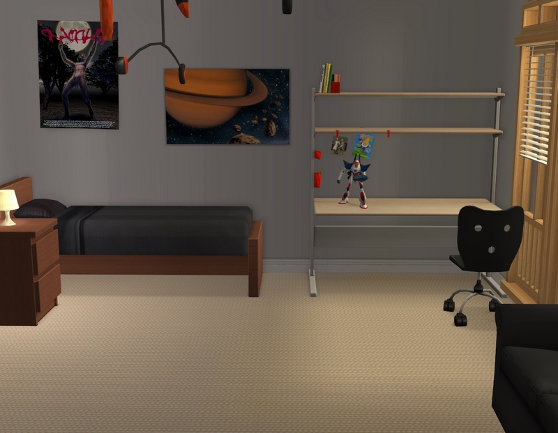
Guess whose room this is? This is Declan and Xavier's shared dorm room - this is Xavier's side. Their poster collection has dwindled a little but EA has a decent amount of sci-fi sort of clutter in the game already, so not too bad!
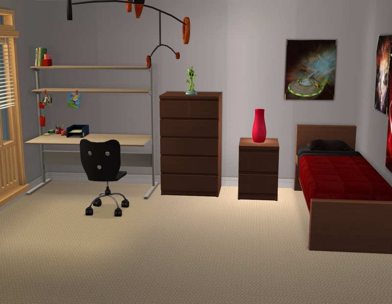
This is Declan's side. There are a few other twin share rooms in the dorm but all except this one just have the basic furniture with no decor. I'll add that when I move students in.
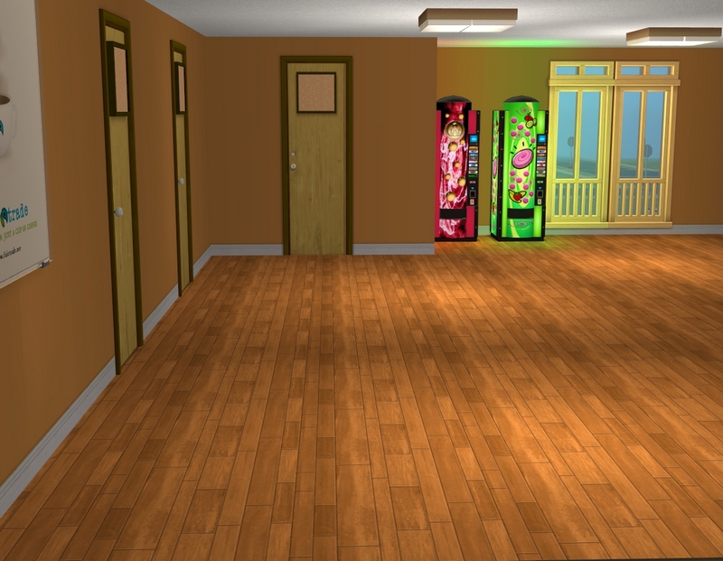
Upstairs hallway. Declan is very happy that I've added the vending machines - he goes up there all the time. I've play tested the dorm a little because I had to get the boys back up to their sophomore year before I could play them (which I am now ready to do).
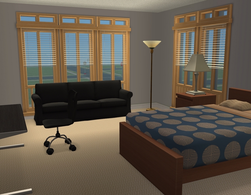
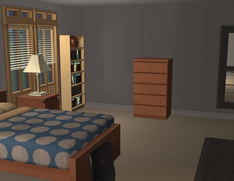
An example of one of the double rooms. This one is not currently occupied by a playable, so it's a bit boring. I don't know why I didn't think to take a picture of Justin's room.
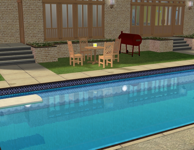
The poolside area. I went without the glass walls around the pool this time, in favour of adding a little barbeque area.
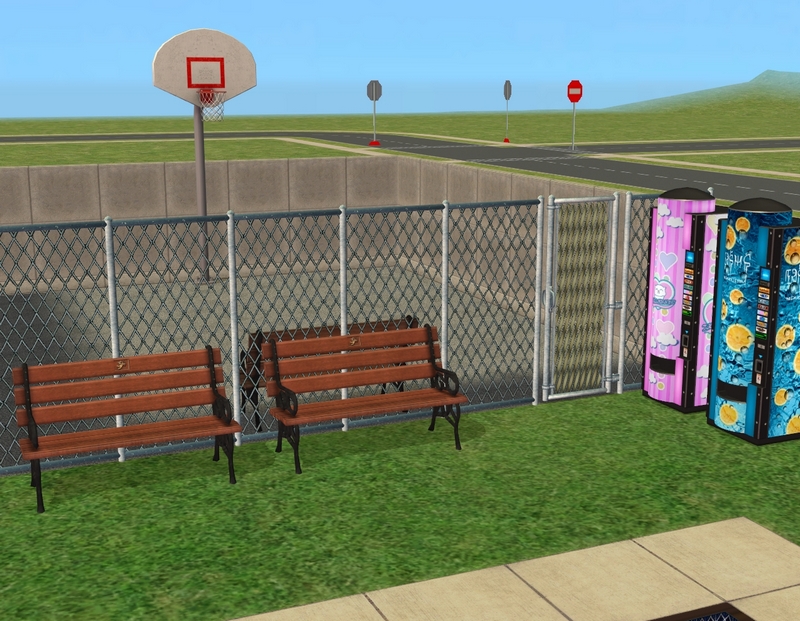
The basketball court, which I probably should have taken a better picture of.
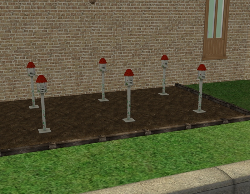
I always have great plans for vegetable patches on my dorm lots and I don't think I've ever got one to harvest state! My sims are too busy flirting with each other to bother with the garden!
Anyway, hope you enjoyed the tour! I am aware that it's been kind of a long time between proper updates, so I hope this tides you over a bit. I've been having some health issues (which do seem to be improving over the last week, luckily), so I hope to get some time to play on the weekend. :)

Very nice, are those custom windows behind the tv?
ReplyDeleteGlad you like it! I used MsBarrows' Classy Completer Set for this dorm, so I'm not sure which windows are add-ons and which are from AL. It's a great set though and I can't believe I never had it before. It's definitely going to be a new favourite.
DeleteThanks for looking!
You are such a talented builder! (I must have said it before, but since it's true, I don't mind repeating it)
ReplyDeleteThe students at this dorm can count themselves lucky for having such a generous architect, giving them beautiful and spacious rooms.
Aw, thank you. That's so nice of you to say. I'm really more of a renovator and decorator than builder! I do much better when I already have a shell to work with, as opposed to a blank lot. :)
DeleteThanks for looking!
Beautiful lot Carla. You know what, if it wasn't for TJ's garden mod none of my sims would be able to grow anything. At least your sims have been otherwise preoccupied, but mine can't even feign an interest.
ReplyDeleteLately I've been impressed by how much you can do with just Maxis items that I created a subhood, and built and decorated all the lots with just those.
You know, I've never used Perfect Gardens! I use Perfect Plants but my sims have to do all the hard work in growing all their fruit and vegetables!
DeleteBut anyway, I'm glad you like the lot. You should post up some tours of your own lots at N99 if you get a chance. :)
Thanks for looking!
It looks really good, spacious, and as I've said before, I barely notice that you have little/no cc in the game. Looking forward to seeing it in use.
ReplyDeleteThanks. I think I notice the lack of CC more than anyone else does. :) I'm so keen to play but that will once again be pushead forward today. Tomorrow! I'm just going to have to make the time, because I'm really missing my sims!
DeleteThanks for looking!
Your dorm looks awesome, Carla.You really have a knack for decorating, even with maxis objects.I love how you balance keeping it well-decorated, without too much clutter.The layout changes you made to the interior look much better for playability.Similar to Starr, I hardly notice that you're using limited cc.
ReplyDeleteHeh, as I said to Blackcat, I notice more than anyone else. I'm the one who can look at the lot and know what I would have used instead of the EA decor! But I am fairly happy with this one regardless, so I'm glad you all like it too. :)
DeleteThanks for looking!
It looks really nice Carla! You can hardly see that you don't have that much CC in your game at the moment!
ReplyDeleteI like the size of the rooms! They all look so spacious, even the ones with single beds!
I don't have any dorms with bathrooms for both boys and girls on both floors, but I can see it being a lot easier :)
I seem to be incapable of making small rooms! In the original dorm, I think the rooms are half the size. Probably more realistic but much harder to take pictures in! Glad you like the lot!
DeleteThanks for looking!
This turned out great! I'm glad you were able to find this lot again, and I'm totally downloading that completed set! I hope you are feeling better, I realize that I'm reading older posts. I went back to refresh my memory of the old remodel you did and really like the dorm room changes. I don't like interior rooms ether.i really like the common room and cafeteria too.
ReplyDeleteI'm getting very lucky with finding my lots! I managed to grab the girls' dorm the other day too (after slightly panicking when the first link I found was dead!). Sullivan looks very different but I'm glad I've been able to have some familiar things around.
DeleteGlad you like the dorm. After playing it through, it really does feel more playable than my first makeover/extension, much as I liked that.
And thank you, I'm feeling a lot better! I'm hoping my GP agrees and lets me go off all these pills I'm on, lol!
Thanks for looking!