I'll warn you now that there is a spoiler for the last update included in this tour. So you might want to go and read that now, if that sort of thing bothers you.
Anyway, I did this lot fairly quickly over a few days (that's quick for me, for anything that's not a house!). Shannon asked in a comment if there was a Takemizu Village lot I wanted to make over. Yes, all of them! I think the EA vacation lots are so dire and they pretty much all need a makeover. But Takemizu Village is the weakest of the destinations, in my opinion, so I was never particularly inspired to work on any of those lots. Shannon's comment gave me a little prod though and I got to work!
A picture of the original lot is here. I had taken my own before pics but in my longstanding tradition of completely failing at before pics, I accidentally deleted them. Oops! So that one will have to do.
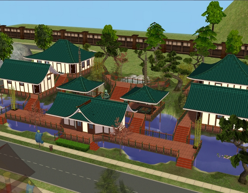
This is what the lot looked like after I was done with it. The first thing to go was that hideous green picket fence.
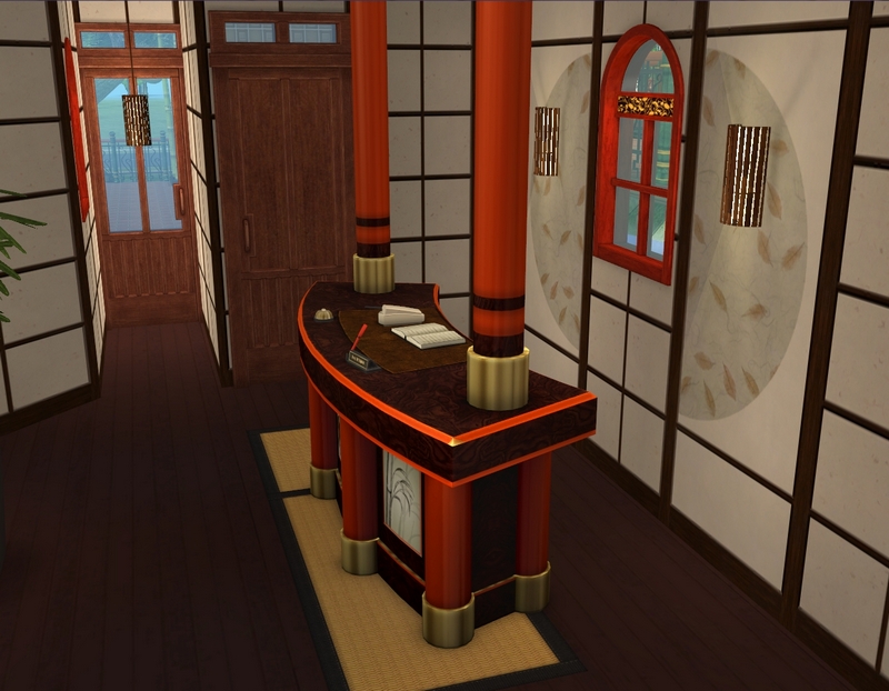
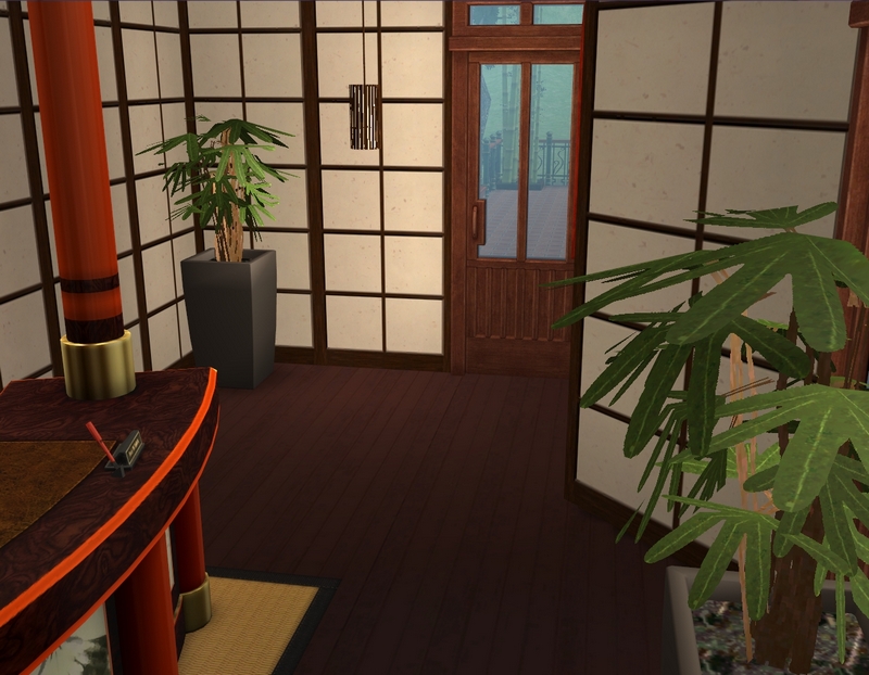
Front desk. I didn't consciously try to stick too closely to an Asian theme, both because I don't do well with themes and because I didn't want to download a bunch of CC I wouldn't use again outside this destination.
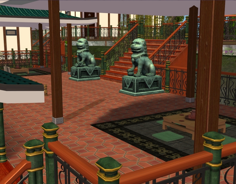
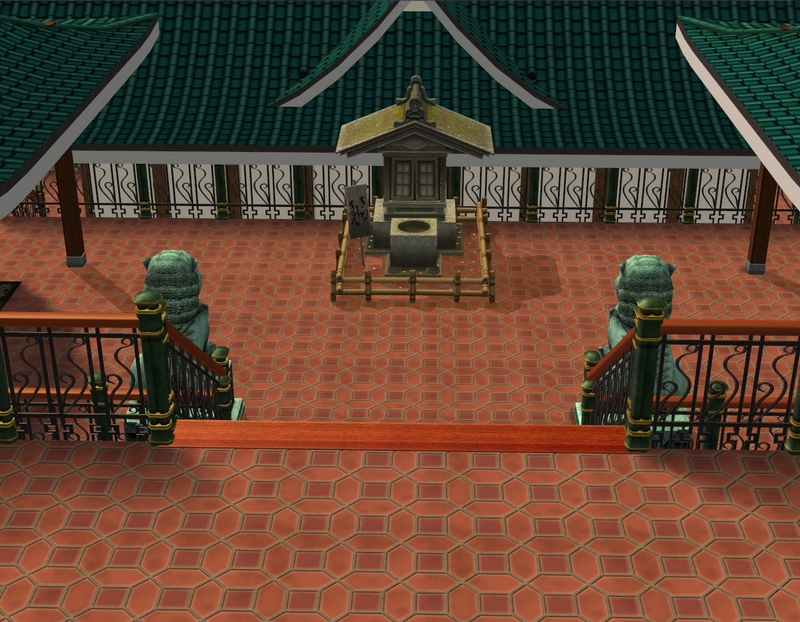
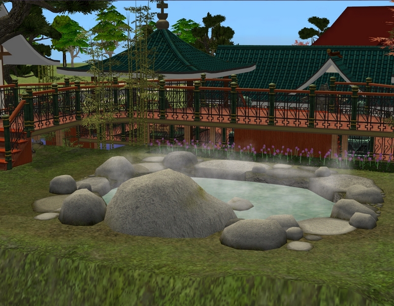
Just a few shots of the exterior. I may still replace those flowers in the last shot.
I'll show you the villas now. The rooms are basically identical, so these pics aren't all from the one villa - I took pictures that showed off the rooms the best, no matter what villa they were in.
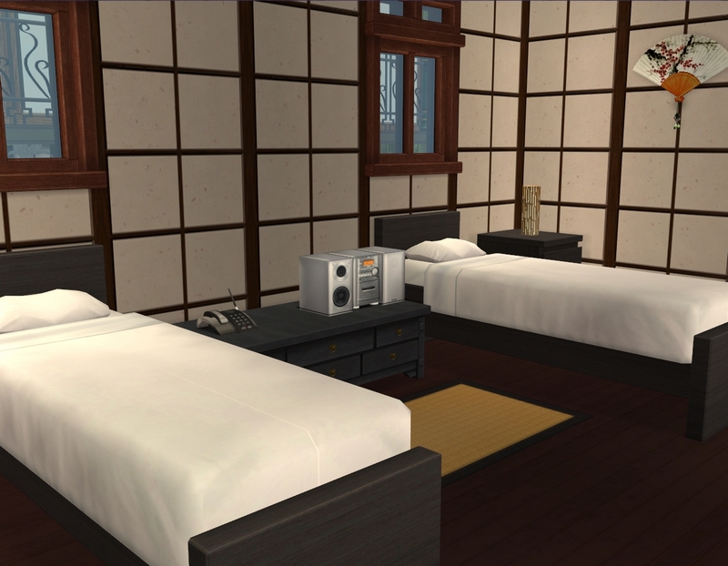
Only one of the villas has single beds. It's not a place I'd generally send my sim families to. More of a couple's retreat, I think.
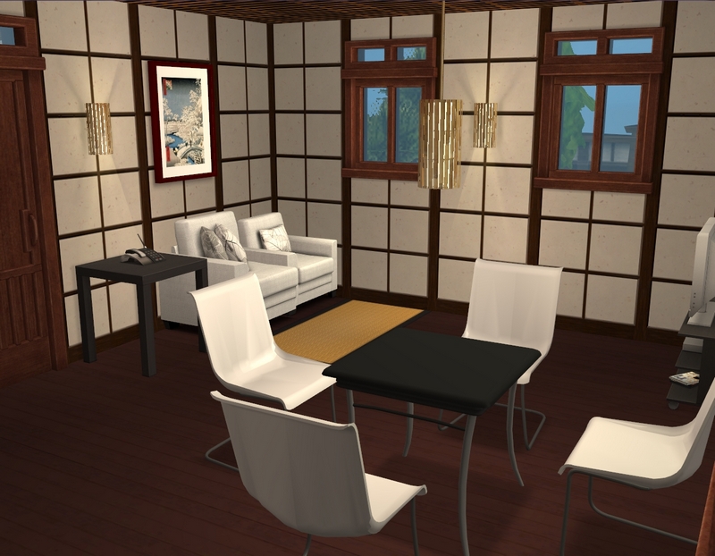
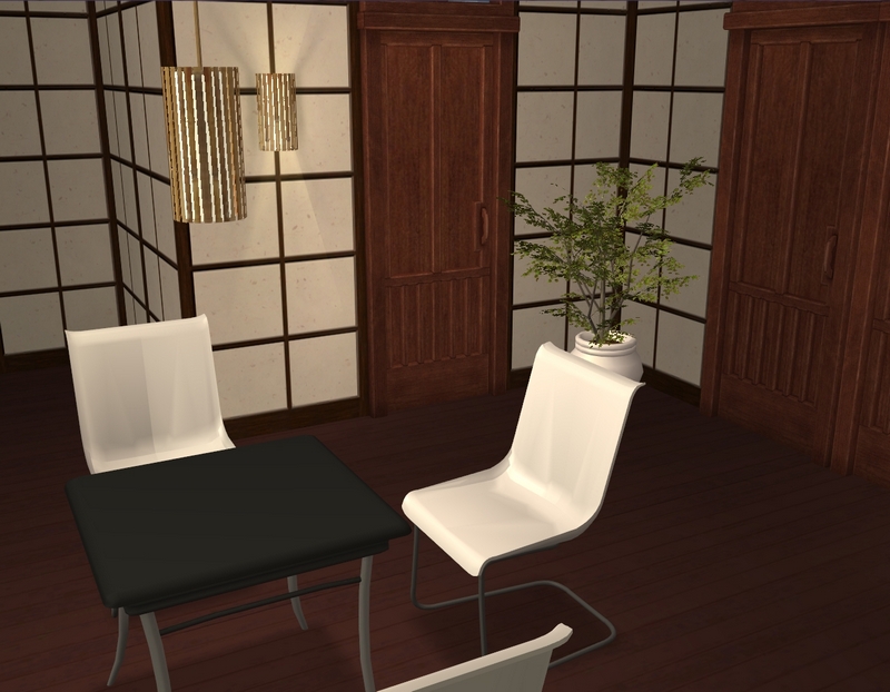
Living/dining area.
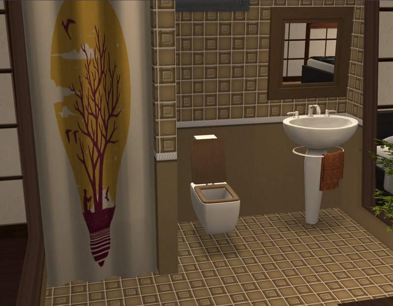
Bathroom, with literally the only shower curtain in my game that vaguely fit the theme! I would have preferred a shower/tub but the room looked too cramped with that (which is actually how EA designed the bathrooms, originally).
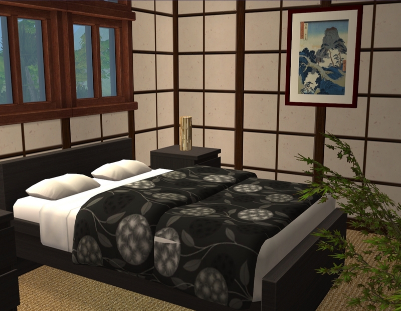
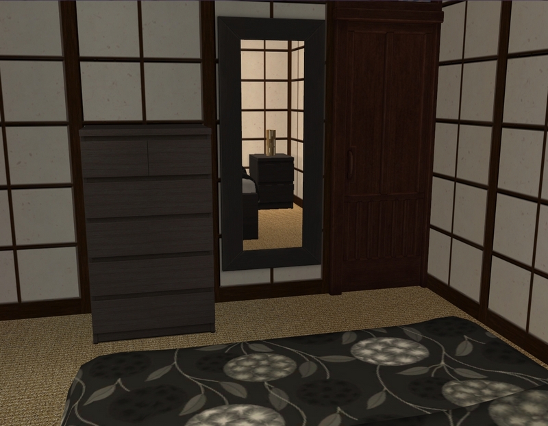
And finally, the bedroom!
I will be sending Lila and Connor here for their honeymoon, so they'll probably guinea pig it for me. But I'm sort of excited to play it, so I may end up sending someone else before them!

Wow, this looks fabulous! I really like what you've done with this lot. Previously it always seemed horribly decorated that it overwhelmed me. You've inspired me to give that lot and the hood in general a better look sometime. I like the colors you used especially in the room, and while it didn't all exactly scream asian, I thought that it all worked very well that I wouldn't have noticed if you hadn't mentioned it.
ReplyDeleteI did do a bit of a blank look when I opened up the lot and wondered what on earth I'd do with it! Once the green picket fence was gone though, it was a lot easier to get started. I considered trying to be more overtly Asian at the beginning but 1) I was wary of getting into gimmicky stereotype territory and 2) I looked up pictures of hotel rooms in Japan and most were not super-Asian looking either! Most had some elements of rice paper somewhere but they were not laden with JAPAN, you know? So I felt better about going a tad more generic after that. :)
DeleteThanks for looking and commenting!
I agree, Takemizu was the weakest destination, by far, to me too. Even without the extra cc or trying to follow a theme, I thought your version looked quite Asian, with a quiet, understated look, which is, to me, what the authentic Asian aesthetic is, more than cluttered junky stuff. But it still looks traditional to me. And it is so much better without the green fence!! I look forward to seeing Connor and Lila enjoying it; it's nice that after putting in the work to re-do it, that you sound more interested in sending sims there now, too.
ReplyDeleteWell, there's still plenty of CC, as always - I just didn't download much extra! But I'm glad you like the aesthetic of this place.
DeleteAs for being more interested in sending sims there...yes and no. I'm interested to see my sims try out this hotel but I don't know if that interest will be sustained or if it will spread to the rest of Takemizu. As you say, it is the weakest destination but I think the main problem is not the aesthetic (which is easy to fix) but the lack of things to do there. That's going to take a bit more work on my part than just simple lot makeovers. I have some ideas for what I'd like to add but it's all a matter of having the time.
Thanks for looking and commenting!
I was thinking that too, that there's just not anything fun to do the way they made the destination. I added an "Olympic Center" to mine, as if the Olympics had been held there, so it had a gift shop, a pool, and an ice skating rink. At least sims could go there for something else to do besides mahjong and tea.
DeleteThat's a fun idea! I was thinking of adding a karaoke bar, a restaurant (it's the only destination without a restaurant, unless I'm missing it) and maybe a "street" of shops. :)
DeleteKaraoke would be great, and you need a restaurant and shops!
DeleteI like what you've done with the place. I like a bit of the modern decor you've put in it.
ReplyDeleteI'm glad you like it. :)
DeleteThanks for looking and commenting!