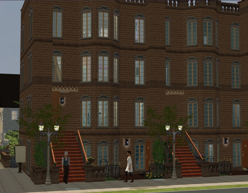
The girls live in this apartment block, built by Starr. Emma's sister Sophie lives in the same block, though that will change once she marries Oliver.
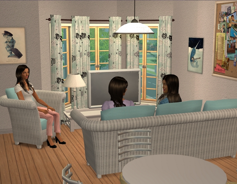
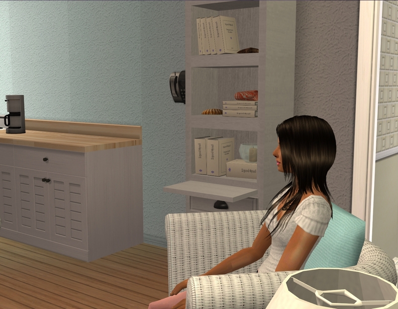
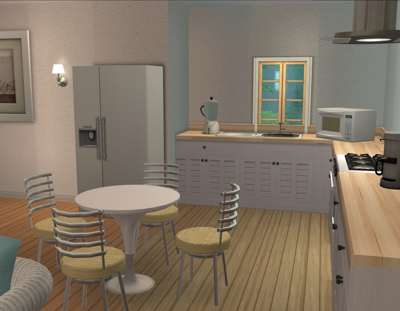
The living/kitchen/dining area. Please note the cute and quirky fish posters in the first pic! I was so happy to find them, because I was trying to at least vaguely stick to the theme without adding too much extra CC and I happened to already have those in my downloads folder. :)
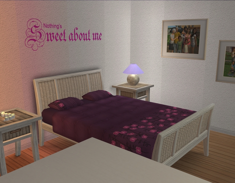
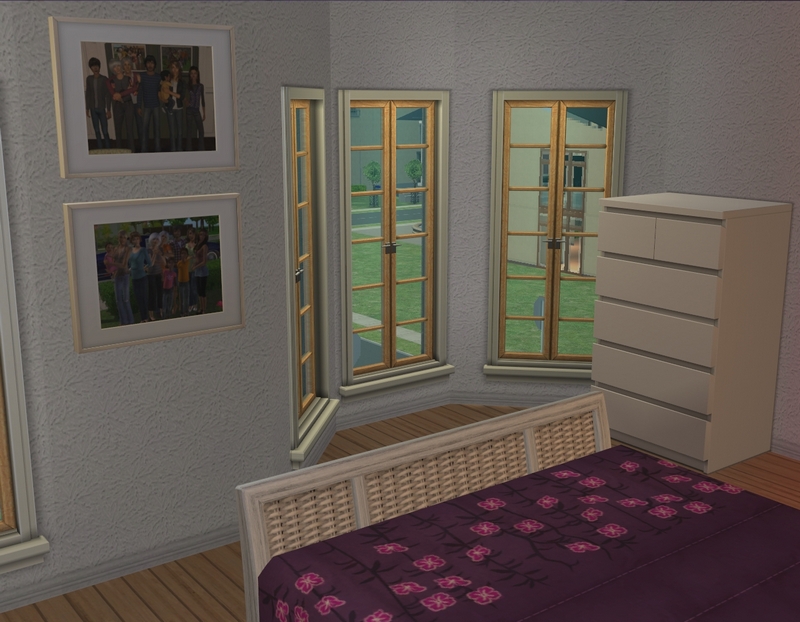
Some of you may have already guessed this was Emma's bedroom; that decal wouldn't really suit Lauren or Jessica! She still needs some curtains. I was having issues with the ones I wanted to use, as they don't have a diagonal morph. :\
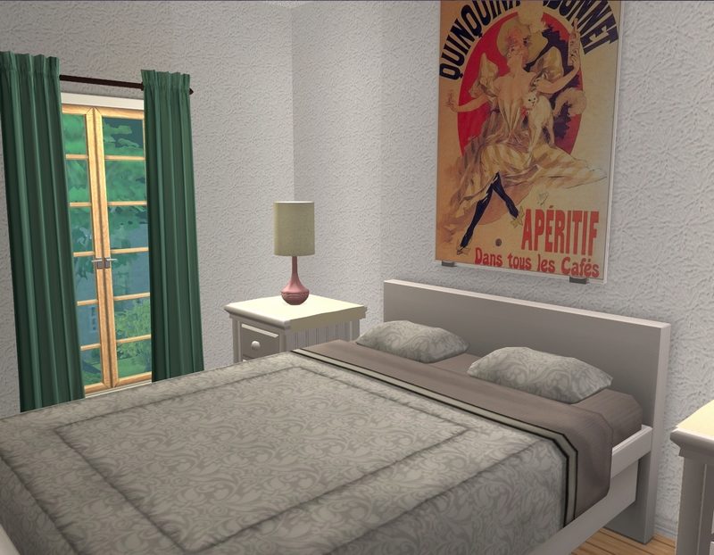
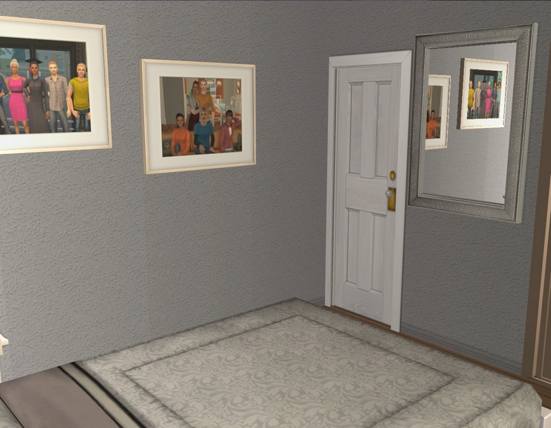
This is Lauren's bedroom. Not pictured: the very cool Weapons of Mass Creation poster that I thought was perfect for a journalist like Lauren.
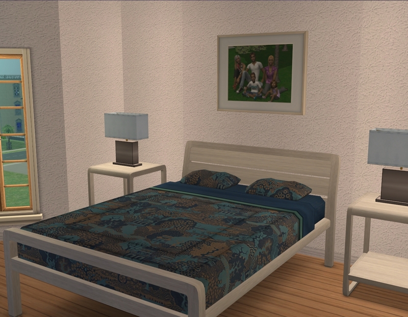
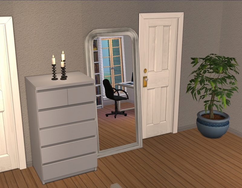
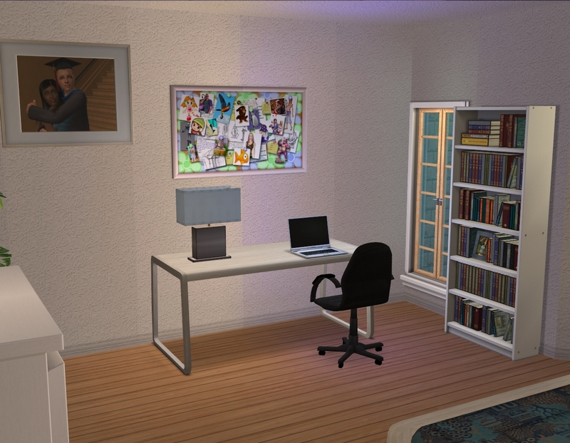
Finally, Jessica's bedroom. I had already decorated this bedroom before deciding to use this place for the challenge, so I had to decide whether I wanted to scrap it or just change up some colours and work with what I'd done. I chose to do the latter and I think it worked out pretty well. :)
There are bathrooms in this place, though they're not featured here. You guys know me and bathrooms. ;) They're pretty basic and don't fit particularly well into the theme (having also been done before the challenge), so I didn't bother taking pictures.

A nice modern place, just right for three young women.
ReplyDeleteGlad you like it! I'm looking forward to finally playing them here. I'm missing Emma and Jessica, especially. :)
DeleteThanks for looking and commenting!
All the light colors are so pretty. I had never heard of a moodboard till reading this post so I looked it up, and so glad to find out about them. The kitchen is also very pretty and is that a ventilator fan or a light in the corner? I like the way the fridge makes a little divider, since it isn't flush with the counters.
ReplyDeleteMoodboards aren't something I normally use for inspiration (and I probably won't use them outside of this challenge) but it was a fun way to do something a bit differently for a change.
DeleteThat's a ventilator fan that functions as a light over the stove there. :) I think it's funny that you and S.B have both commented on the fridge - it was really just the only way it fit in and still allowed me to have the same amount of counter space! I'm glad it works though. :)
Thanks for looking and commenting!
I'm always curious how people manage those apartment/townhouse buildings, particularly the designs with the angled bay windows. This one has more interior space that it appears on the outside. I really like the way you put the fridge on that column thing - I wouldn't have thought of that and it does punctuate the transition from the kitchen. The dinette style works so well. The big tv fits right in the bay, too - something else I would be nervous to try. The colors are so nice together - that sand with the aqua (is that aqua - I always have trouble with blues) and that wonderful punch of berry in the bedroom. It all looks wonderful! Ok, what on earth is a moodboard?
ReplyDeleteThe bay-style windows can be tricky. Really, sticking a TV in that space is often the only thing that works! I think I've put the TV in that space in every apartment I've decorated on this lot. :)
DeleteHeh, as I said to Shannon, that was really just where the fridge fit! I put approximately zero thought into placement there, so I'm just glad it doesn't look weird, lol. Thanks for the compliments!
A moodboard is just a collage of various images - things like colour swatches, pieces of furniture, room decor and scenery, uusally - that are meant to evoke a particular "mood" or look. So in this case, it was Coastal Bohemian, so there were a lot of soft colours, sea-themed decor and wicker. They're not something I'll use very often in the future, I don't think (mainly because I usually do okay with just slapping random things down when I'm uninspired!) but it was a fun little challenge. :)
Thanks for looking and commenting!
This aparetment looks very nice. It's suits those 3 girls very well!
ReplyDeleteI've had this lot in my bin for some time now, but never placed it. You've inspired me to finally place it, and now I can't wait to move some one in :)
Oh, I really love this lot and I think you will too! It's spacious but not enormous and there is more than one apartment with three bedrooms, which I find incredibly handy yet rare in the TS2 community. Glad you like the girls' place.
DeleteThanks for looking and commenting!
Looks perfect for three ladies! I've always like playing sims in apartments, it feels more cozy and fun because of the smaller space. The kitchen is cute, it all looks like really nice & simple living. :)
ReplyDeleteI really like apartments for my singles, though I'm not so keen on them with families. You'll notice I have very few families in apartments! I think the girls will enjoy living here though. I'll have to get playing so they can actually do a bit of living. ;)
DeleteThanks for looking and commenting!