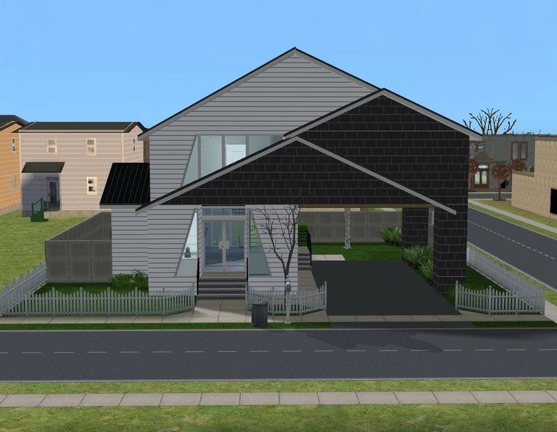
Anyway! The house is from MTS and is mostly untouched on the outside, apart from changing the fence. I don't like low fences all the way around a lot, personally.
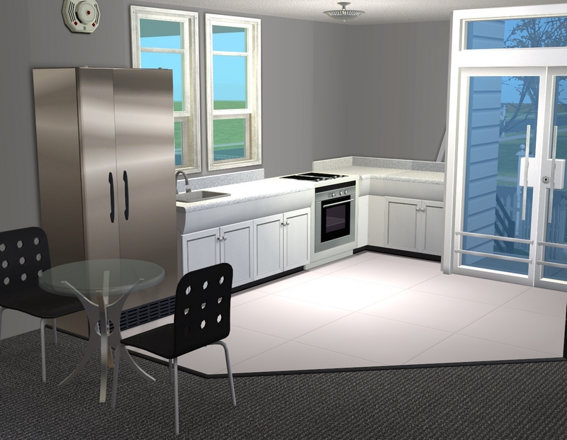
The kitchen was also left mostly as is, except for the addition of a little dining table and chairs.
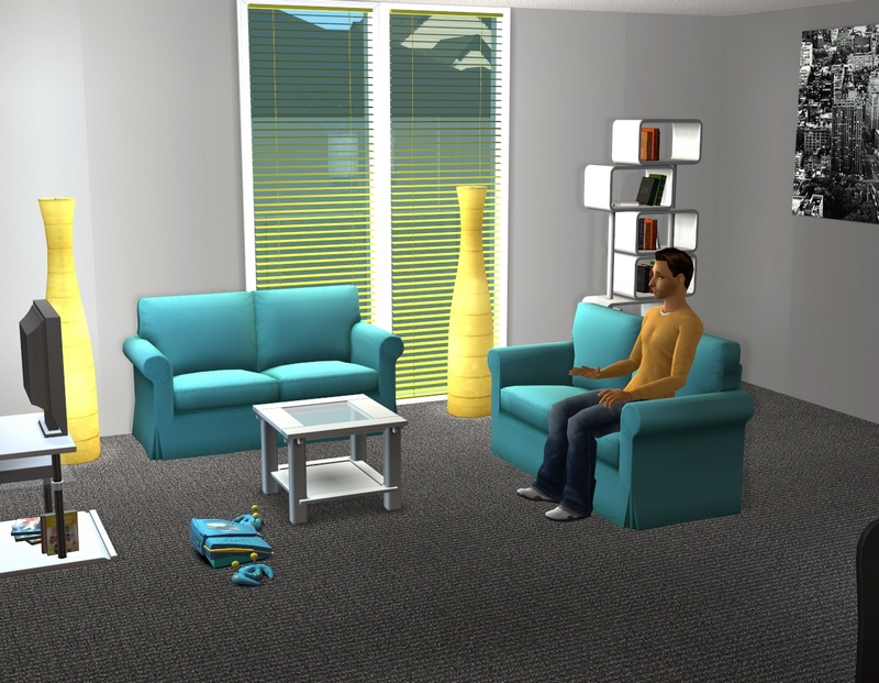
The living room is spacious enough for just two young guys.I love the yellow venetians! I was excited to see I had those.
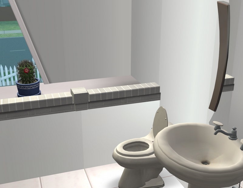
I really liked the builder's creative use of those triangular windows with the platform foundation. It's a cool effect.
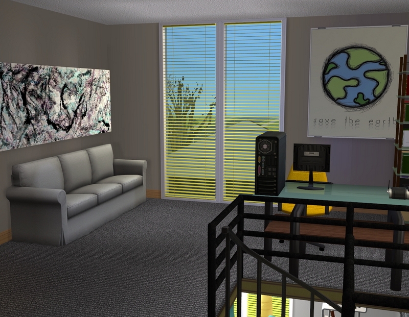
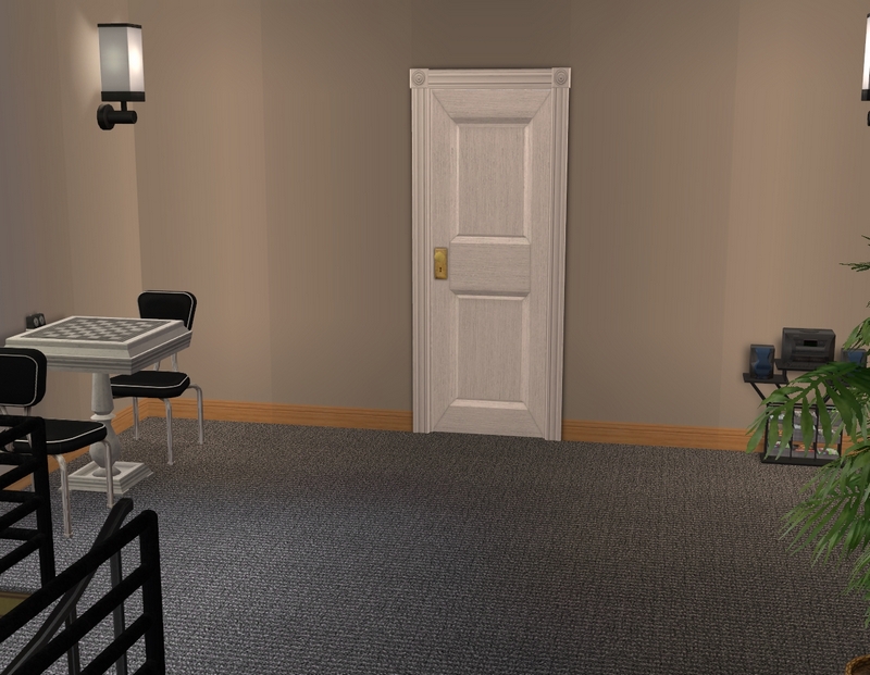
Upstairs, I turned the "hallway" into a kind of office/rec room for the boys. I need more wall deco in a bad way, so please excuse the naked walls!
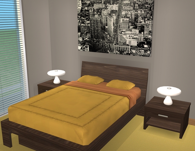
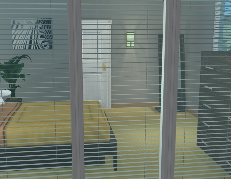
Anthony's room. I still haven't decided whether I'm keeping the yellow carpet or not. I may switch it to the grey I'm using in the rest of the house.
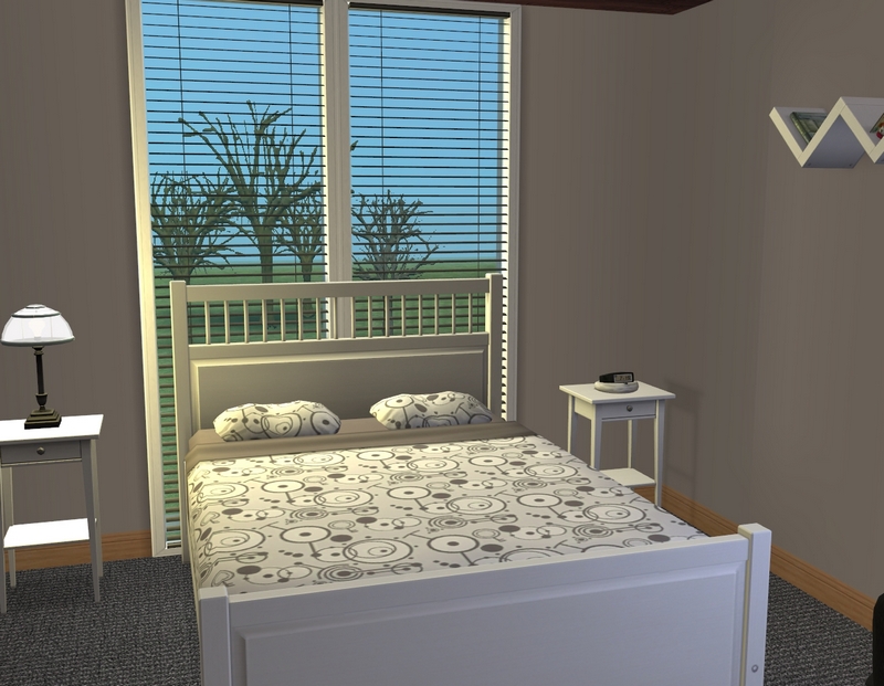
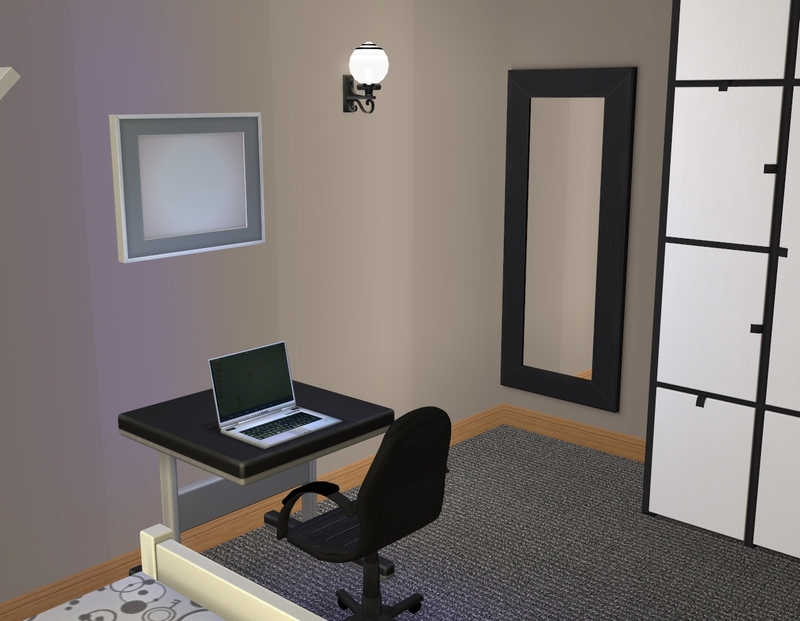
And finally, Noah's bedroom! The picture frame will be filled in, once I add all the Gottlieb pics back in. If you are super-observant, you may notice that Noah's bedspread is the same one he had when he was living at home. I thought that was a fun touch!

You're right about us loving your lot tours :-)
ReplyDeleteThis one is very modern in a sleek style; love the use of the platform foundation, too!
Nothing wrong with empty walls; in real life, I love empty surfaces and empty walls as a contrast to (colour)full bookshelves and some chosen decorative objects.
Glad you like it! I can't wait to get a chance to play it. I just remembered I have to remake Noah's townie girlfriend first and do all the associated SimPE editing.
DeleteIn real life, my instinct is to fill empty walls (big ones, anyway) , so I tend to go that way in game too!
Thanks for looking and commenting!
I always love lot tours. I really like seeing how other people's sims live, and yours are no exception!
ReplyDeleteI like the house, I might even download it for one of my sims, but I already have so many unused houses in my hood, I might have to use those first, lol!
I love the colors you've used in the livingroom, the blue and the yellow match really well, and suit 2 boys perfectly.
I know what you mean with the walls. I'm like you in real life and always try to make sure the big empty walls are decorated with something, and it bothers me with my sims as well.
But I have to say that it didn't bother me here :)
I really enjoy lot tours as well. I love it when I see one up on someone's blog or at a forum. Those are always the first posts I check.
DeleteOne good thing about rebuilding my hood is I've been getting to download houses again! I hadn't really done much of that in recent years, as I was pretty happy with the ones I had and couldn't justify it.
I'm so glad you like the house. I've been using a ton of yellow lately, because I just happened to have a few sims in a row who had it as their favourite colour. It's my favourite too, so I won't complain. :)
Thanks for looking and commenting!
I'm enjoying the lot tours, too... you see bits of a house in updates, but it's good to see the whole thing and how its been decorated. I'm thinking of doing some for some of my favourite houses, except... time!!! :)
ReplyDeleteYeah, I notice that most of my scenes are in the living room or kitchen, with maybe a few in the bedrooms. And even with those scenes, it's usually only one angle of the room, so you do miss a lot if that's all you see!
DeleteI would love to see you do some lot tours. :) I find they are way, way quicker to do than proper updates, but that's just me!
Thanks for looking and commenting!
Great looking house, and decor to boot. The boys really have done well sharing a house together. The bathroom is great, I really like the foundation use there as well, very unique. The shared living areas all look perfect for the boys.
ReplyDeleteGlad you like it! Noah and Anthony are doing all right together. Not bad for two guys in their early 20s!
DeleteThanks for looking and commenting!