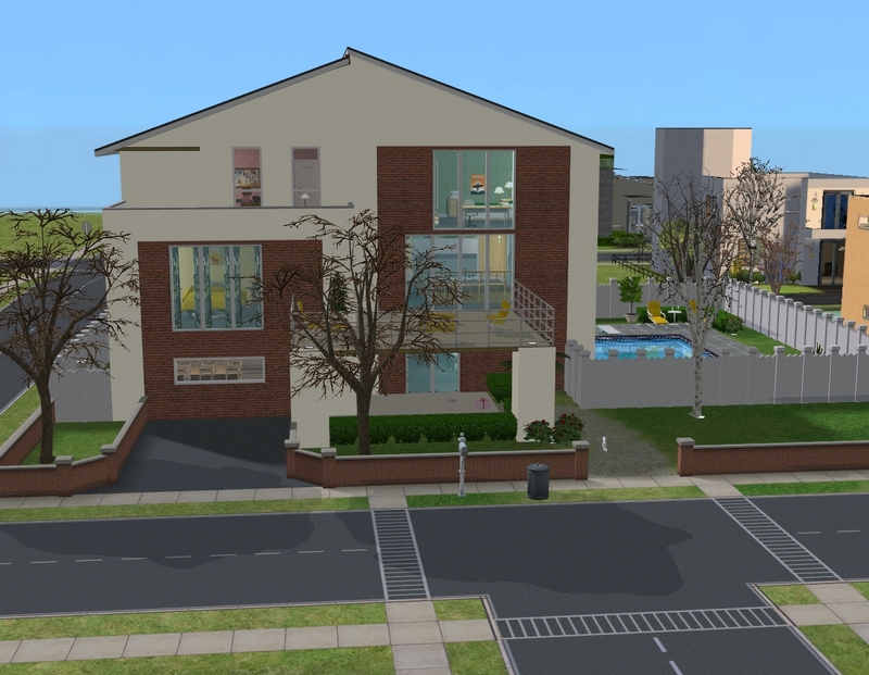
Here is the exterior. I downloaded the house from MTS. It was intended for another family (can't even remember who now!) at first but when I checked it out in game, it seemed a bit fancy for them. I thought of Rob and Patience right away though, so I moved them in.
I've changed the layout a bit from the original, so I've included layout pics so you can see what I've done.

First floor.
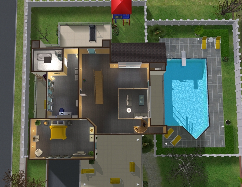
Second floor.
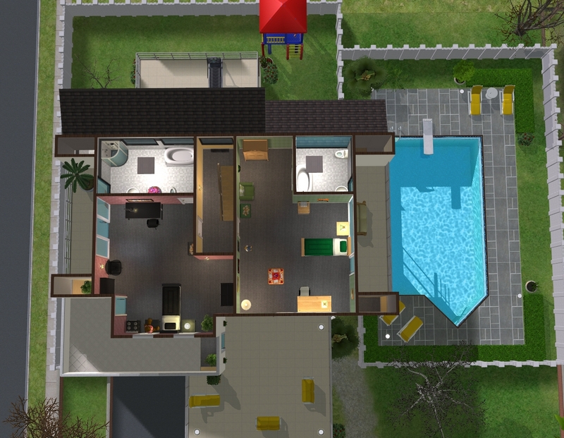
Third floor.
I'm still really not happy with Rob's study on the second floor but I'll show you that later.
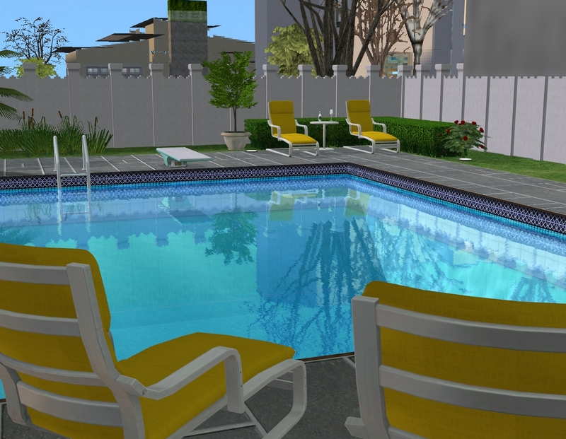
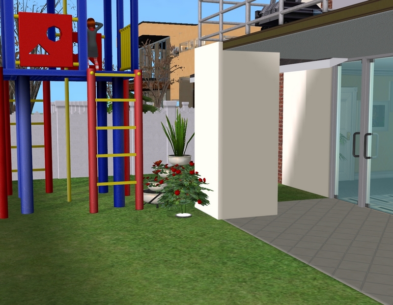
The backyard, complete with lovely pool and jungle gym for Felicity and Patrick.
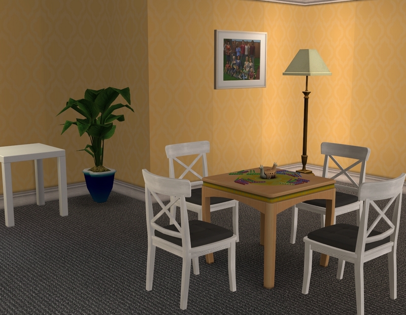
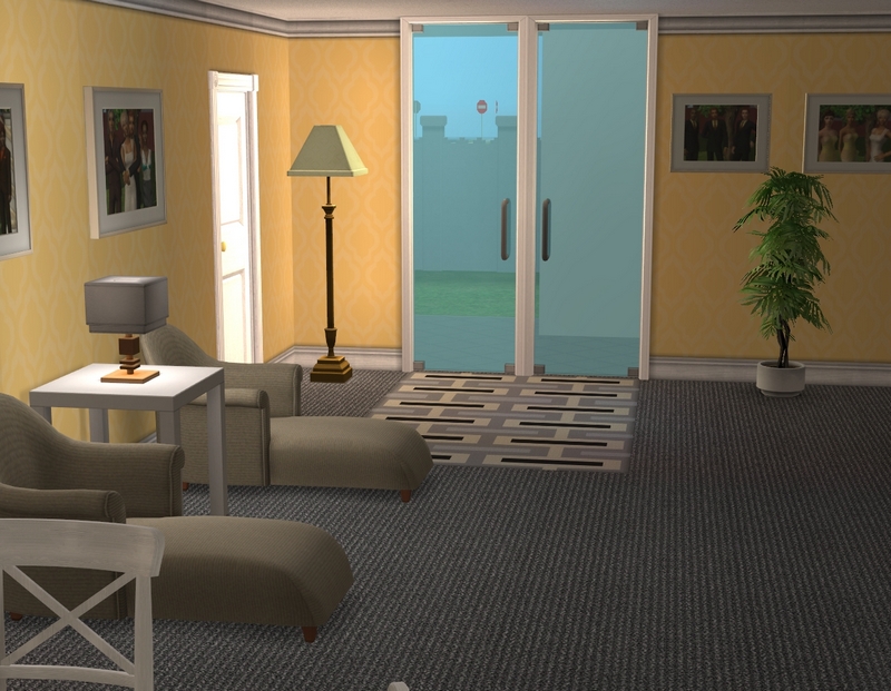
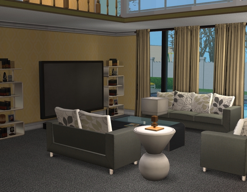
The living room, which I really love. Hopefully by the time I get around to playing, I'll remember to change the Don't Wake The Llama table over to the white recolour I downloaded.
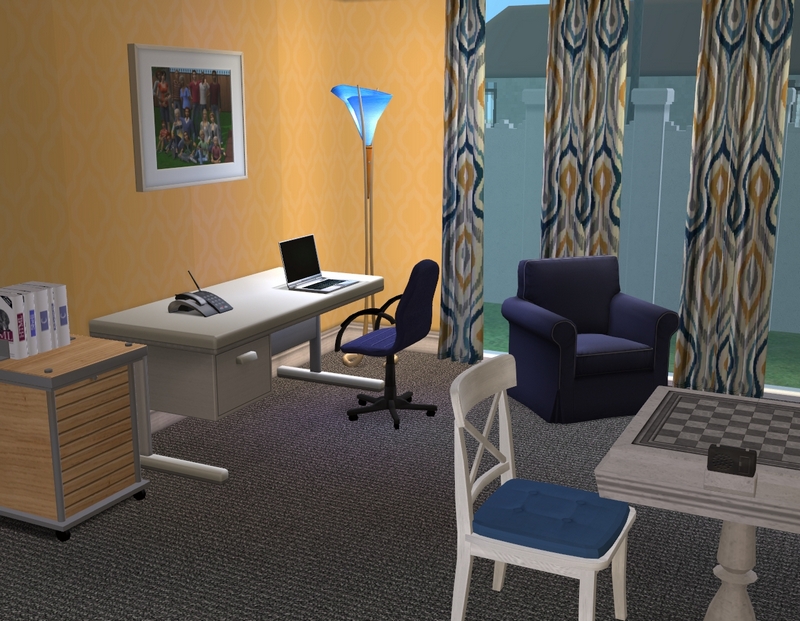
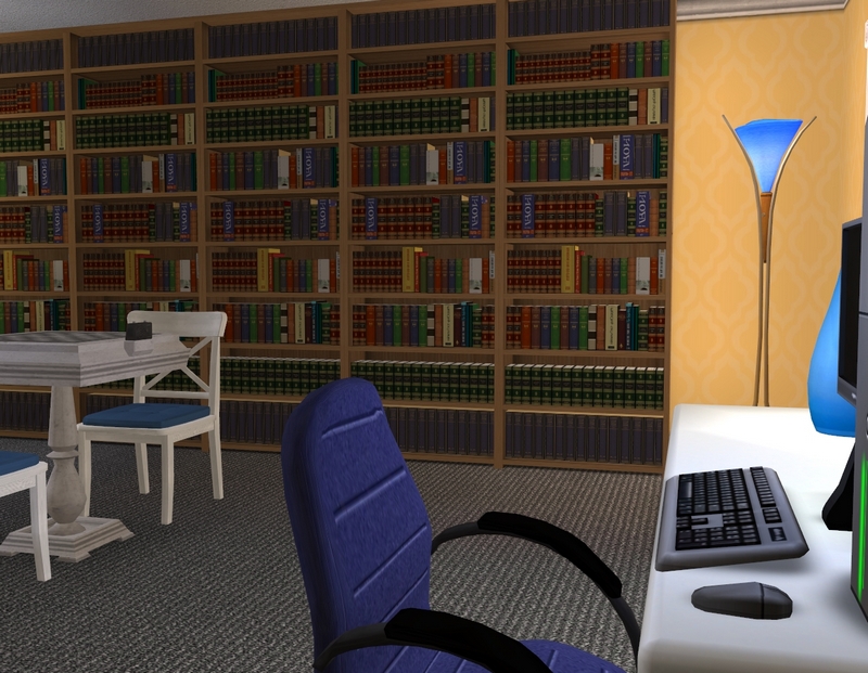
The family study, which is the one the kids are allowed to use. ;)
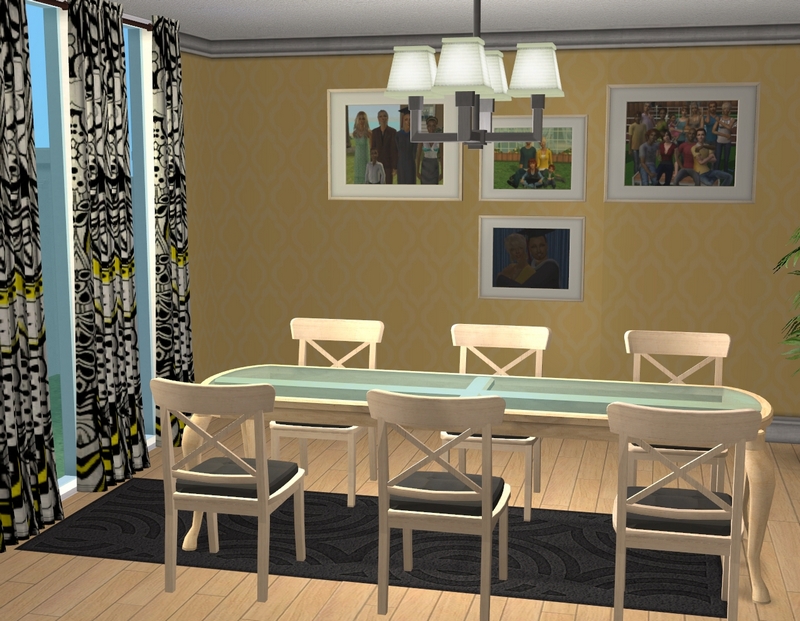
The dining room. I downloaded a set that I just realised has place settings included, so I will probably add those to the table here. Just because they had place settings on the table in their old house. :)
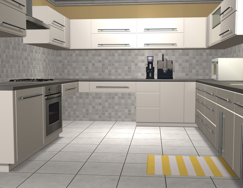
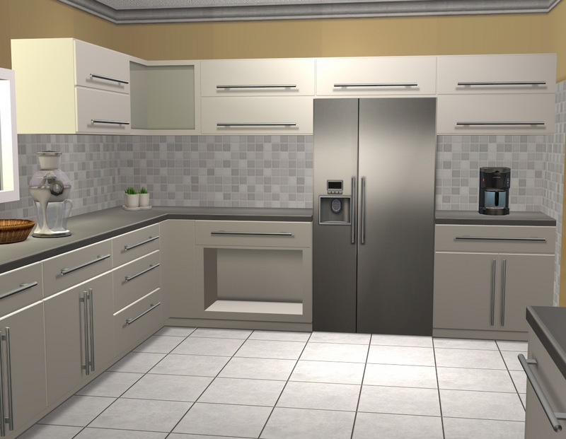
The kitchen, with just a tiny splash of yellow.
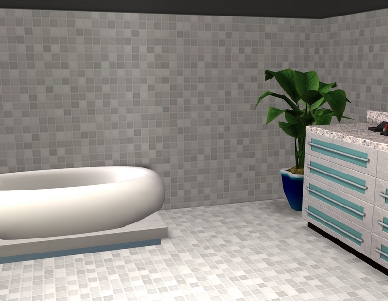
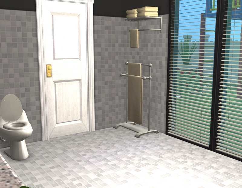
One of the bathrooms, which used to have a splash of yellow before I decided it looked ugly. I also need to change those windows to white.
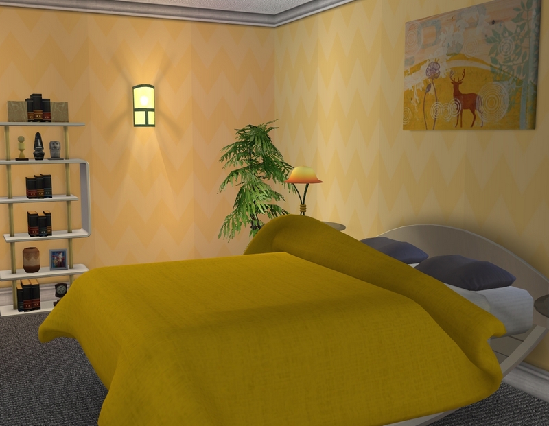
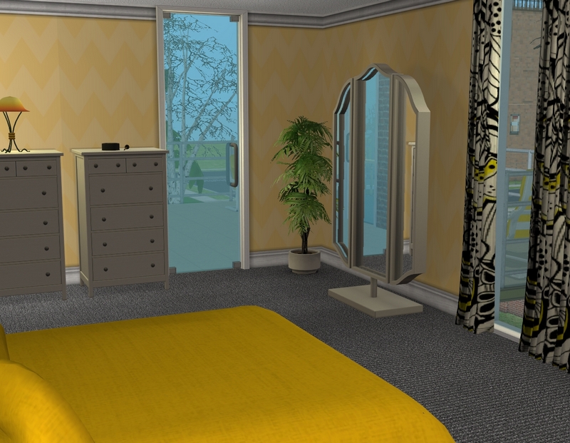
Patience and Rob's bedroom, which I thought I had another picture of.
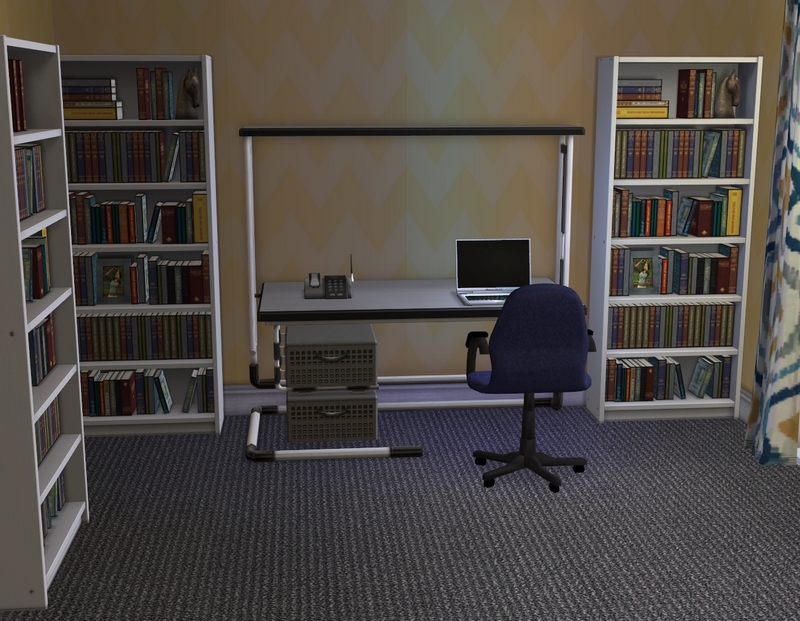
The half of Rob's study I'm happy with...
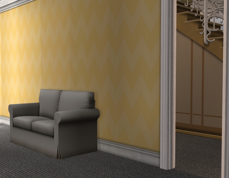
...and the half I'm not. :\ I'm not sure what I'll do with it. It's an awkward-shaped room but I want to try to work with it. I'm calling the house done though, for the meantime.
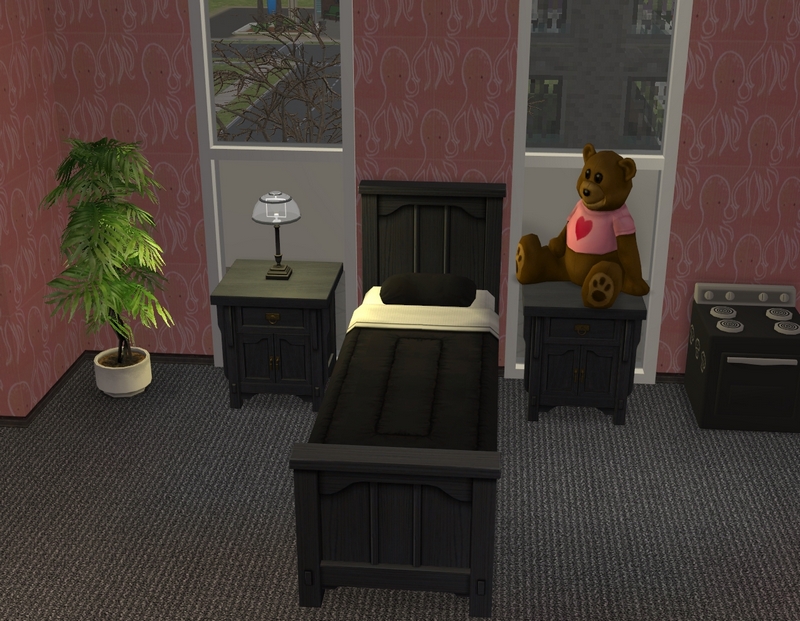
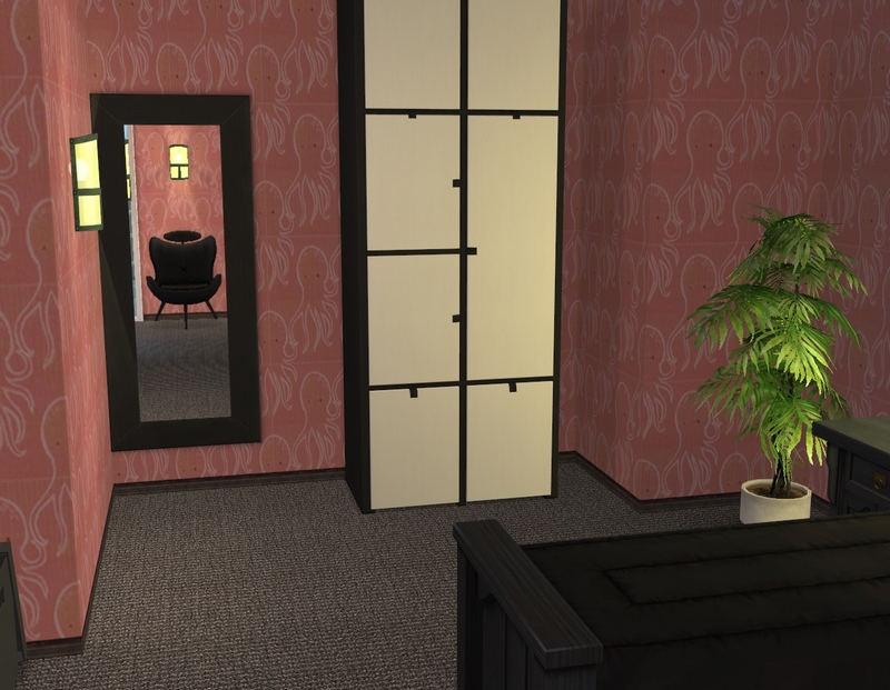
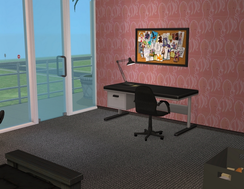
Felicity's bedroom. Her favourite colour is black, which is a bit much for a little girl, so I mixed it up with the pink. You may remember I did something similar with her bedroom in the old house.
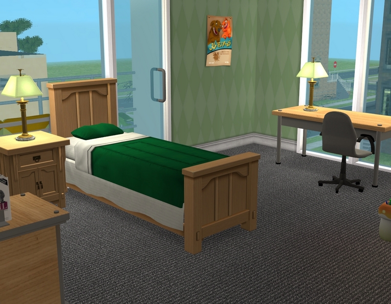
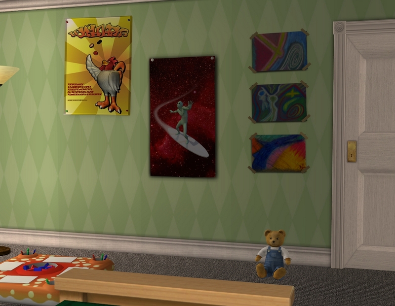
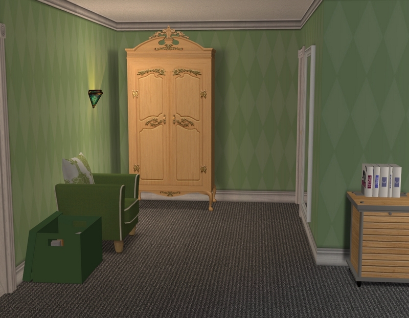
Patrick's bedroom, which I'm not thrilled about but which looks better in pics than in game. ;) It seems a bit empty to me in game. I just need more boyish toys in the game for him. Sandy has some good ones at ATS, so they may be my next addition.
Hope you enjoyed the tour!

Wow,that is a posh place, and very chic!
ReplyDeleteSince yellow is my favourite colour, I especially love those parts where yellow plays a role :-)
I figure a successful actress would have a rather chic place! I have so much fun decorating for my richer sims.
DeleteYellow is my favourite colour as well. I have to restrain myself from using it in every single house, lol!
Thanks for looking and commenting!
Very nice, you are awesome at decorating
ReplyDeleteSo nice of you to say, thanks for looking and commenting!
DeleteI love the house! It looks really great!
ReplyDeleteI think it matches their status nicely :)
I love the colors and wallpapers you've used. And you added a great color with Felicity's favourite color, black.
When you're playing the family you might get some more idea's to make Rob's study more appealing to you.
Glad you like it, Tanja! Yellow and grey is a favourite colour combination of mine. Pink's not such a favourite but it seems to work with the black.
DeleteI hope I'll get a spark of imagination with Rob's study when I play. Can't leave it the way it is forever! I'll probably get some play time this weekend, so we'll see. :)
Thanks for looking and commenting!
This turned out really well, I love the living room and the master bedroom, oh and the pool, those are my favorite places. I think that the study wall you don't love would look great with an addition of a plant on the ground, and a family portrait above the sofa, or at least Patrick and Felicity in a photo together. What Dad doesn't love having his kids' pictures in his office?
ReplyDeleteThe pool makes me miss summer, it practically did not exist this year, looks super cozy and welcoming. Looking forward to their update, hope you have some time to play soon!
I hardly did anything to the pool, apart from change the tiling and the deck chairs. Most of that was the creator's work!
DeleteGood ideas for the study. I actually don't think I have any pics of Felicity and Patrick on their own. I should do some. It can be a project for all my families, actually. Plants are something I need to download more of. Most of EA's ones are too big or too small (or too ugly, lol).
I think we might have stolen your summer. It's early spring here but we've already had more than one day over 30C (86F). It's ridiculous!
Thanks for looking and commenting!