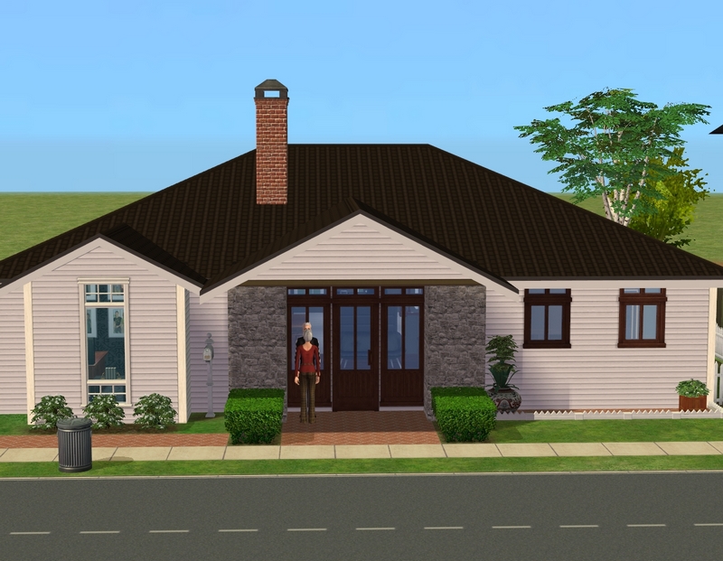
So here it is! There is also a pretty awesome pool off to the side, which you can't see. You can probably see it better at MTS. I've barely touched the outside at all. Please don't mind the windows! I meant to change them all to the ones on the right but apparently, I got distracted. ;)
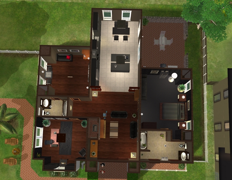
Layout.
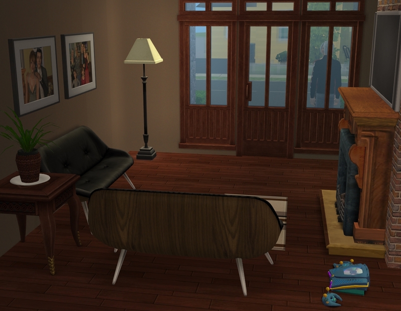
The living room is quite small but it's just the two of them now and they're not big entertainers. They have plenty of space for that outside anyway.
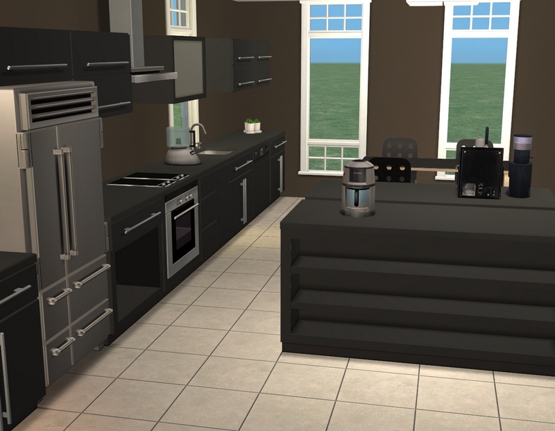
The kitchen. Anna's favourite colour is brown and Emil's is black and I've used those colours throughout the house. I really like how they work together.
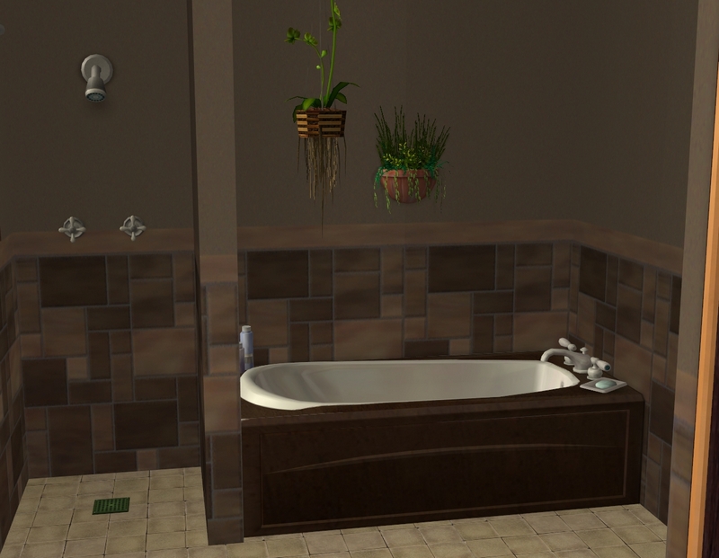
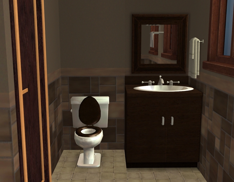
The larger bathroom. I actually decorated a bathroom I like, rather than merely tolerate! Yay for me!
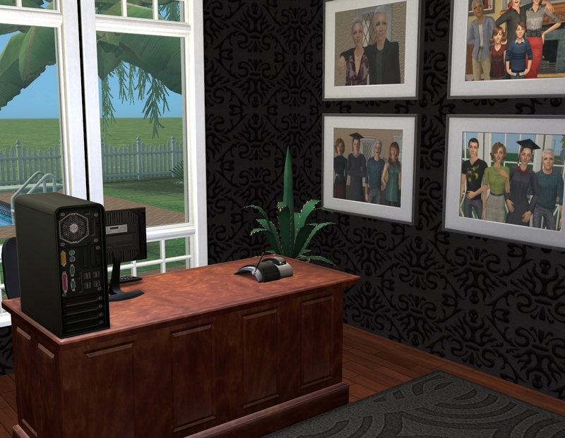
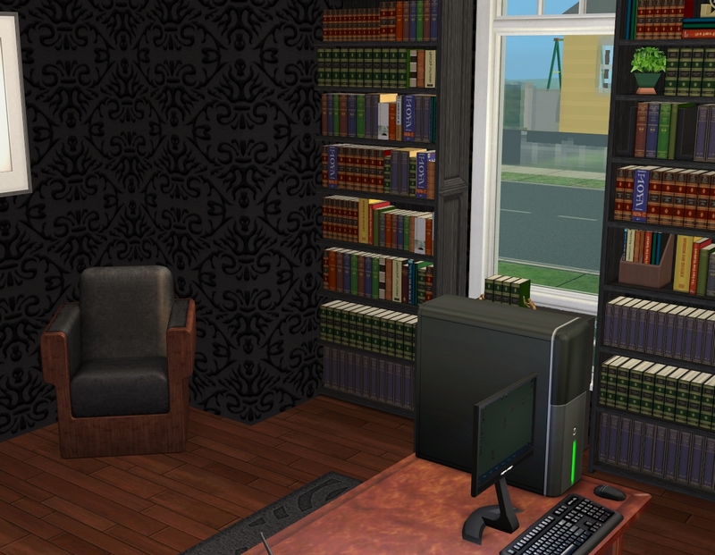
The office, which I didn't change much at all from the original. I switched around a little decor and changed the walls and floors.
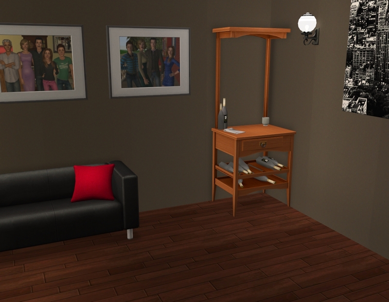
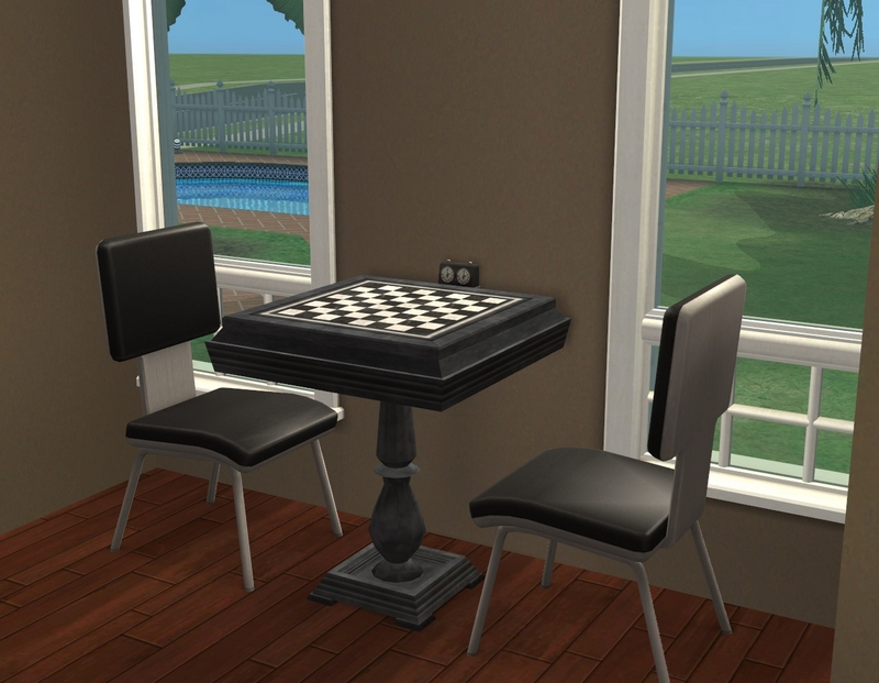
The game room, which I'm intending mostly for Emil, seeing he's a Games sim. There's a dartboard on a wall you can't see. I can tell I decorated this room last, because it's a bit blah! I just need a rug to pull it all together, I think.
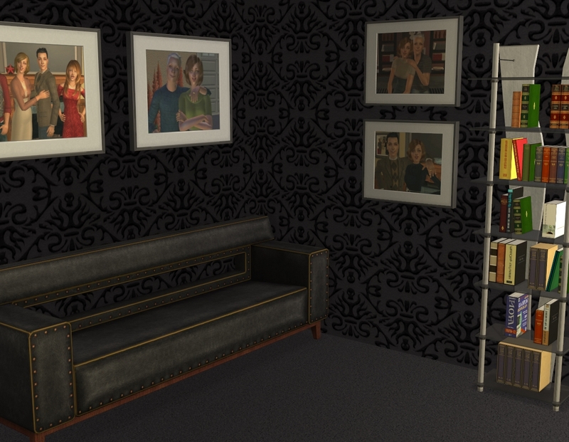
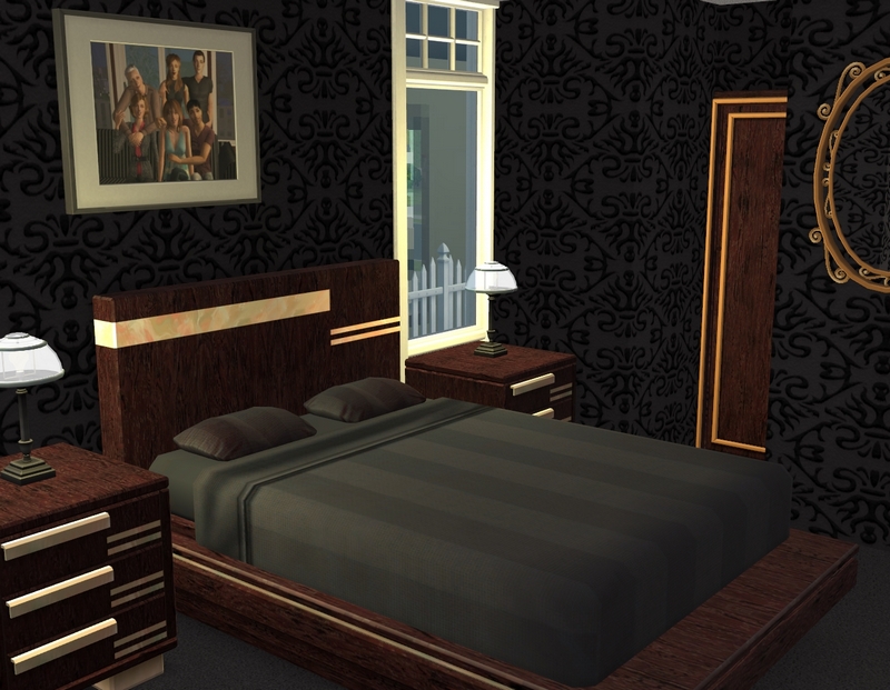
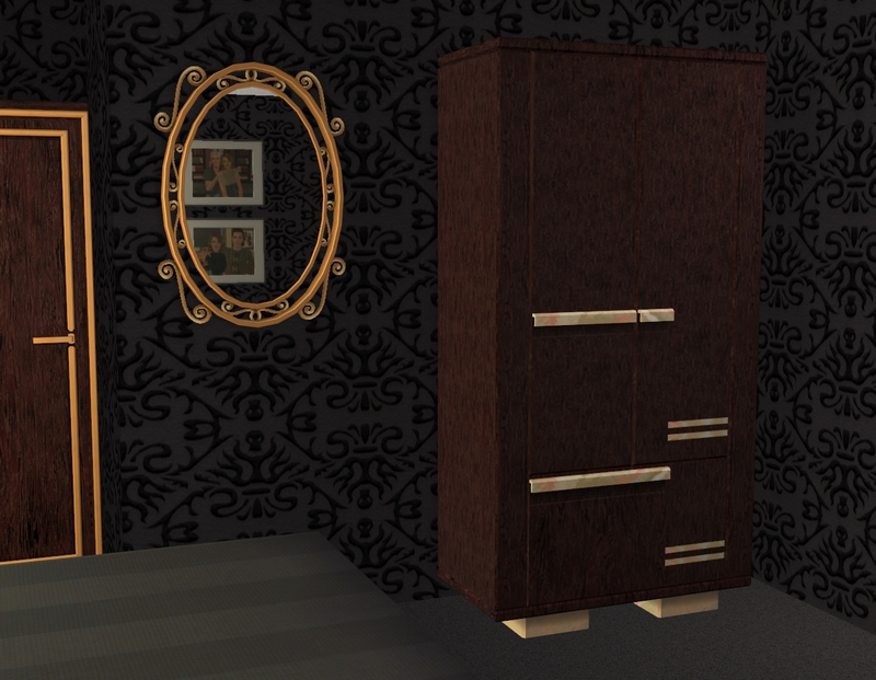
And finally, the bedroom, which is the room that I think is most suited to Anna and Emil's style. I'm really looking forward to playing this house.
I have been busy in my game over the past week! I've been on a bit of a roll and I've decorated/prepared four lots - lately, it's been taking that long or longer to do one lot, so I'm pretty thrilled. I did this house, Starry Nights (which had more CC than I remembered, so I had to go and replace some things with other things) and a makeover of a restaurant from Sims Community Project. It's not worth a whole lot tour but you can see two quick pics here at my Simblr. I also did Maia's (formerly Jace's) flower shop and I may put up a tour of that too. :)

It looks very playable and very stylish!
ReplyDeleteGood job black and brown are their favourite colours - for my taste, the interior would be a bit too dark ;-)
Love the mirror in the bedroom and how it looks so good with its curvy-curly shapes in contrast with the straight, clean lines of the furniture. The bathroom is great - I never think of using the hanging basket plants!
It would be a little dark for me too. In real life, I like jewel tones and brights. :) My bedroom walls are yellow and the bedspread is purple. ;)
DeleteThe mirror is probably my favourite part of the bedroom actually. I really like how it sets the room off. I think the hanging plants might have already been there because I rarely remember to use them either. I put them in Maia's flower shop the other day and I remember thinking that was unusual for me!
Thanks for looking!
I can't wait to see more tours :)
ReplyDeleteI don't know why, but I never really liked black and brown together, but you make it work! I like the same colors and style through the house.
It fits them really well :)
I'll throw some more tours up eventually, though it might not be Maia's shop. Thinking back, it's not really that interesting! I will still share pics but there's probably not enough to necessitate a tour.
DeleteI actually never really liked black and brown together myself, until I started decorating for Anna and Emil! It can look too dark but I find it works well if most of the brown is wood. Glad you like the house!
Thanks for looking!
I really like their house, the black and brown is just very stylish and fitting for these two, who I like to think have a lot of class, if not a lot of money, they still have their pride and dignity. Their bathroom really turned out fabulous, and the office, and bedroom are favorites too. I really like the whole house and am looking forward to seeing it in action for the wedding party/reception.
ReplyDeleteThat's how I think of Anna and Emil too. They wouldn't want furniture that looked cheap or garish, which I hope I achieved here! Happy you like it!
DeleteYou'll see the house in the next update but it's far too small to hold the reception. The reception is actually the reason I put Starry Nights back into the game - that's where I'm holding it. :)
Thanks for looking!
Ooh, those dark colors and wood work so well! It gives a very classy atmosphere, and yet very cosy, not cold at all. I love it! And all these pictures on the walls! Awwww!!! I'm always swooning at all the pictures your Sims have on their walls/desks. *sigh*
ReplyDeleteGlad you like it, Sandy! It really feels like it's just the perfect style for Anna and Emil for me. The family pics are something I really like adding to each house as well. :)
DeleteThanks for looking!